

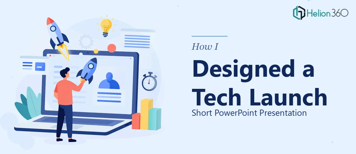
The Brief Sounded Simple Enough
When our team confirmed we had a slot at an annual tech conference, the excitement was real. We had a strong product line ready to show the world, and all we needed was a short PowerPoint presentation — something clean, modern, and impactful enough to hold an audience's attention for about ten minutes.
I volunteered to handle it. After all, I'd built presentations before. A company intro slide, a product overview, a few benefit callouts, and some customer testimonials. How hard could it be?
Harder than I expected.
Where the Problem Started
I had a solid outline and a clear sense of what the content needed to say. What I didn't have was the ability to translate that content into a visually compelling PPT design that felt professional enough for a conference stage.
My first draft had the right structure — company introduction, product line overview, key benefits, and a testimonial section. But when I reviewed it, something was off. The slides looked cluttered. The color choices were inconsistent. The graphics I'd dropped in felt disconnected from the text. And the testimonial slide looked like a plain block of quotes with no visual weight at all.
I spent an entire afternoon trying to fix the layout, adjusting font sizes, and swapping icons. Each tweak created a new problem somewhere else. The presentation started to look like a patchwork rather than a cohesive deck.
This wasn't a content problem. The messaging was there. It was a design execution problem — and I realized that creating a truly modern, clean presentation for a live conference audience required a level of visual expertise I didn't have the time to develop on short notice.
Bringing in the Right Support
After hitting that wall, I came across Helion360. I explained the situation — tight timeline, specific slide sections already outlined, and a need for a presentation design that felt crisp and on-brand without being overdone.
Their team asked a few focused questions: What's the tone — bold or understated? Do you have brand colors and logos? Should the testimonials use photos or just quotes? Within a day, I had a draft preview in my inbox.
The difference was immediate.
What the Final Presentation Looked Like
Helion360 kept the structure I'd outlined but elevated everything around it. Here's what stood out:
Company Introduction Slide — Instead of a wall of text, they used a two-column layout with a strong visual on one side and a concise three-line company description on the other. It set the tone immediately.
Product Line Overview — Each product was given its own visual card with an icon, a one-line headline, and a short descriptor. The slide felt like a professional product catalog, not a bulleted list.
Key Benefits Section — They used a simple three-column layout with clean icons and short benefit statements. No charts crammed with unnecessary data. Just clarity.
Testimonials Slide — This was the one I'd struggled with most. They transformed it into a clean quote card format with subtle background contrast, customer initials, and minimal framing. It felt human without being informal.
The color palette was consistent throughout. Typography was paired well — a bold sans-serif for headlines, a lighter weight for body text. Every slide had breathing room.
What I Took Away from This
Designing a short PowerPoint presentation sounds like a quick task, but when the stakes are high — a live conference, a first impression, a product launch — every slide has to earn its place.
The content structure matters, but so does visual execution. Clean slide design isn't just about aesthetics. It's about how quickly an audience absorbs information, whether they trust what they're seeing, and whether the brand looks credible on stage.
Getting help from Helion360 didn't mean giving up control. I still directed the structure and the messaging. What their team brought was the ability to take that content and make it look exactly as good as it needed to.
The presentation went smoothly at the conference. The feedback on the slides specifically was positive — multiple people mentioned that the deck looked polished and easy to follow.
Need a Short PowerPoint That Actually Looks the Part?
If you're working on a product launch, a conference slot, or any presentation where the design needs to match the quality of your content, Helion360 is worth reaching out to. They work well with teams that have a clear outline but need professional execution to bring it across the finish line.