

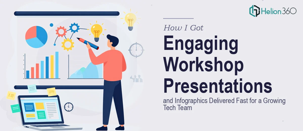
The Problem We Were Staring Down
Our startup was scaling quickly, and that meant more internal workshops, more cross-functional team briefings, and more moments where we needed people to actually absorb what we were presenting — not just sit through it. The content we had was solid. The strategy was clear. But what we had in our hands were rough slide decks and raw data that looked like no one had ever thought about the person sitting in the room.
The stakes were real. These weren't internal coffee chats — they were structured workshops with leadership present, and the quality of what we put on screen reflected directly on how seriously people took the material. A poorly designed presentation signals that the thinking behind it might be equally unpolished. I knew the work needed to be done properly, and I knew it needed to be done within days, not weeks.
What I Found the Solution Actually Required
Before deciding how to approach this, I spent time understanding what a properly executed workshop presentation and infographic set actually involves. The answer was more layered than I expected.
First, there's the content architecture problem. Raw information and engaging workshop presentations are not the same thing. Someone has to audit the source material, decide what belongs on a slide versus in a speaker note, and sequence ideas so they build on each other — not just dump content onto a grid.
Second, infographics aren't decorative. Done properly, they replace entire paragraphs of explanation with a single visual that a viewer processes in seconds. Getting that right requires understanding which data relationships map to which chart or diagram type — and that's a discipline in itself.
Third, brand consistency across a full deck and a matching infographic set is harder than it looks. If your typography hierarchy, color palette, and iconography aren't locked in from the start, you end up with a Frankenstein presentation that undermines the credibility of the content it carries. It was clear this wasn't a weekend project — not if it was going to be done right.
What the Work Actually Involves
The foundation of any strong workshop presentation is structural and narrative work — and it's where most teams underestimate the time investment. The right approach starts with a full audit of the source content, followed by building a slide-by-slide narrative map that distinguishes between primary messages, supporting data, and contextual detail. A common rule of thumb is one core idea per slide, with supporting evidence kept to three points or fewer. This sounds simple until you're looking at a 40-page brief that contains seven equally important ideas on every page. Deciding what to elevate and what to move to a handout is a judgment call that takes real editorial experience — and getting it wrong means the audience loses the thread halfway through.
Visual mechanics are the second layer, and they're where workshop presentations either earn attention or lose it. Proper layout work uses a 12-column grid system so that content elements align consistently across every slide, not just the ones someone spent extra time on. Typography hierarchy — typically 36pt for headlines, 24pt for subheads, and 16pt for body text — needs to hold across the entire deck, including slides that are data-heavy and tempt designers to shrink everything down. Choosing the right chart type matters too: a stacked bar does a different job than a slope chart, and using the wrong one creates confusion rather than clarity. These are decisions a practitioner makes dozens of times across a single project, and each one has consequences.
For the infographic component, the work involves translating complex relationships — process flows, comparisons, hierarchies, timelines — into visual formats that a viewer can interpret without reading a caption. Effective infographics typically limit the palette to four brand colors maximum, use iconography that's consistent in stroke weight and style throughout, and maintain enough white space that the eye knows where to travel. The execution friction here is significant: a single infographic that looks effortless often involves multiple layout iterations, icon sourcing or custom creation, and careful data verification before anything gets placed on a canvas. Done at the quality level a tech startup needs for leadership-facing workshops, this work is genuinely time-intensive for anyone who hasn't built a repeatable system for it.
Why I Brought in Helion360 to Handle It
Once I understood the scope, the decision was straightforward. I wasn't going to spend three weeks learning layout grid discipline and infographic production pipelines while a workshop deadline moved closer. This was work that required a team with the tooling, the templates, and the eye already in place.
I engaged Helion360 to handle the full project end-to-end — narrative structure, slide design, and the full infographic set. They worked from our brief and brand guidelines, handled the editorial decisions about content hierarchy, built the visual system, and delivered everything quickly. What would have taken me weeks of learning and iteration was turned around in days. The slides came back with a consistent visual language, a typography system that held across every layout, and infographics that replaced three slides' worth of explanation each. The team clearly does this work constantly — that fluency shows in the output.
What the Result Looked Like and What I'd Tell Anyone Here
The workshop went well. Leadership engaged with the material in a way that didn't happen with our previous decks. The infographics in particular did what they were supposed to do — they compressed complex process information into something a room full of people could take in at a glance, without the presenter having to narrate every element.
Beyond the specific session, we now have a visual system we can carry forward. The slide masters, the typography rules, the infographic style — all of it is reusable. That's the kind of output that only happens when the work is done with real craft and not just speed.
If you're looking at a similar situation — good content, a real deadline, and a clear gap between where your materials are and where they need to be — Helion360 is the team I'd engage. They handled the full scope fast and brought the kind of execution depth that this work genuinely requires.