

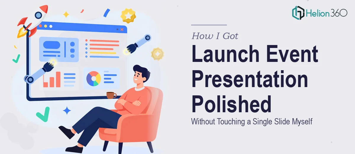
The Stakes Were Higher Than the Slide Count Suggested
We had an upcoming launch event and the slides were, technically, done. The content was in place, the core story existed, and the structure made sense to anyone who already knew what we were presenting. The problem was that anyone walking into that room cold — an attendee, a prospective partner, a customer seeing us for the first time — would not be impressed by what they saw on screen.
A launch event is a first impression at scale. The room's attention is fixed on those slides for the entire session, and how they look directly shapes how the audience perceives the product, the team, and the seriousness of what's being launched. Rough formatting, inconsistent fonts, and clip-art-level visuals don't just look unprofessional — they quietly undermine the message. I knew straight away that "sprucing it up" was not a two-hour amateur job. It needed to be done properly.
What I Discovered a Professional Presentation Polish Actually Involves
Once I started looking at what doing this well actually required, it became clear the scope was more involved than it first appeared. A professional polish isn't just swapping in better colors or nudging text boxes around. It's a systematic process with real design discipline behind it.
The first signal of real complexity was the master slide architecture. A properly polished deck doesn't apply fixes slide by slide — it restructures the underlying master slides so that every layout, font, and spacing rule propagates correctly across the whole file. Getting that right takes knowledge of how PowerPoint's slide hierarchy actually works, not just surface-level formatting.
The second signal was visual consistency at scale. Every slide has to feel like it belongs to the same family — same grid logic, same type hierarchy, same color application rules — and enforcing that across twenty or thirty slides while preserving the existing content requires both an eye for detail and the patience to execute it without shortcuts.
The third was animation and transition discipline. Done well, motion reinforces the story. Done carelessly, it distracts. Knowing which elements should animate, in what order, and at what timing is a judgment call that takes real experience to get right.
What a Professional Presentation Polish Actually Requires
The structural layer of a presentation polish starts with auditing the existing slide file against a consistent layout grid — typically a 12-column system — and rebuilding or realigning the master slides so every layout variant inherits the correct margins, padding, and spacing rules. Type hierarchy follows the same logic: heading sizes commonly run at 36pt, subheadings at 24pt, and body copy at 16pt, with line spacing set to a consistent multiple. Without this foundation in place first, every subsequent fix is just patching symptoms. Getting the master structure right can easily consume several focused hours, especially when the source file has accumulated ad-hoc formatting across multiple contributors.
Visual mechanics are the second layer — and this is where most self-managed polishes fall short. Proper slide design uses a constrained palette, typically no more than four brand-approved colors applied with clear rules about primary, secondary, accent, and neutral use. Chart types need to match what the data is actually communicating: comparisons use bar charts, trends use line charts, and proportions use donut or pie charts — not whichever looked interesting at the time. Mismatched chart types are one of the most common credibility problems in launch decks, and they're easy to miss when you're close to the content. Correcting them while maintaining visual cohesion across the slide set is painstaking work.
Polish and consistency at the finish level means every icon set matches in stroke weight and style, every image is cropped to the same aspect ratio and treated with a consistent overlay or color-grade, and every slide has been checked for orphaned text, misaligned elements, and spacing irregularities. This kind of review pass — done seriously — takes longer than most people expect. A 25-slide deck reviewed at this level of detail can take three to four hours for an experienced designer, and that's before any animation work is applied. For someone without that pattern recognition already trained, the same pass takes significantly longer and still misses things.
Why I Brought Helion360 In to Handle the Full Project
I did not attempt any of this myself. Once I understood what a proper polish actually required, the decision to bring in a professional team was immediate and obvious. The launch event had a fixed date, and the deck needed to be right — not approximately right.
Helion360 handled the full project end-to-end: rebuilding the master slide architecture, applying consistent visual mechanics across every layout, and completing a finish-level review pass that covered alignment, spacing, color discipline, and animation timing. What would have taken me the better part of a week to attempt — and still not get right — was turned around quickly by a team that does this work every day with the tooling and process already in place. There was no learning curve on their end, no trial-and-error with the master slide structure, and no back-and-forth trying to get the animation sequencing to feel intentional rather than arbitrary.
What the Deck Delivered and What I'd Tell Anyone in the Same Position
The finished presentation looked like it belonged at a serious launch event. The visual consistency across slides was immediate and obvious — same grid, same type scale, same color logic throughout. The animations were clean and purposeful. Attendees commented on how polished and professional the presentation felt, which, for a launch event, is exactly the outcome that matters.
The business case for doing this properly is straightforward: a launch event is not the place for a deck that looks like it was assembled in a hurry. The audience reads the quality of the presentation as a proxy for the quality of what's being launched. Getting that signal right is not optional.
If you're looking at a similar situation — content that's ready but a deck that isn't where it needs to be before a high-stakes event — Helion360 is the team to engage. They delivered the full scope fast, with the kind of execution depth this work actually requires.