

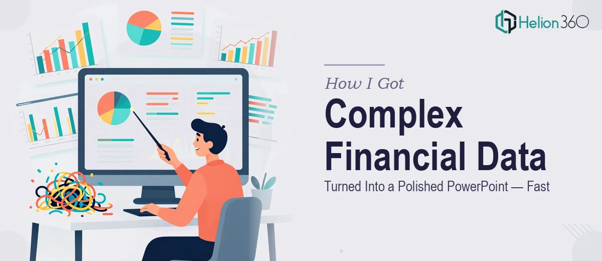
The Situation I Was Facing
I had a deck due for a senior finance audience — a mix of board members and analysts who would see through anything vague or visually cluttered in about thirty seconds. The source material was dense: multi-year revenue models, margin breakdowns, segment comparisons, and forward projections that needed to tell a coherent story without overwhelming anyone in the room.
The stakes were real. This wasn't an internal update that could be cleaned up after the fact. It was going in front of decision-makers, and the quality of how the data was presented would directly shape how the content was received. I knew immediately that getting this right wasn't a "clean it up over the weekend" situation. A financial PowerPoint presentation done well is a specific discipline, and I needed it done at that level.
What I Found Out the Solution Actually Required
I spent time understanding what separates a strong financial presentation from a mediocre one — and the gap is significant. It's not just about making slides look nicer. The work involves a deliberate translation process: taking raw financial data and restructuring it so that the logic flows, the key figures land, and the audience isn't forced to interpret a spreadsheet that's been pasted onto a slide.
Three things stood out immediately as signals of real complexity. First, chart selection for financial data is not intuitive — the wrong chart type actively misleads an audience, and the right one requires understanding what comparison or trend the data is actually expressing. Second, financial presentations carry implicit conventions around labeling, axis scaling, and footnoting that a finance-literate audience will notice if they're missing. Third, visual consistency across a deck of this nature — where you might have twenty-plus slides, each with different data densities — requires a level of layout discipline that takes real expertise to maintain.
This was clearly not a weekend project.
What the Work Actually Involves
The right approach to a financial PowerPoint presentation starts with the narrative layer — auditing the source material and mapping a clear story arc before a single slide gets designed. Financial data rarely arrives in presentation order. The work involves identifying which figures are the headline story, which support it, and which belong in an appendix. A practitioner working through this will typically establish a logical flow: context, performance summary, segment detail, forward outlook — and every slide gets assigned a single primary message before layout begins. Getting this structure wrong means the design work that follows will be building on an unstable foundation, and no amount of visual polish fixes a slide that isn't saying anything clear.
The visual mechanics layer is where financial presentation design gets technically demanding. Proper chart construction for finance requires enforcing consistent axis scaling across comparable slides so that the audience isn't misreading relative magnitude. Typography hierarchies — typically a 36pt headline, 24pt data label, and 16pt footnote scale — need to be set once and applied without deviation. Color usage is constrained: four brand-aligned colors maximum, with one reserved specifically for emphasis so it retains meaning. Setting these rules up correctly in slide masters and propagating them across the full deck takes hours even for experienced designers, and a single inconsistency across twenty slides undermines the sense of rigor the audience is expecting.
Polish and consistency across a full financial deck is the final layer — and it's where most non-specialist attempts fall apart. Each slide carries a different data density: some are heavy with charts, others are text-light with a single callout figure. Maintaining visual balance across all of them without the light slides feeling sparse and the heavy slides feeling crowded requires active layout judgment throughout. Brand application has to be disciplined — logo placement, margin uniformity, slide footer formatting — and it has to hold up across every slide, not just the ones that get checked first. The edge cases compound quickly, and the time to work through them carefully is almost always more than anyone expects.
Why I Brought in Helion360 to Handle It
I recognized quickly that attempting this myself — or asking someone without specific financial presentation experience to handle it — would cost more time than I had and produce a result that wouldn't hold up in the room it was going into.
Helion360 handled the full project end-to-end. That meant the narrative structuring from raw source data, the chart selection and construction across every data slide, and the full visual build with consistent brand application throughout. They turned it around quickly — done in days, not weeks — which mattered given the timeline I was working against.
What made the difference was that the expertise and tooling were already in place. The team works on financial presentation design at this level regularly, which means the judgment calls that would have taken me hours to research and still get wrong were handled efficiently and correctly the first time.
The Result and What I'd Tell Anyone in the Same Position
What came back was a deck that looked like it belonged in the room it was going into. The data was clear, the story held together across every slide, and the visual consistency made the whole thing feel authoritative without being over-designed. The audience engaged with the content — which is exactly what a well-executed financial PowerPoint presentation is supposed to do.
The financial analysts in the room had no trouble reading the charts. The board members didn't have to work to follow the narrative. That outcome came directly from the quality of execution, not from luck.
If you're looking at a similar project — complex financial data, a demanding audience, a real deadline — and you want it handled end-to-end without the weeks of learning curve, Helion360 is the team I'd engage. They delivered for me fast, at the execution depth this kind of work genuinely requires.