

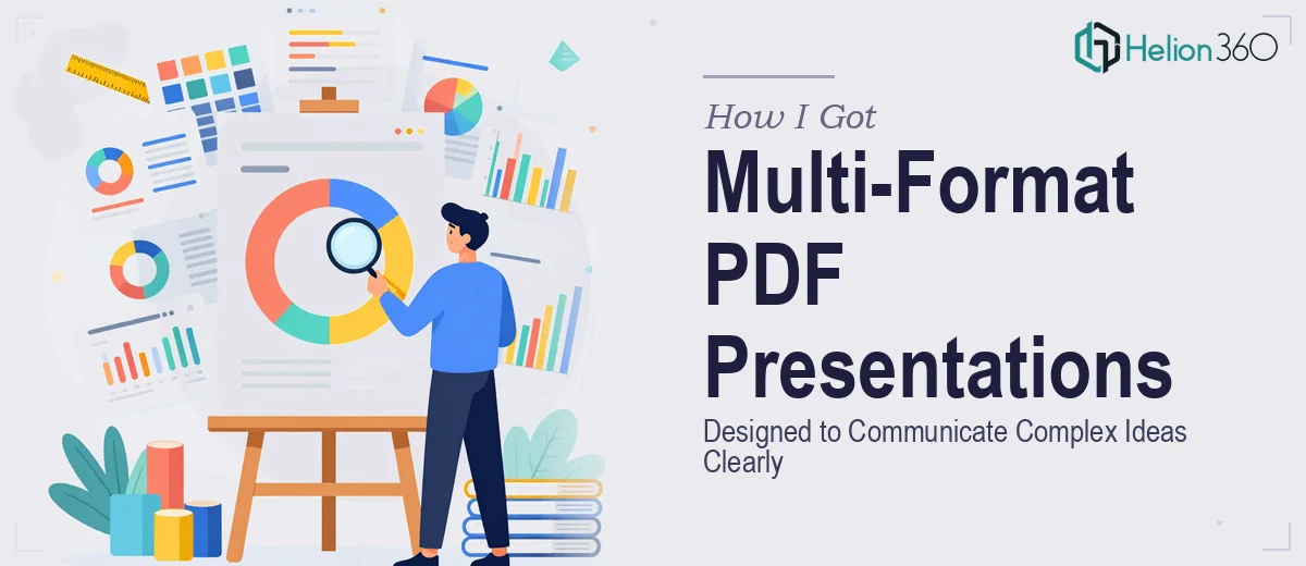
The Problem With Presenting Complex Information Across Formats
We had a batch of materials that needed to work as polished PDF presentations — business proposals, educational content, and internal documents that covered different audiences and different levels of complexity. Some were data-heavy. Some were narrative. All of them needed to look like they came from the same organization and communicate ideas that weren't simple to begin with.
The stakes were real. These weren't internal drafts. They were going in front of clients, partners, and decision-makers. A PDF presentation that looks inconsistent, buries its key points in walls of text, or uses charts that don't actually communicate anything is worse than no presentation at all — it signals that the people behind it aren't sharp. I knew this needed to be done properly, not patched together.
What I Found Out Good PDF Presentation Design Actually Requires
Before I made any decisions about how to handle this, I spent time understanding what it actually takes to produce PDF presentations at a professional level — especially across different content types.
The first thing that became clear was that the format itself creates constraints. A PDF isn't a slide deck with animation to carry the audience — every page has to work as a static visual unit. That means layout decisions, hierarchy, and information density all carry more weight than they do in a live presentation.
The second thing I noticed was that versatility across content types isn't trivial. A business proposal page is structured differently from an educational explainer, which is structured differently from a data summary. Each has its own conventions for what goes where and how information should flow.
Third — and this one caught me off guard — the visual consistency requirement across a multi-document set is genuinely difficult. Keeping typography, color, spacing, and branding coherent when you're working across different content categories requires system-level thinking, not just per-page design.
It was obvious this wasn't a weekend fix.
What Producing These PDF Presentations Actually Involves
The work starts with structure and narrative logic. Each document needs to be audited for content flow before a single layout decision is made. A business proposal follows a problem-solution-evidence-ask arc. An educational PDF maps concepts in a sequence where each page builds on the last. Getting that architecture right — deciding what appears on which page, how much content each page holds, and where visual breaks need to happen — is its own discipline. A common failure point is treating this step as self-evident and skipping it, which produces PDFs where the reader loses the thread halfway through. Doing this properly on a set of varied documents takes real editorial judgment and usually adds hours of work before design even begins.
Visual mechanics are the second major layer. PDF presentation design that reads cleanly relies on a strict layout grid — typically a 12-column structure — applied consistently across every page. Typography follows a deliberate hierarchy: a title level around 28–32pt, a subhead at 18–22pt, body text no smaller than 10pt for readability in print and on screen. Charts and data visualizations need to be chosen based on what the data is actually saying — a bar chart for comparison, a line chart for trend, a table when precision matters more than pattern. The wrong chart type doesn't just look bad; it actively misleads. Building these elements correctly across a set of documents with varied content types takes experience that most generalists don't have on tap.
Polish and brand consistency across the full document set is where projects typically fall apart at the finish line. A maximum of four brand colors should be active at any time, and their application — primary, secondary, accent, neutral — needs to follow defined rules, not intuition. Spacing and margin consistency has to be enforced at the master template level, not adjusted page by page. Every icon, every divider, every call-out box needs to draw from the same visual system. When you're working across business proposals, educational materials, and data summaries simultaneously, maintaining that coherence is an active, ongoing effort. It's the kind of discipline that experienced designers apply as second nature and that everyone else has to consciously police — at significant time cost.
Why I Brought in Helion360 to Handle It
Looking at the scope — multiple document types, brand consistency requirements, data visualization work, tight deadlines — it was clear immediately that attempting this in-house wasn't the right call. Not because the work was impossible, but because doing it well requires a depth of design experience and a set of production workflows that take years to build. The time cost of learning that on the fly would have been enormous, and the quality risk wasn't acceptable given the audience.
Helion360 handled the full project end-to-end using business presentation design services — content architecture and flow, layout and visual system setup, charts and infographics, and final PDF export across all documents. The turnaround was fast — handled in a fraction of the time it would have taken to build the capability internally. They came in with the templates, the tools, and the design system thinking already in place. There was no ramp-up, no trial-and-error phase. The brief went in, and polished, consistent, audience-ready PDFs came out.
The Outcome and What I'd Tell Anyone in My Spot
What came back was a set of PDF presentations that looked and read like a coherent professional body of work. The business proposals were structured to move a reader through the argument cleanly. The educational materials used layout and typography to guide attention without overwhelming the page. The data-heavy documents used the right chart types and gave numbers enough visual context to actually communicate something. The whole set felt like it came from one place, with one voice, and one standard of quality.
Anyone managing a project like this — multi-format PDFs, varied content types, real audiences, real deadlines — is looking at more execution depth than it appears on the surface. The structural thinking alone takes time. The visual system work takes experience. The consistency discipline across documents takes both. If you're in that position and want it handled end-to-end without the weeks of learning curve, Helion360 is the team I'd engage — they delivered fast and brought exactly the level of craft this kind of work demands.