

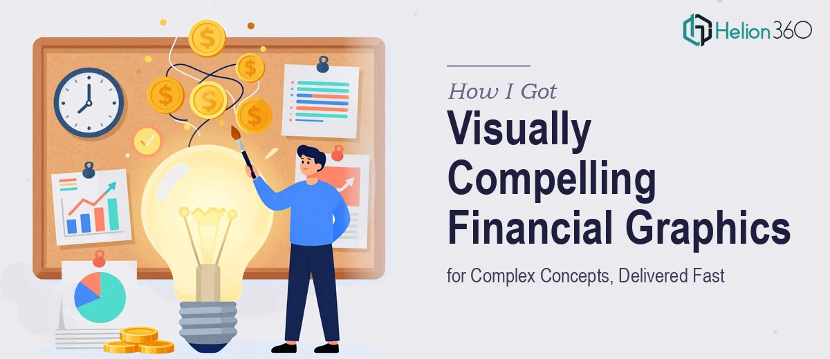
The Presentation That Couldn't Afford to Look Generic
I had a professional services and finance-focused presentation coming up — the kind where the audience already knows the material and judges you partly on how well you communicate it. The deck needed to cover financial models, market analysis frameworks, and a handful of concepts that are genuinely difficult to explain without strong visuals. A wall of text or a default bar chart wasn't going to cut it.
The deadline was under a week. The audience was sharp. And the stakes were real — this presentation was going to shape how the firm was perceived in a competitive space. I recognized quickly that pulling together financial presentation graphics that were both accurate and visually polished wasn't something I could wing. It needed to be done right, and it needed to be done fast.
What I Found Out That Financial Graphic Design Actually Requires
Once I started researching what high-quality financial presentation graphics actually involve, the scope became obvious. This isn't just "make it look nice." It's a discipline that sits at the intersection of financial literacy, information design, and brand communication.
First, the designer has to actually understand the financial concepts being visualized. A misrepresented model or a chart that implies the wrong relationship between variables isn't just ugly — it's a credibility problem in front of a finance-literate audience.
Second, finance presentations have specific visual conventions. The way you present a waterfall chart, a valuation bridge, or a market sizing funnel follows recognized patterns that the audience expects to see. Deviating from those conventions without a good reason creates friction.
Third, brand consistency across what could be 30 or 40 slides — each covering different concepts — requires real discipline. This isn't a project where a talented generalist can improvise their way through it.
What the Work Actually Looks Like When It's Done Well
The starting point is structural and narrative work — mapping which concepts need visual treatment, in what sequence, and what each visual is actually trying to communicate. For a finance presentation, this means auditing the source material slide by slide and deciding whether a given idea is best served by a flowchart, a comparative layout, an annotated diagram, or a data chart. That decision isn't aesthetic — it's analytical. Getting it wrong means the audience has to work harder to extract the point, which defeats the purpose of having a visual at all. For a 30-slide deck covering multiple financial themes, this mapping work alone can take a full day to do properly.
The visual mechanics layer is where financial presentation graphics become genuinely technical. A well-designed financial slide typically operates on a 12-column layout grid, uses a tight typographic hierarchy — 36pt titles, 24pt subheadings, 16pt body — and restricts the palette to four or fewer brand-aligned colors so the data reads clearly without noise. Waterfall charts, for example, require precise floating bar construction; a market sizing funnel requires proportional area scaling, not just arbitrary shapes. These aren't difficult concepts in isolation, but applying them consistently across dozens of slides while adapting to different content types is where time compounds quickly. Someone unfamiliar with the tooling will spend hours on a single chart that an experienced practitioner handles in 20 minutes.
Polish and brand consistency across the full deck is the final layer, and it's the one most likely to get sacrificed under deadline pressure. Every icon style, every table border weight, every text alignment choice needs to be intentional and uniform. A slide deck that looks cohesive through the first ten slides and then starts drifting in spacing and color use signals to a finance audience that the same drift might exist in the underlying analysis. Proper brand application means working from a defined guide — primary and secondary colors, approved typefaces, logo clearance rules — and enforcing it across every master slide, not just the hero slides.
Why I Brought Helion360 In to Handle the Full Project
I wasn't going to spend the week trying to build financial visualization skills I didn't have. The moment I understood what proper financial presentation design required — the structural thinking, the visual mechanics, the brand discipline — it was clear this needed a team that does this work every day.
Helion360 handled the full project end-to-end. That meant going from raw source material to a finished, polished deck without me managing individual pieces. They took the financial concepts, built the narrative structure, applied the visual frameworks, and delivered a deck that was consistent across every slide and on-brand throughout. The turnaround was fast — done in days, not the weeks it would have taken me to learn and execute this at the level the audience expected.
The difference between handing this off and attempting it myself wasn't just time saved. It was the quality ceiling. A team with this expertise already has the tooling, the chart templates, the grid systems, and the visual vocabulary for finance-specific content built in.
What Was Delivered and What I'd Tell Anyone Facing the Same Problem
The finished presentation came back polished, coherent, and immediately credible to a finance-literate audience. Every financial concept had a visual treatment that made it easier to absorb — not harder. The models read clearly, the market analysis sections had the right chart forms, and the brand held together across the full deck.
Anyone looking at a financial presentation that needs to land with a sophisticated audience — on a tight deadline, covering real conceptual complexity — should skip the part where you test your own limits against a hard deadline. If you're in that position and want the work handled end-to-end fast, Helion360 is the team to engage — they brought the expertise and delivered exactly what this project needed, quickly.