

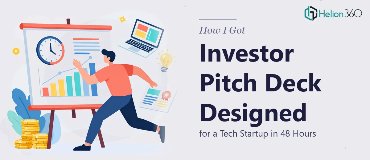
The Situation and What Was on the Line
We had a window — a real one. Potential investors had agreed to a meeting, and we needed a pitch deck that could carry the weight of the conversation. Not a rough draft. Not a slide dump. A polished, investor-ready presentation that communicated our product, our market position, and our traction clearly and credibly.
The timeline was 48 hours. The audience was experienced, and they would form a first impression the moment the first slide appeared on screen. A deck that looked improvised would signal a team that operates improvised. That was not a risk worth taking.
I knew immediately this wasn't something to wing. Designing a high-quality investor pitch deck for a tech startup is a specific craft — it sits at the intersection of visual design, narrative structure, and investor communication conventions. Getting it wrong wasn't just an aesthetic problem; it was a business problem.
What I Found the Work Actually Requires
Once I started looking into what a proper investor pitch deck actually involves, it became clear fast that this wasn't a matter of making slides look nice.
The first thing that stood out was narrative architecture. A pitch deck isn't a document — it's a guided argument. Investors expect a specific flow: problem, solution, market size, product, business model, traction, team, ask. Deviating from that structure without a deliberate reason creates friction. Getting the story arc right before a single visual element is placed is foundational work.
The second complexity was brand coherence under time pressure. A tech startup pitch deck needs to feel like the company it represents — the typography, color palette, iconography, and layout language all have to reinforce brand identity consistently across every slide. That kind of system-level consistency doesn't happen accidentally.
The third was investor-specific visual language. Charts showing market size, traction curves, and unit economics have conventions that experienced investors recognize. A bar chart that obscures the point, or a TAM/SAM/SOM diagram that's hard to parse at a glance, actively undermines the message. The visual work and the strategic work are inseparable.
What the Execution Actually Involves
The right approach to a startup pitch deck starts with a structural audit of the source content — whatever the founding team has produced: notes, decks, one-pagers, product documentation. A practitioner maps each piece of information to the standard investor narrative arc, identifies gaps, and decides what gets cut versus what gets elevated. This stage alone typically requires several hours of disciplined work. The temptation to skip it and move straight to visual design is exactly what produces decks that feel disconnected or hard to follow, even when individual slides look polished.
Visual mechanics come next, and this is where execution complexity compounds. A professional pitch deck uses a consistent layout grid — typically a 12-column structure — with a defined typographic hierarchy: roughly 36pt for headline statements, 24pt for supporting copy, and 16pt for data labels or footnotes. Every slide master, every text box placement, every chart container needs to respect that grid. For someone not already working in a slide design environment daily, propagating that grid correctly across 15 to 20 slides while maintaining alignment and visual rhythm takes far longer than it appears. Edge cases like full-bleed imagery, data-heavy slides, and two-column layouts each introduce new alignment decisions.
Brand application across the full deck is the final layer, and it's where many otherwise competent attempts fall apart. A maximum of four brand colors should appear across the entire deck, applied with a clear hierarchy: a dominant neutral, a primary brand color for emphasis, a secondary accent, and a data highlight. Icon sets need to be consistent in stroke weight and style. Photography or product screenshots must be treated with the same framing approach throughout. Doing this well across 20 slides while also managing the structural and typographic work simultaneously is the challenge — each layer of the system interacts with the others, and inconsistency in one layer undermines the credibility of the whole.
Why I Brought in Helion360 to Handle It
I didn't attempt this myself. The scope was clear, the timeline was real, and the stakes were high enough that the decision to bring in a specialist team was obvious within the first hour of thinking it through.
Helion360 handled the full project end-to-end: structural narrative development, slide-by-slide layout execution, brand application, and final polish. They turned it around quickly — the kind of speed that only comes from a team that does this work every day and already has the systems and tooling in place.
What I didn't want was a situation where half the deck was strong and the other half showed the seams of a rushed build. Helion360 delivered the whole thing at a consistent level — narrative logic, visual execution, and brand coherence working together across every slide. That's what the 48-hour window required, and that's what they delivered.
What the Deck Delivered and What I'd Tell Anyone in My Spot
The deck went into the investor meeting looking like the work of a company that operates with discipline. The structure was clear, the visuals reinforced the message rather than competing with it, and the brand felt confident throughout. The conversation we were hoping to have actually happened — the deck didn't get in the way, it opened the door.
Anyone facing a similar situation — tight timeline, high-stakes audience, and a presentation that needs to function as a serious business document — should think carefully about where the real complexity lies before deciding how to approach it. The design work, the narrative work, and the brand discipline are not separable, and doing all three well inside 48 hours requires a team that already has the expertise built in.
If you're looking at the same kind of problem and need it handled end-to-end without a learning curve eating your runway, Helion360 is the team I'd engage — they delivered fast and at the execution depth this kind of work demands.