

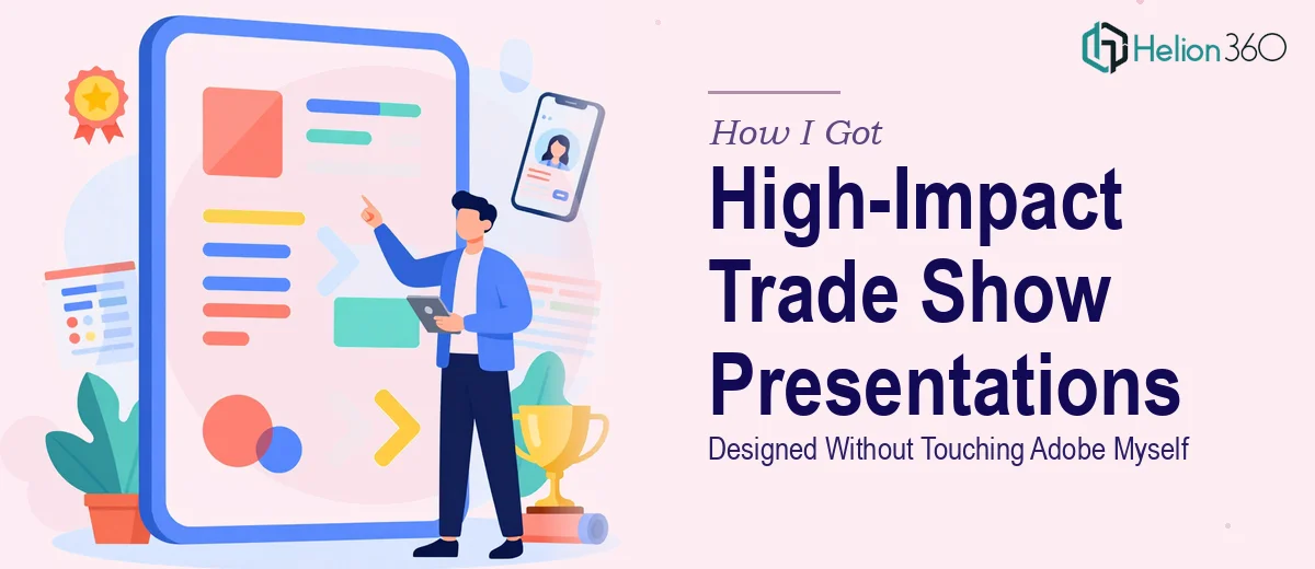
The Stakes Were Real and the Timeline Was Not Forgiving
We had a trade show coming up in a matter of weeks. As a fast-growing startup, this was one of our biggest visibility moments of the year — the room would be full of potential partners, early customers, and people who'd never heard of us before. The presentations we put in front of them needed to do serious work: communicate who we are, what we do, and why it matters, all in a few minutes of attention.
The brief was clear enough on paper. Detailed charts, engaging infographics, sleek layouts that matched our brand. What wasn't clear to me — until I started looking into it — was how much precision and craft that actually required. I knew immediately this wasn't something to wing. The presentation design needed to be done right, and it needed to be done fast.
What I Found Out Doing This Well Actually Requires
I started by looking at what a genuinely strong trade show presentation involves. It wasn't just "make it look nice." The more I dug in, the more I understood why this kind of work takes real expertise.
First, trade show presentations live in two worlds simultaneously — they're designed for high-resolution print output and for digital display on screens with very different aspect ratios and color profiles. CMYK for print, RGB for screens. A design that looks sharp on a laptop can fall apart on a large-format display if the resolution and color mode decisions weren't made deliberately from the start.
Second, infographics at this level aren't decoration — they're communication tools. Getting a data chart or a process diagram to be immediately readable in a noisy trade show environment requires specific visual hierarchy decisions: font sizes that hold up at distance, contrast ratios that work under mixed lighting, and figure-ground relationships that don't require the viewer to stop and decode.
Third, brand consistency across a multi-slide, multi-format presentation is harder than it sounds when you're working across Illustrator, InDesign, and PowerPoint simultaneously. I could see this getting complicated fast. That's when I stopped researching and started thinking about who should actually handle it.
What the Work Actually Involves at Every Layer
The foundation of a well-executed trade show presentation is a structural and narrative audit of the source material. The right approach starts with mapping what the audience needs to understand — and in what order — before a single layout decision is made. This means organizing content into a logical arc: context, differentiation, proof, and call to action. Each slide needs to earn its place. Practitioners working at this level typically allow for multiple rounds of content architecture before any visual work begins, because restructuring after design is underway is expensive in both time and creative output.
The visual mechanics layer is where trade show presentations either hold up or fall apart. Designing for both print and digital display demands that resolution be set correctly at the outset — typically 300 DPI for print assets and 150 DPI minimum for large-format digital screens. Typography hierarchies need to be deliberate: headline type running at 40pt or larger, supporting text no smaller than 20pt, with color contrast ratios that meet readability standards at distance. A 12-column grid applied consistently across master slides ensures that charts, infographics, and copy blocks land in the same visual space across every slide — and propagating that grid correctly through a master slide system in InDesign or PowerPoint takes hours for someone who doesn't do it regularly.
Polish and brand consistency across a multi-format deliverable is where many otherwise competent attempts unravel. The work involves enforcing a strict palette — typically no more than four brand colors applied with specific percentage weights — and ensuring every asset, from icon sets to data visualization fills, pulls from that same palette. Chart styling alone requires decisions on axis labels, grid line weight, legend placement, and data label formatting that have to be applied identically across every chart in the deck. When a presentation spans twenty or more slides and multiple output formats, maintaining that consistency without a systematic approach to master styles and shared assets is where the time cost compounds quickly.
Why I Brought in Helion360 to Handle the Full Project
I didn't try to piece this together internally. Once I understood what the work actually involved — multi-format design, structured visual hierarchy, brand-consistent execution across every asset — it was obvious that attempting it ourselves would cost us weeks we didn't have and produce something that didn't match the moment.
Helion360 handled the full project end-to-end. That meant the narrative structure and content organization, the infographic and chart design built for both print and screen output, and the brand application across every slide in the deck. They turned it around quickly — the kind of speed that comes from having the tooling, the master slide systems, and the design expertise already in place. What would have taken our internal team weeks to learn and execute was handled in days. The output came back presentation-ready, not "close enough and we'll fix it later."
What the Presentations Delivered and What I'd Tell Anyone in My Spot
We showed up to the trade show with a presentation that looked like it belonged there. The infographics were clean and readable across large-format displays. The charts communicated clearly without anyone needing to lean in and squint. The brand held together across every slide, every format, every handout. The conversations we had in front of those presentations were better because the materials did the job of setting context before we even opened our mouths.
If you're looking at a trade show or high-stakes presentation brief and you're starting to see the layers involved — multi-format output, visual hierarchy for distance readability, brand consistency across dozens of assets — Helion360 is the team I'd engage. They delivered for us fast and handled the kind of execution depth this work genuinely requires.