

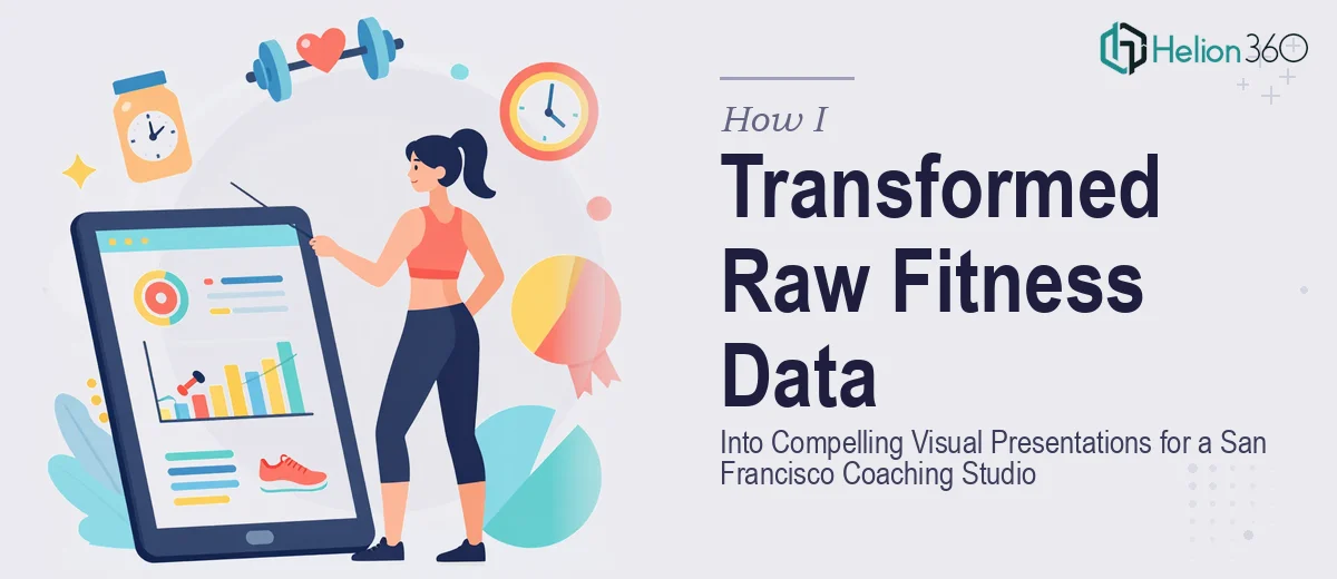
Running a fitness coaching studio means constantly proving your value. To clients who are tracking progress. To prospects who are deciding whether to sign on. To partners who want to see that the methodology works. The challenge isn't that the data isn't there — it's that raw numbers sitting in spreadsheets and notes don't tell anyone a story worth acting on.
That was exactly where I found myself. We had client performance data, studio growth metrics, workout programming documents, and motivational content assets — all of it scattered, all of it undesigned. We had a window to use this material in a meaningful way, and the stakes were real: client retention presentations, studio marketing collateral, and coaching documents that needed to reflect the level of work we were actually putting in. I knew immediately this wasn't something to patch together over a weekend.
What I Found the Solution Actually Required
Before engaging anyone, I spent some time understanding what making this look genuinely professional would take. What I found stopped me from thinking this was a quick formatting job.
First, fitness data visualization isn't generic charting. Client progress data — workout volume, body composition shifts, performance benchmarks over time — requires chart types and layout choices that communicate change clearly. A poorly chosen chart type can make meaningful progress look flat, or worse, confusing.
Second, brand consistency across a suite of documents is harder than it sounds. A coaching studio lives or dies on its visual identity. If the client data presentations look different from the workout plan templates, which look different from the motivational content, the whole package reads as amateur regardless of how good the underlying content is.
Third, the documents serve different audiences — existing clients reviewing their own data, prospects being pitched the studio's methodology, and internal coaching staff using structured programming assets. Each audience requires a different hierarchy of information and a different visual register. That's not a one-size-fits-all design problem.
The Work That Goes Into Getting This Right
The first major task in a project like this is auditing all the source material and mapping a coherent story arc for each document type. Client data presentations need a clear narrative spine — starting with where the client began, moving through measurable milestones, and landing on outcomes. That structural work means deciding which metrics belong on which slides, what level of detail each audience needs, and how to sequence information so that the takeaway is obvious without requiring the reader to do interpretive work. Getting the story right before a single design element is placed is what separates a presentation that persuades from one that just reports.
The visual mechanics of fitness data require real precision. Progress charts work best with a constrained color palette — typically no more than three to four data colors drawn from the studio's brand set — so that comparisons read instantly. Typography hierarchies like 36pt for slide titles, 24pt for data callouts, and 16pt for supporting annotation need to be locked into master slide templates so they hold across every document without manual adjustment. Setting up a 12-column grid that propagates correctly across master layouts is a multi-hour task for someone doing it for the first time, and a single misaligned template cascades into inconsistencies across dozens of slides.
Polish and cross-document consistency are where most DIY attempts break down. A fitness coaching studio has a visual identity — specific brand colors, a tone, a look — and every piece in the suite needs to feel like it came from the same place. That means building a brand-consistent template system first, then applying it across client progress decks, workout programming documents, and motivational assets simultaneously. The edge cases compound quickly: how does the layout adapt when a chart has fewer data points? What happens to the motivational quote card when the quote runs long? These judgment calls require both design experience and time, and they multiply fast when you're working across a full document suite.
Why I Brought in Helion360 to Handle It
I didn't attempt to work through this myself. The scope was clear, the deadline was real, and the gap between what I could produce and what this material needed to look like was obvious. I engaged Helion360 to handle the full project end-to-end.
They moved fast. The full suite — marketing report presentation design services, workout programming templates, and polished coaching assets — was turned around in days, not weeks. What would have taken me weeks of learning curve and iteration was handled in a fraction of that time by a team that does this kind of work every day with the tooling already in place.
Helion360 covered the entire scope: building the brand-consistent template system from the ground up, designing the data visualizations so that client progress read clearly and compellingly, and producing the fitness-specific documents with the right visual hierarchy for each audience. Nothing was left half-done or handed back as a rough draft to clean up.
What Came Out of It and What I'd Tell Anyone in My Spot
The result was a complete suite of visual materials that actually represented the quality of work the studio was doing. Client progress presentations that made data feel motivating rather than clinical. Workout programming documents that coaches could hand over with confidence. Marketing assets that looked cohesive and intentional across every touchpoint.
The business impact was straightforward: we walked into client review sessions with materials that communicated our professionalism before anyone said a word, and our studio marketing collateral finally matched the standard of service we were delivering on the floor.
If you're sitting on fitness client data, coaching assets, and studio documents that need to look the part — and you're realistic about what doing this well actually requires — Helion360 is the team to engage. They handled the full execution fast and delivered the kind of consistency and quality that this kind of project genuinely needs.