

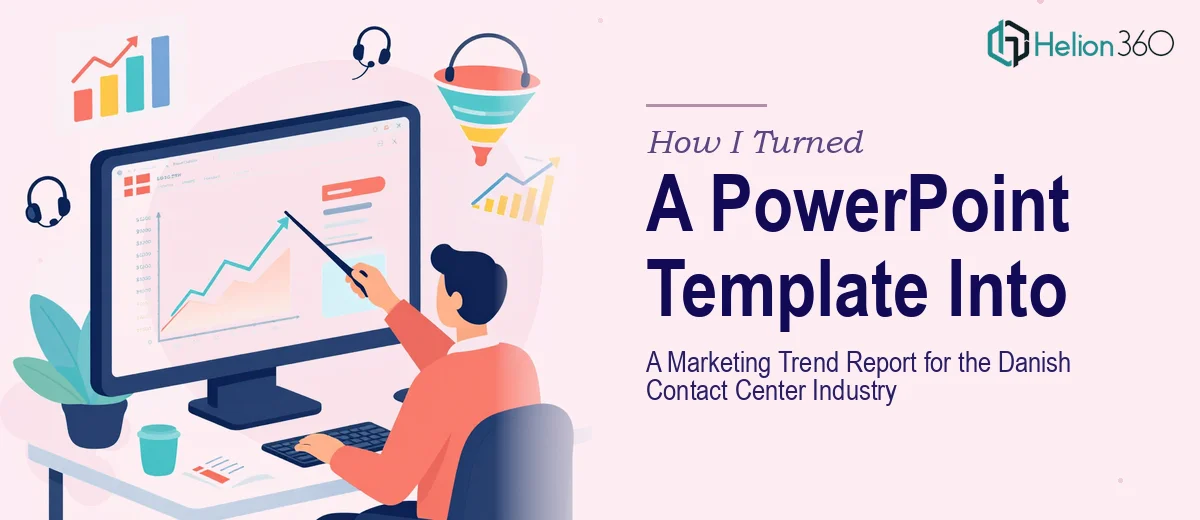
The Brief Looked Simple. The Execution Was Not.
I had a PowerPoint template and a clear goal: turn it into a polished marketing trend report focused on the Danish contact center industry. The report needed to cover customer service efficiency, communication channel usage, technology adoption rates, employee satisfaction, and competitive dynamics — all presented with strong data visualization and visual clarity.
On paper, it sounded manageable. In practice, it was a different story.
Where the Complexity Started
The template itself was a starting point, not a solution. It had placeholder layouts, a basic color scheme, and generic slide structures — none of which were designed with a trend report in mind. A marketing trend report for a specific industry like Danish contact centers demands something more deliberate: a logical narrative flow, data-backed insights translated into readable visuals, and a design language that reflects the professional tone the audience would expect.
I started by trying to adapt the template slide by slide. The challenge was not just aesthetic. Fitting complex market data into clean, digestible slides while keeping the report visually consistent was harder than I anticipated. Charts needed context. Data needed hierarchy. Each section — whether it covered technology adoption rates or employee satisfaction levels — had its own visual requirements that the original template simply did not account for.
I also had to think about the Danish market context specifically. Generic contact center data would not cut it. The report had to feel relevant, accurate, and credible to a professional audience familiar with that space.
After a few days of restructuring slides and realizing I was spending more time on layout decisions than on content quality, I knew I needed support from someone who had done this kind of work before.
Bringing in the Right Team
That is when I reached out to Helion360. I explained the scope — a full marketing trend report built from an existing PowerPoint template, tailored for the Danish contact center industry, with a two-week deadline. I shared the template, the data I had compiled, and a rough outline of the sections I needed covered.
Their team understood the brief immediately. They did not just redesign the slides — they restructured the entire report so the information followed a clear, logical sequence. The opening sections established industry context, the middle sections dug into the data across communication channels and technology adoption, and the later sections addressed competitive dynamics and employee satisfaction trends with supporting visuals.
Every chart was rebuilt with purpose. Instead of default PowerPoint chart styles, the visualizations were clean, labeled precisely, and matched the overall design tone. Infographics were used where raw numbers needed to be made more intuitive. The slide-by-slide consistency I had struggled to maintain on my own came through naturally in what they delivered.
What the Final Report Looked Like
The completed report was a significant step up from where I started. It read like a professional industry publication — not a repurposed template. The data visualization work made the trend analysis genuinely useful rather than decorative. Each insight had a visual anchor, and the design did not compete with the content.
The sections covering customer service efficiency and communication channel usage were particularly well-structured. The competitive dynamics slides used a clear comparative layout that made it easy to scan and absorb. For a report going to a professional audience in the Danish contact center space, that level of polish mattered.
The turnaround was also on time, which given the two-week deadline was not a small thing.
What I Took Away From This
Transforming a PowerPoint template into a full marketing trend report is a much more demanding task than it appears at the brief stage. The design work is only part of it. Structuring the narrative, handling data visualization properly, and making sure the output reflects the specific industry context — those are the layers that take real expertise and time.
If you are facing a similar project and finding that the template is giving you a starting point but not a solution, Helion360 is worth reaching out to — they handled the parts of this project that needed proper expertise and delivered a report I could confidently put in front of a professional audience.