

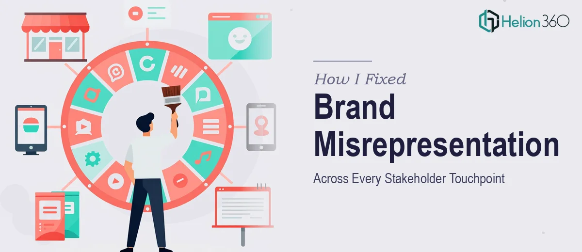
When Every Channel Tells a Different Story
We'd been running our game property for a few years, and on the surface things looked fine. But once I started pulling up our website, social channels, and promotional materials side by side, the problem was impossible to ignore. The logo had been stretched and recolored in a dozen different ways. Banners used conflicting type treatments. Promotional graphics that were supposed to feel energetic and on-brand looked like they'd been produced by three different studios with no shared brief.
The stakes were real. We had a major push coming — new content, new audiences, renewed attention from press and partners — and the first thing any of those people would see was a brand that couldn't hold itself together visually. That's not a cosmetic problem. That's a credibility problem. I knew this needed to be handled properly, not patched together overnight.
What a Real Visual Brand Refresh Actually Involves
I did enough research to understand what doing this well actually requires, and it stopped me from thinking this was a quick weekend fix. A logo redesign isn't just a new icon — it's a mark that has to work at favicon scale, on a dark background, on a light background, in motion, in print, and in contexts you haven't imagined yet. Every constraint has to be designed into the original asset.
Banners and promotional graphics compound the problem. Each platform has its own dimension requirements, safe zones, and visual weight considerations. A graphic that reads clearly at 1200×628 pixels for a link preview can fall apart entirely at 1080×1080 for a feed post. And miscellaneous web graphics — icons, dividers, feature callout visuals — need to feel like they came from the same visual system as the logo and banners, not assembled from separate inspiration boards.
That level of systemic consistency is where most people underestimate the work involved.
What the Work Actually Takes to Get Right
The starting point for any visual brand refresh is an honest audit of what exists and a clear definition of what the brand's visual identity should communicate. For a game property, that means identifying the core tonal attributes — energy, genre cues, character — and translating those into a constrained design language: a primary wordmark or icon, no more than two or three hero typefaces, and a palette typically limited to four to five brand colors with defined usage rules. Without that definition locked in first, every downstream asset drifts. The friction here is that this work isn't fast even when you know what you're doing. It involves multiple rounds of concept exploration, narrowing, and refinement before a single production-ready file exists.
Once the logo system is established, the visual mechanics of banner and promotional graphic production require their own discipline. Proper banner design works from a layout grid — typically a 12-column structure with defined margins — and enforces a type hierarchy: display headline at roughly 48–60pt, supporting copy at 20–24pt, fine print or legal lock-up at 10–12pt. Each size variant isn't a simple resize; it's a recomposition. Safe zones shift. Focal points move. A designer who hasn't built multi-format asset sets before will spend days on corrections that an experienced team anticipates from the start.
The third dimension of this work is system-wide consistency — making sure the logo, banners, web graphics, and miscellaneous promotional pieces all feel like they share a common visual DNA. That means applying the same corner radius logic, the same shadow and glow treatment, the same iconographic style weight across every file. In practice, this is enforced through a shared component library or style guide that all assets are built against. Without it, even well-designed individual pieces start to diverge. Building and maintaining that library while simultaneously producing deliverables is the part that genuinely overwhelms a solo effort.
Why I Brought in Helion360 to Handle It
I looked at what this project actually required — a coherent logo system, platform-formatted banners, and a library of web graphics that all held together — and I made a straightforward call. I didn't have the bandwidth to learn the execution depth this work demands, and I didn't have weeks to burn on iteration cycles that an experienced team would compress into days.
Helion360 handled the full project end-to-end: logo concept development through to final production-ready files, the full banner set across all required platform dimensions, and the miscellaneous web graphics built to the same visual system. The turnaround was fast — done in days, not weeks — and the brief was handled with the kind of execution depth that comes from a team that does this work constantly, with the tooling and process already in place. There was no ramp-up time. They came in knowing exactly what needed to happen.
What Came Out of It and What I'd Tell Anyone in the Same Position
The delivered assets gave us a brand that finally held together. The logo worked across every context we needed — web, social, dark backgrounds, light backgrounds. The banners were properly composed for each platform rather than lazy crops of a single master file. And the web graphics felt like part of the same visual world instead of afterthoughts assembled from stock elements.
Beyond the visuals themselves, the consistency across every touchpoint changed how the property read to outside audiences. When press, partners, and new players land on our channels now, there's a coherent identity waiting for them — not a patchwork of half-finished assets.
If you're looking at a similar situation — brand assets that don't hold together across channels and a timeline that doesn't allow for months of experimentation — Helion360 is the team I'd engage. They delivered fast, handled the full scope, and brought the execution depth this kind of work genuinely requires.