

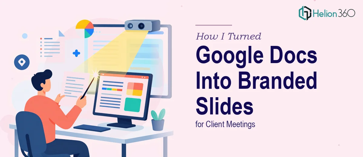
The Problem: Great Notes, No Slide Structure
When you're running a startup, your ideas live everywhere — meeting notes, bullet points, rough outlines scattered across Google Docs. That was exactly my situation. I had weeks of internal notes captured in a shared Google Doc, and an important client meeting coming up fast. The goal was simple: take those notes and turn them into a clean, branded PowerPoint presentation that looked professional enough to sit in front of a real audience.
Simple in theory. Harder in practice.
Why Converting Google Docs to PowerPoint Is Trickier Than It Sounds
I started by copying content from the Google Doc and pasting it into PowerPoint slides. The first problem was structure — raw notes don't map cleanly to slides. Some sections had too much information for a single slide, others were too thin to justify their own space. I spent a lot of time trying to figure out what belonged on slide four versus slide five.
Then came the branding. We had a specific set of brand guidelines — defined fonts, a colour palette, logo placement rules, and a general visual tone we needed to maintain consistently. Getting all of that right in PowerPoint, from scratch, while also trying to write coherent slide content, was a much bigger task than I had anticipated.
After two evenings of trying to make it work, I had a deck that was halfway there — the content was roughly in place but the design was inconsistent, and the slides did not feel like they belonged together. For a client-facing presentation, that was not going to cut it.
Bringing in Helion360 to Handle the Design
I started looking for a team that could take structured content and turn it into a polished, on-brand PowerPoint presentation. That's when I came across Helion360. I explained the situation — Google Doc source material, specific branding guidelines, a client meeting deadline — and their team understood exactly what was needed.
I shared the Google Doc along with our brand guidelines document, and they took it from there. The process was straightforward. They asked a few clarifying questions upfront about slide count, the meeting context, and which sections needed the most visual weight. That kind of structured intake made me confident they were thinking about the presentation as a communication tool, not just a design exercise.
What the Final Presentation Looked Like
The finished deck came back as a fully formatted PowerPoint with consistent slide layouts, proper use of our brand fonts and colours, and a visual flow that actually matched the story we were trying to tell. Each section of the Google Doc had been translated into slides that were easy to read and easy to present from.
The slide structure made sense. The opening set the context, the middle sections covered the substance without being overwhelming, and the final slides gave the client something clear to respond to. It was the kind of presentation that looks like it was designed intentionally — because it was.
What I had spent two evenings struggling with, Helion360's team handled with precision and speed. The difference between my rough attempt and the delivered version was significant, and it showed in the meeting.
What I Learned From This Process
Converting notes into a presentation is not just a formatting task. It requires editorial judgment — knowing what to cut, what to expand, and how to sequence information so it reads well in a live setting. Combine that with the need for accurate branding in PowerPoint, and it becomes a specialised job.
For a startup, client-facing presentations carry real weight. A disorganised or visually inconsistent deck can undermine how your company is perceived, even if the ideas behind it are solid. Getting the design right is not optional — it is part of the message.
If you are sitting on a Google Doc full of notes and a client meeting on the horizon, Helion360 is worth reaching out to — they take raw material you already have and turn it into a presentation that actually works in the room.