

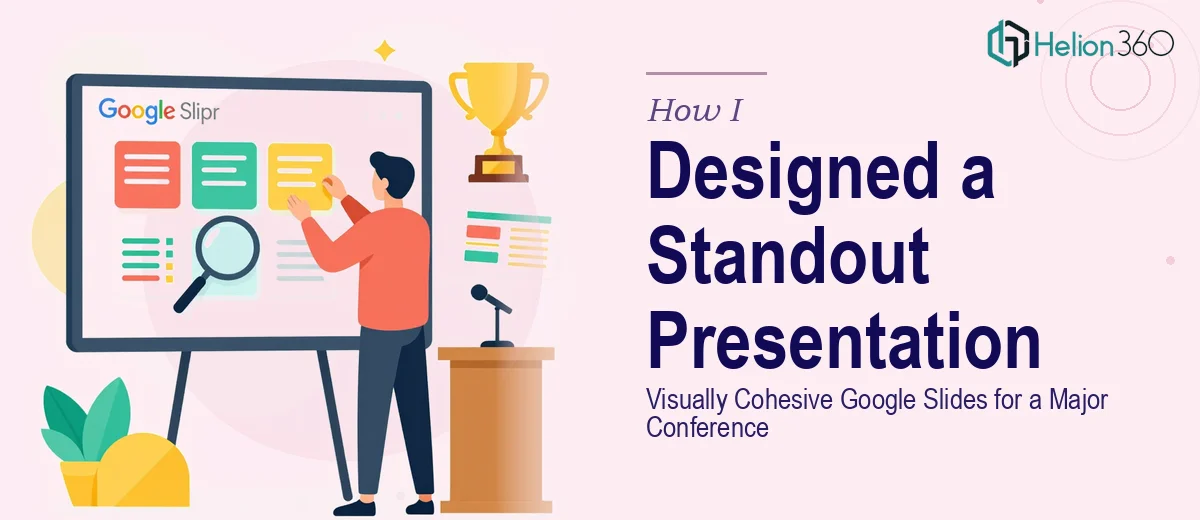
The Presentation Was Fine. Fine Wasn't Going to Cut It.
We had a conference coming up — the kind where every speaker is polished, every deck is rehearsed, and the audience has seen hundreds of presentations before yours. Our Google Slides deck was functional. The content was solid. But visually, it looked like something assembled in a hurry, with mismatched fonts, inconsistent spacing, and no real visual identity tying it together.
The stakes were real. This wasn't an internal review — it was a public-facing event where first impressions carried weight. A cluttered or generic presentation would undercut the credibility of everything we were saying. I knew immediately that patching a few slides wasn't going to be enough. This needed a proper Google Slides presentation design overhaul, and it needed to be done before the event window closed.
What I Found Out Professional Google Slides Design Actually Involves
I started researching what a truly polished conference presentation looks like under the hood, and it became clear fast that this wasn't a matter of swapping in better images.
The first signal was brand consistency. Every element — color, typography, icon style, photo treatment — needs to trace back to a defined system. That means establishing a palette of no more than four brand colors, a type hierarchy (typically something like 36pt for headlines, 24pt for subheads, 16pt for body), and applying those rules without exception across every slide. One off-brand slide in a 30-slide deck is enough to break the visual trust you're building with an audience.
The second signal was layout architecture. Professional conference presentations use an underlying grid — usually a 12-column structure — to control alignment and visual rhythm. Without it, elements drift. Slides that look fine in isolation feel inconsistent when flipped through at pace.
The third was image and infographic integration. Sourcing high-quality visuals that match tone and brand, then compositing them so they don't compete with the content — that's a craft skill, not a checklist. I could see this was the kind of work that compounds quickly in complexity.
What the Actual Work Looks Like End-to-End
The right approach to a conference Google Slides redesign starts with a structural audit. The practitioner reviews the existing deck slide by slide — assessing which slides carry the narrative weight, which are supporting, and which can be cut or consolidated. The goal is a story arc with a clear opening hook, a logical middle, and a memorable close. Mapping that arc before touching a single visual element is the difference between a deck that flows and one that just exists. Getting this wrong at the start means the visual work lands on a shaky foundation, and the whole thing has to be revisited.
With structure locked, the visual mechanics come next. In Google Slides, setting up a master slide system that enforces a consistent grid, typography scale, and color palette requires working inside the Slide Master editor — a layer most users rarely touch. A 12-column underlying grid needs to be manually configured so that text boxes, image frames, and graphic elements snap to consistent positions. Font pairings need to be selected and locked at the master level so they don't drift slide by slide. This is time-consuming work even for someone experienced with the tool, and for someone new to it, the learning curve alone can consume an entire day before a single slide looks better.
The third layer is polish and brand consistency across the full deck. This means applying a controlled palette — no more than four brand colors used with defined frequency rules — and ensuring every image, icon, and infographic is treated consistently. Photos need to be color-graded or masked to fit the brand tone. Infographics need to be rebuilt in brand colors, not pasted in as-is. Spacing between elements needs to be uniform using pixel-level adjustments. On a 25-to-35-slide conference deck, this pass alone takes several hours to execute properly, and it's the layer most DIY attempts skip — which is exactly why those decks look almost-right but never quite professional.
Why I Brought Helion360 In to Handle the Full Project
After understanding what a proper Google Slides presentation design actually required, attempting it myself wasn't a realistic option. I didn't have the tooling set up, the visual design experience to make brand-level calls quickly, or the hours to spend on a master slide system from scratch.
Helion360 handled the full project end-to-end — structural audit and narrative mapping, master slide build-out with grid and typography system, and the full visual polish pass including image sourcing, infographic creation, and brand consistency across every slide. The turnaround was fast. The deck was done in days, not weeks, which mattered enormously given the conference timeline.
What stood out was that this wasn't a team learning the work on my project. The expertise and process were already in place. That's the difference between getting a polished result quickly and spending two weeks figuring out why things still look slightly off.
What the Deck Delivered — and What I'd Tell Anyone in My Position
The final deck was unrecognizable from what we started with. The visual identity was coherent from the first slide to the last. The typography was clean and readable from a distance. The infographics communicated data clearly without crowding the slide. Audience members at the conference commented on the quality of the presentation unprompted — which, at an event full of strong decks, meant something.
The content hadn't changed. The argument was the same. But a professionally designed Google Slides presentation elevated the credibility of everything in it. That's the real return on this kind of work — not decoration, but trust.
If you're looking at a similar situation and need a conference-ready presentation handled properly and delivered fast, Helion360 is the team I'd engage — they brought the full execution depth this work requires and turned it around in a fraction of the time it would have taken to figure out independently.