

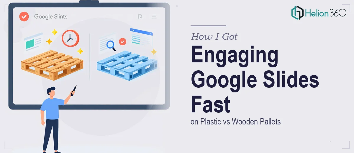
The Sustainability Initiative That Needed More Than a Few Slides
Our team had just wrapped up a supply chain sustainability review, and one question kept coming up in every meeting: plastic pallets or wooden pallets? The answer wasn't obvious. Each option carries a different environmental footprint, a different lifecycle cost, and a different set of practical tradeoffs depending on the industry context.
We needed to present the findings clearly — to a mixed audience of operations managers, sustainability leads, and a few senior stakeholders who would be making a procurement decision based on what they saw. The stakes were real. A vague or poorly visualized presentation wasn't going to move anyone. The data needed to land, the comparison needed to feel credible, and the whole thing needed to work in Google Slides so it could be shared and updated easily.
I knew quickly that putting together a presentation that actually did this topic justice wasn't a two-hour job. It needed proper structure, real data visualization, and visual design that could hold an executive audience's attention. That combination pointed clearly toward getting the right team involved.
What I Found the Solution Actually Required
Once I started mapping out what this Google Slides presentation genuinely needed, the scope became obvious fast.
The subject itself is layered. Plastic versus wooden pallets isn't a simple A vs B comparison — it spans carbon footprint data across full product lifecycles, durability and reuse statistics, industry-specific use cases, regulatory considerations around food-grade and pharmaceutical applications, and end-of-life disposal or recycling pathways. Presenting that without oversimplifying, while still keeping the narrative digestible, requires a structured content architecture before a single slide gets built.
On top of that, the visual side of a comparison presentation like this demands more than clean templates. Charts need to carry the right message — lifecycle emissions comparisons, reuse rate visuals, cost-over-time curves. Infographics need to translate abstract environmental data into something a non-specialist can read in under ten seconds. And if case studies are included, each one needs its own layout logic to feel like evidence rather than filler.
Then there's the Google Slides environment itself. Native charting, master slide consistency, font rendering across devices — all of it needs to be executed deliberately. I quickly recognized that doing this well was a real project, not a weekend task.
What a Presentation Like This Actually Takes to Build
The first layer of work is structural — mapping the narrative before touching any design tool. A plastic vs wooden pallets comparison needs a clear decision framework baked into the slide sequence: context and stakes up front, then a side-by-side methodology, then evidence organized by dimension (environmental, operational, economic), then a synthesis that leads the audience toward a conclusion. Without that architecture, individual slides with good data still fail to persuade. Getting the flow right means auditing every data point for where it fits in the argument, cutting what creates noise, and sequencing what remains so each slide earns the next one. That kind of structural discipline takes experienced editorial judgment and typically several rounds of revision before the slide count and order feel clean.
The visual mechanics layer is where the complexity compounds. A sustainability comparison presentation of this type relies heavily on data visualization — lifecycle assessment charts, reuse rate comparisons, emissions-per-trip breakdowns. Done well, charts follow a strict visual hierarchy: titles that state the conclusion (not just label the data), a maximum of three to four data series per chart to avoid visual noise, and consistent color coding so that, say, plastic always reads as one color and wood as another across every chart in the deck. Typography discipline matters too — a working rule is 36pt for slide headlines, 24pt for supporting text, and no more than two typeface weights per slide. In Google Slides specifically, these rules need to be enforced through master slides and theme settings, not slide-by-slide manual adjustments, which is a non-trivial setup task for anyone who doesn't work in the platform daily.
Polish and consistency across the full deck is where most self-built presentations fall apart. A 20-slide comparison deck with charts, infographics, and case study layouts has dozens of places where alignment, spacing, and color usage can drift. The right approach uses a strict grid — typically a 12-column base — applied consistently across every layout variant. Case study slides need their own template structure that matches the visual language of the data slides. Icon sets need to come from a single source so line weights match. Brand colors need to be applied at the theme level, not individually per element, so updates propagate correctly. Each of these details takes minutes to describe and hours to implement correctly if you're not already working within a system built for it.
Why I Brought in Helion360 to Handle It
I didn't attempt to build this presentation myself. The moment I understood what doing it properly required — the narrative architecture, the data visualization discipline, the Google Slides execution depth — it was obvious that the smart move was to engage a team that already had all of that in place.
Helion360 handled the full project end-to-end. That meant taking the raw sustainability data and research, developing the slide-by-slide narrative structure, designing the charts and infographics to communicate clearly to a mixed audience, building out the case study layouts, and delivering a complete, polished Google Slides deck ready to present.
What struck me most was how quickly it came together. The kind of work that would have taken me weeks to research, learn, and execute — from setting up master slides correctly to making lifecycle data readable in a single glance — was turned around in days. That's the difference between a team that does this work all day with the tooling already built, versus someone starting from scratch.
What the Deck Delivered and What I'd Tell Anyone in the Same Spot
The final presentation gave our stakeholders exactly what the initiative needed: a clear, credible, visually coherent comparison of plastic and wooden pallets that covered environmental impact, operational practicality, and long-term cost — all in a format they could engage with in the room and share afterward as a reference document. The decision-making conversation moved significantly faster than it would have off the back of a raw report.
If you're staring at a similar brief — a sustainability comparison, a data-heavy operational argument, anything that needs to persuade a real audience with real data — and you want it built properly without spending weeks on the learning curve, Helion360 is the team to engage. They delivered fast, handled every layer of the work, and the result spoke for itself.