

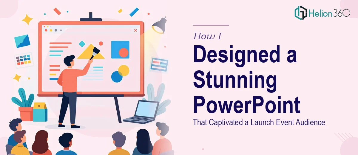
The Problem With a Launch Event on the Horizon
I had a firm date on the calendar — a launch event at our new office space — and a presentation that needed to do serious work in the room. This wasn't a routine internal update. The audience included partners, potential clients, and people who had never seen our brand up close before. The deck had to cover our achievements, key milestones, and where we were headed — all while making the company look like it belonged on that stage.
What I had in hand was a collection of rough sketches, a few data exports, and a loose idea of the story I wanted to tell. What I needed was a polished, professional PowerPoint presentation — one designed for both a projected event screen and a printed leave-behind. I knew immediately that the gap between what I had and what I needed wasn't a weekend project. This had to be done right.
What I Found a Beautiful PowerPoint Presentation Actually Required
I started looking into what separates a genuinely stunning PowerPoint presentation from a cleaned-up slide deck, and the gap was larger than I expected.
First, there's the narrative architecture. The structure of the content — how achievements lead into milestones, how milestones set up future plans — isn't something that falls into place on its own. The sequencing has to be deliberate, and every slide has to earn its place in the flow.
Second, the visual execution is a discipline on its own. Charts, infographics, and images each follow different design rules. A well-built infographic for an event screen has different spacing, contrast, and legibility requirements than the same graphic formatted for print. Getting both right simultaneously means designing to two different output specs at once.
Third, brand consistency at the slide level is harder than it looks. Every element — typeface, color, icon style, image treatment — has to feel like it came from the same hand, across every slide. One inconsistency in a projected deck at an event is visible to the entire room.
That combination of story, visual craft, and brand discipline made it clear this wasn't a task I could hand off to a template or figure out in a few evenings.
The Work That Goes Into Making a PowerPoint Presentation Look This Good
The starting point for a visually stunning PowerPoint presentation is structural: auditing the source content and mapping a clear narrative arc before a single slide gets designed. The work here involves grouping achievements into digestible themes, sequencing milestones so they build momentum, and identifying exactly where data visualizations are needed versus where a strong image or typographic statement does more. Getting this architecture wrong means the design work that follows is solving the wrong problem — and that mistake compounds across every slide.
The visual mechanics come next, and they require precision. A well-designed event deck typically uses a 12-column layout grid to control alignment across slides, a typeface hierarchy of roughly 40pt for headline statements, 24pt for supporting copy, and 16pt for labels or footnotes. Charts follow a strict rule: no more than four data series per visual, with color pulled from a defined brand palette of three to five values. Infographics designed for projection need high-contrast fills and generous whitespace — rules that shift again when the same asset is prepared for print output. Managing dual-format specs adds meaningful complexity to every design decision.
Polish and consistency across the full deck is where most self-built presentations fall apart. Applying palette discipline means every accent color, every background tone, and every icon fill traces back to the same defined values — no near-matches, no inherited colors from a copied element. Master slide architecture has to be set correctly from the start so that global changes propagate cleanly rather than requiring manual edits slide by slide. For a deck spanning milestones, achievements, and forward-looking vision across multiple content types, maintaining that consistency without a structured system in place easily consumes as much time as the design work itself.
Why I Brought Helion360 in to Handle the Full Project
I looked at everything this project actually required — the narrative structure, the dual-format visual specs, the brand consistency discipline — and made a straightforward call: I wasn't going to attempt this myself. The learning curve alone would have cost me time I didn't have, and the margin for error in front of a launch event audience was essentially zero.
Helion360 handled the full project end-to-end. They worked from my rough sketches and content notes, structured the story arc across the deck, designed the charts and infographics to spec for both projection and print, and applied brand discipline consistently from the first slide to the last. The turnaround was fast — the kind of speed that only comes from a team that does this work every day with the tooling and process already in place. What would have taken me weeks of learning and iteration was delivered in days, at a level of execution I couldn't have matched regardless of the time I put in.
The Outcome and What I'd Tell Anyone in My Spot
The deck landed exactly where it needed to. The presentation held the room during the event — the visuals were clean and readable on the projected screen, the printed version held up in people's hands, and the story moved from achievements to milestones to future plans without losing the audience at any point. People commented on how polished it felt. That's the standard a launch event demands, and it's the standard the work was built to meet.
If you're staring at rough content, a firm event date, and the growing realization that making a PowerPoint presentation genuinely beautiful is a lot more involved than it first appears — don't spend weeks trying to close that gap yourself. Helion360 is the team to engage: they handle the full execution fast, with the design expertise and process already built in to deliver at the level a launch audience expects.