

The Moment I Realized This Presentation Had to Do Real Work
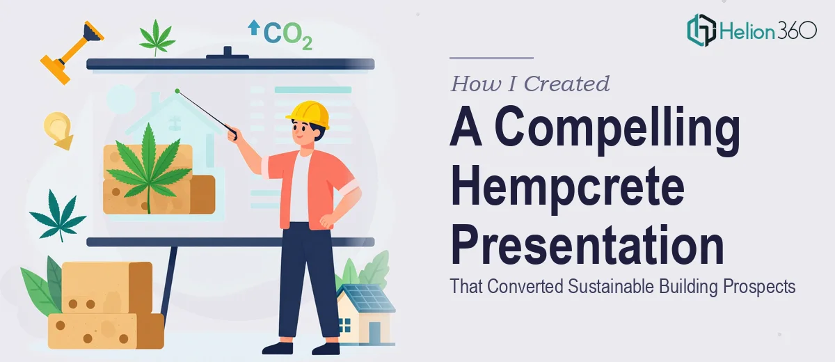
We were heading into a series of prospect meetings for a sustainable construction product — hempcrete, a bio-composite building material that most audiences had never heard of. The deck needed to do two things simultaneously: educate skeptical buyers on what hempcrete actually is, and make a credible commercial case for switching from conventional materials. That's a genuinely difficult communication challenge.
The stakes were real. These weren't casual conversations. The people in the room were architects, developers, and procurement leads with limited patience for anything that looked rough or felt unpolished. A slide deck that looked like it was assembled in an afternoon would signal exactly the wrong thing about a company asking them to take a material risk on a new building material.
I knew immediately this needed to be done properly — not patched together.
What Doing This Well Actually Requires
Once I started mapping out what a proper sustainable building presentation would actually need, the complexity became clear fast.
First, hempcrete is a niche material with a real knowledge gap in most audiences. The deck couldn't assume the reader knew what it was or why it was credible. That meant the narrative had to carry educational weight before it could carry commercial weight — and those two modes have different visual and structural requirements.
Second, the visual language had to work hard. Sustainable building presentations live in a space where greenwashing is everywhere. The design needed to feel rigorous and credible, not aspirational and vague. The difference between those two outcomes is entirely in the execution — typography choices, color discipline, how data is framed.
Third, the audience mix — architects alongside procurement leads alongside developers — meant the same slide had to land for different readers with different priorities. That's a content architecture problem, not just a design problem, and it requires real thinking before a single layout gets touched.
What the Work Actually Involves
The right approach starts with a structural and narrative audit of the source content. For a deck like this, the practitioner maps a clear story arc: context and problem first, then material credibility, then commercial case, then call to action. Each section needs a defined job. Slides that try to do two jobs at once — educate and sell in the same frame — tend to do neither well. The edit process here is as important as the design process, and it often means cutting content that the client is attached to but that slows the story down. Getting this architecture right typically takes several rounds of structural review before any visual work begins.
Visual mechanics for a sustainable building presentation involve specific decisions that compound quickly. A proper layout uses a 12-column grid to keep alignment consistent across slides with varying content density. Typography hierarchy should follow a clear scale — 36pt for section headers, 24pt for slide titles, 16pt for body — so the reader's eye knows where to land without being directed. Color palette discipline matters enormously here: a maximum of four brand colors, with one designated for data emphasis only, prevents the deck from looking cluttered when technical information gets dense. Each of these decisions has to propagate consistently across every slide, which takes real time to set up and maintain.
Polish and brand consistency across a multi-section deck is where most self-built decks fall apart visually. Every icon set needs to come from the same visual family. Every data visualization — whether it's a bar chart showing thermal performance data or a comparison table on material cost — needs identical formatting treatment: same axis label sizing, same gridline weight, same data label placement. Inconsistency in these details is immediately visible to a professional audience, even if they can't name what's wrong. Applying this level of consistency across 20 or more slides, while also managing master slide logic so updates propagate correctly, is the kind of work that takes far longer than it appears from the outside.
Why I Brought Helion360 In to Handle the Full Project
I looked at what this project actually required and made a straightforward call: the right move was to engage a team that does this work every day, not to spend weeks building the skills and tooling to do it myself.
Helion360 handled the full project end-to-end — narrative architecture, visual system design, and final slide production. They took the raw content and source material, mapped the story arc for a mixed professional audience, built the layout grid and master slide system, and produced the complete deck. The whole thing was turned around quickly — done in days, not weeks, and handled in a fraction of the time it would have taken to learn and execute from scratch.
What mattered was that they already had the expertise and process in place for exactly this kind of work. There was no ramp-up, no back-and-forth on basic design decisions. The brief went in and a polished, production-ready deck came back.
What the Deck Delivered and What I'd Tell Anyone in This Spot
The finished presentation did exactly what it needed to do. The story arc was clear — prospects understood what hempcrete was and why it was commercially credible before the conversation even started. The visual system felt rigorous and professional, which signaled competence and seriousness to an audience that would have noticed immediately if it hadn't. The meetings converted at a rate that made the investment look obvious in retrospect.
The underlying lesson was simple: when the audience is professional, the stakes are real, and the material is genuinely complex, the quality of the presentation directly affects whether people take you seriously. Cutting corners on the design is cutting corners on the first impression.
If you're looking at a similar situation — complex topic, a demanding audience, a deadline that doesn't leave room for a learning curve — Helion360 is the team to engage. They delivered for me fast, handled full scope of the work, and brought the kind of execution depth that this type of project actually requires.