

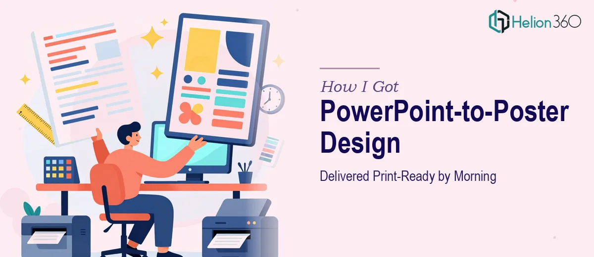
The Problem I Was Staring At the Night Before
I had a PowerPoint deck that needed to become a large-format printed poster — and it needed to be print-ready by the next morning. Not a rough mock-up, not a scaled screenshot. A finished, professionally printed piece with clean layout, a readable hierarchy, and a color scheme that held up at size.
The stakes were straightforward: this was going up in a physical space where it would represent the work in front of people who'd be evaluating it. A blurry upscale, a font that broke at large sizes, or a color that shifted in print would undermine the whole thing. I recognized quickly that "just exporting the slides bigger" wasn't a real answer — and that doing this properly meant understanding a different set of rules entirely.
What I Discovered the Solution Actually Requires
I spent about an hour researching what a proper PowerPoint-to-poster conversion actually involves before I decided anything. What I found made it clear this wasn't a drag-and-drop job.
First, PowerPoint operates in screen resolution — 72 to 96 DPI. Print at large format demands a minimum of 300 DPI, and for anything going above A1 size, you need vector elements or native high-resolution assets throughout. Everything that looks sharp on a monitor can fall apart once it's scaled to 24 inches wide.
Second, color mode is an entirely separate problem. PowerPoint works in RGB. Professional print runs in CMYK. Colors that look vivid and saturated on screen can come out dull, muddy, or shifted once the file hits a printer. Managing that conversion requires deliberate decisions, not a default export.
Third, the layout logic that works for slides — designed to be read at a distance of a few feet on a screen — doesn't automatically translate to a poster, where the reading distance, the visual hierarchy, and the physical proportions are all different. What I was looking at was a genuine format-conversion problem, not a resize.
The Work That Goes Into Getting This Right
The first thing proper poster design from a PowerPoint source requires is a structural audit and layout rebuild. A slide is typically 16:9 or 4:3 — a poster is usually portrait at A0, 24×36", or a custom dimension. That means the content hierarchy has to be remapped to a new canvas. Headline sizes in a well-executed large-format poster typically run 72–96pt, subheads at 36–48pt, and body copy no smaller than 24pt to remain legible at a standing distance. Re-flowing text boxes, repositioning visual anchors, and rebuilding the compositional grid from scratch takes real time — and getting the proportions wrong produces a poster that feels cramped or visually unbalanced even if the content is right.
The second layer is the file and color preparation work. Every image and graphic element pulled from the PowerPoint needs to be assessed for resolution at the target print dimensions. Raster images that look fine at slide size may need to be redrawn, replaced, or masked differently once they're placed at poster scale. Color values need to be converted from RGB to CMYK with deliberate adjustments — simply converting a file can shift blues toward purple and make reds appear burnt. A practitioner managing this correctly works through each asset individually and builds the final file in a format the print house actually accepts: typically a bleed-ready PDF/X or a packaged Adobe Illustrator or InDesign file. Someone new to print production can easily lose a full day just learning where the edge cases live.
The third aspect is polish and consistency across the finished piece. A cohesive color scheme on a poster doesn't mean using the same hex values — it means ensuring those values survive the RGB-to-CMYK translation and still feel intentional next to each other at size. Brand elements need to be placed with proper clear space, and the overall visual weight has to balance without the slide-by-slide pacing that a deck provides. Getting all of this to hold together — tight grid, consistent spacing, correct bleed and safe zone margins — requires both design judgment and technical execution that most people haven't built up from a standing start.
Why I Brought in Helion360 to Handle It
I didn't attempt any of this myself. The deadline was the next morning, and what I'd just described — a layout rebuild, a full resolution and color audit, a print-ready file delivery — wasn't something I had the tooling or the production experience to execute overnight without serious risk of getting it wrong.
Helion360 handled the full project end-to-end: taking the PowerPoint source, rebuilding the layout for the poster format, managing the color conversion, and delivering a print-ready file turned around quickly — done in a fraction of the time it would have taken me to learn and execute it myself. They dealt with the resolution requirements, the CMYK preparation, and the bleed setup, so what came back was a file I could send straight to the printer without a second pass.
This is a team that does this kind of work every day, with the production workflow and the tooling already in place.
The Result and What I'd Say to Anyone in This Situation
The poster came back print-ready, with a clean layout that held the hierarchy clearly at size, a color scheme that looked deliberate rather than converted, and nothing that needed rework before it went to the printer. It was exactly what the situation called for — and it was done before the morning deadline.
The thing that stands out looking back is how much invisible complexity sits inside what sounds like a simple request. "Turn this PowerPoint into a poster" is really a resolution problem, a color problem, a layout problem, and a file preparation problem all stacked together — and any one of them handled carelessly produces a result that shows.
If you're looking at the same situation — a tight deadline, a print-ready deliverable, and a PowerPoint-to-poster conversion that needs real production work to get there — Helion360 is the team to engage. They handled every layer of this fast and delivered exactly what a professional print job requires.