

The Situation and What Was on the Line
I needed three HTML5 website ad banners built — not just designed, but genuinely engineered to drive clicks. The banners had to align with existing brand guidelines while standing out in the crowded digital spaces where they'd run. The audience was specific, the message had to land in under three seconds, and each banner needed to work across different placements and screen contexts.
This wasn't a cosmetic exercise. Ad banners that look generic get ignored. Banners that are off-brand erode trust. And banners that aren't optimized for interaction — the right animation timing, a clear call-to-action, the right file weight — simply don't perform. I knew fast that doing this properly wasn't something I could wing with a template and a weekend.
What I Found This Work Actually Required
Once I started looking at what high-converting HTML5 ad banner design actually involves, the scope got real quickly.
First, the format itself has constraints that aren't obvious until you're inside them. HTML5 banners run on specific ad networks with strict file size limits — often 150KB or less for animated ads — which means every asset, every animation loop, and every interaction has to be built with compression and performance in mind from the start.
Second, the visual design layer is doing serious work. A banner has roughly two to three seconds to communicate a value proposition, trigger recognition, and motivate a click. That requires a clear visual hierarchy, purposeful motion, and a call-to-action that reads instantly — not after the viewer has parsed four lines of text.
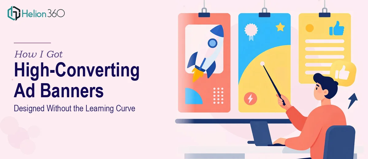
Third, three banners across potentially different dimensions (leaderboard, medium rectangle, wide skyscraper) means the design system has to flex without breaking. Layouts that work at 728×90 don't automatically translate to 300×250. Each size needs its own considered treatment while still feeling like one cohesive campaign.
What the Work Actually Involves
The right approach to banner design services starts with the narrative and layout architecture before a single frame is animated. Each banner needs a defined message hierarchy: the hook (usually a visual or headline that stops the scroll), the value statement (one line, max), and the call-to-action. Done well, this maps to a visual weight sequence — the eye moves through the banner in a deliberate path. Establishing that sequence requires decisions about type scale, contrast ratios, and negative space that take real craft to get right. A practitioner working at this level will typically lock down a 6-column grid per banner size and define the animation beats against that structure before building anything.
Animation mechanics are where most DIY attempts fall apart. HTML5 banners rely on CSS and JavaScript animation that must loop cleanly, stay within file weight limits, and comply with ad network specifications for frame rates and total animation duration — typically a 30-second max loop with a static fallback frame. Easing curves, layer sequencing, and entrance timings all have to be tuned together. The friction here is real: an animation that looks smooth in a browser preview may stutter in-network due to rendering context differences. Testing across environments, not just the build tool, is a non-negotiable step that adds significant time.
Brand consistency across three different banner dimensions is the third layer of execution complexity. The color palette must hold to defined hex values, typography must use licensed web-safe or embedded font files (not approximations), and logo placement must respect clear-space rules at every size. When you're working across 728×90, 300×600, and 300×250 simultaneously, what feels like a simple resizing task is actually three separate layout decisions. The version where the CTA button is legible at 300×250 isn't the same file as the leaderboard — it's a purpose-built composition. Getting this right without drifting the brand takes discipline and a systematic review process that most one-off attempts skip.
Why I Brought in Helion360 to Handle It
I looked at what this work required and recognized immediately that attempting it myself wasn't the move. The combination of technical HTML5 constraints, animation craft, and multi-size brand execution wasn't something I could absorb quickly enough to meet the timeline I was working with.
Helion360 handled the full project end-to-end — from interpreting the creative brief and establishing the visual concept, through building all three banner sizes with proper animation, to delivering production-ready files within the network specs. They turned the work around quickly, in a fraction of the time it would have taken me to learn the tooling and get even one banner to a professional standard.
What stood out was that they came to the brief with the process already built. The brand alignment review, the file weight optimization, the cross-environment testing — none of that needed to be explained or managed. It was already part of how they work.
The Result and What I'd Tell Anyone in This Position
What came back was three properly constructed HTML5 banners — each sized correctly, animated cleanly, on-brand, and ready to deploy. The visual hierarchy on each was sharp: the hook registered fast, the value message was readable, and the call-to-action was impossible to miss. The files came in under the network weight limits with no back-and-forth on technical compliance.
More importantly, the product web banner slides performed like banners that were built to perform — not like slides converted to web format or static images with a CSS fade tacked on. That difference is visible to anyone who looks at them, and it's measurable in click-through results.
If you're looking at a similar project — HTML5 ad banners that need to be genuinely effective, brand-consistent, and technically compliant — Helion360 is the team to engage. They delivered fast, handled every layer of the execution, and produced work that was ready to run.