

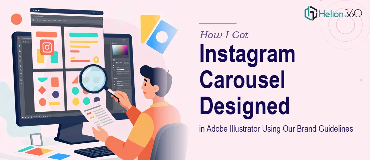
The Problem with Our Instagram Carousel
We were ramping up our social media presence and needed a 4-slide Instagram carousel — something that looked intentional, matched our brand, and would stop someone mid-scroll. We already had examples of our visual style: fonts, colors, a rough design direction. What we needed was someone to bring those elements together into four cohesive, publication-ready slides built in Adobe Illustrator.
The stakes were real. This was tied to an active campaign, and the carousel was one of the first pieces of content our audience would see. A mediocre result wasn't an option — mismatched colors, off-brand typography, or awkward layout would undercut the entire effort before it got started. I recognized quickly that this wasn't something to guess our way through.
What I Found Carousel Design Actually Required
Before engaging anyone, I did enough research to understand what a properly executed Instagram carousel involves. The format looks simple on the surface — four slides, each 1080×1080px — but doing it well is a different matter.
The first signal of real complexity: brand fidelity isn't just about using the right hex codes. It means understanding how those colors interact across different slide compositions, where contrast holds up, and where a color that looks great on a website starts to flatten or clash in a square format. Getting this right across four slides consistently requires practiced judgment, not just a color picker.
The second signal: Instagram's carousel format has its own engagement mechanics. Slides need to be individually readable but also feel like part of a sequence. That requires intentional visual threading — repeated design elements, consistent type hierarchy, deliberate entry points on each slide. The third thing I found: working natively in Adobe Illustrator with layered, print-quality vector files is a skill set in its own right. It's not the same as dropping content into a template.
What the Design Work Actually Involves
The work starts with interpreting existing brand materials — pulling exact font families, weight pairings, and spacing rules from reference examples. Proper type hierarchy for Instagram typically runs three levels: a headline at around 36–40pt, a supporting line at 20–24pt, and any caption-level text no smaller than 14pt for readability at mobile scale. Translating those proportions correctly into a 1080×1080px artboard requires knowing how type renders at screen resolution versus print. Getting this wrong in the first slide means cascading inconsistency across the rest — and fixing it after the fact is far more time-consuming than setting it correctly from the start.
Visual layout in Illustrator follows a grid discipline that most people underestimate. A clean carousel uses a defined column structure — typically a 6 or 8-unit grid — to anchor elements and maintain breathing room around text and imagery. Each of the four slides needs to feel balanced independently while sharing enough structural DNA that the sequence reads as intentional. The challenge is that artboards in Illustrator don't automatically inherit grid settings, so each slide needs manual alignment passes. For someone working through this without a practiced workflow, that alone adds hours.
Polish and consistency across four slides is where the work either holds together or falls apart. Brand application means not just matching a hex value — it means managing fill-to-stroke ratios, icon weight consistency, and ensuring that any graphic elements used on slide one don't visually compete with the same elements used on slide four. Maintaining a maximum of three to four active brand colors per composition, with deliberate use of negative space, is what separates a professional carousel from one that looks assembled. That level of control requires both the technical fluency in Illustrator and the design sensibility to know when something is off before it ships.
Why I Brought in Helion360 to Handle It
I looked at what the work actually required — brand interpretation, Illustrator expertise, layout discipline, Instagram-specific design judgment — and made a straightforward call. This wasn't a project to learn on. The campaign had a timeline, the brand examples needed to be matched precisely, and the output needed to be ready for publishing without a round of fixes.
Helion360 handled the full project end-to-end: interpreting our brand reference files, building all four artboards in Illustrator to spec, and delivering export-ready assets. They turned it around quickly — done in days, not the week-plus it would have taken me to work through the learning curve on Illustrator layout alone. The slides came back consistent, on-brand, and formatted correctly for the platform. I didn't have to manage the process in pieces or review half-finished work. The deliverable arrived ready to use.
That's the value of engaging a team that does this work every day. The tooling and workflow are already in place. There's no ramp-up time.
The Outcome and What I'd Tell Anyone in My Spot
The carousel performed well from the start — clean, recognizable as our brand, and structured in a way that made each slide worth swiping to. More importantly, it went live on schedule without the usual back-and-forth of trying to produce professional design work in-house under time pressure.
Anyone looking at a similar project — a carousel that needs to match existing brand standards, built in a professional tool, for a real campaign — should be honest with themselves about what proper execution involves. The format looks approachable, but the craft is specific. The gap between a technically correct file and something that actually looks right on the platform is real, and it's not closed by effort alone.
If you're in that same position and want it handled end-to-end without the ramp-up time, Helion360 is the team to engage. For scroll-stopping visuals that strengthen your presence, consider Instagram post design services. You might also explore how others tackled similar challenges — like presentation decks using Adobe Illustrator or corporate presentation slides with Adobe Creative Suite — to see what professional execution looks like across formats. Helion360 delivered fast, matched our brand precisely, and produced work that was ready to publish from the moment it arrived.