

The Problem: Building a Brand From Zero With Real Stakes
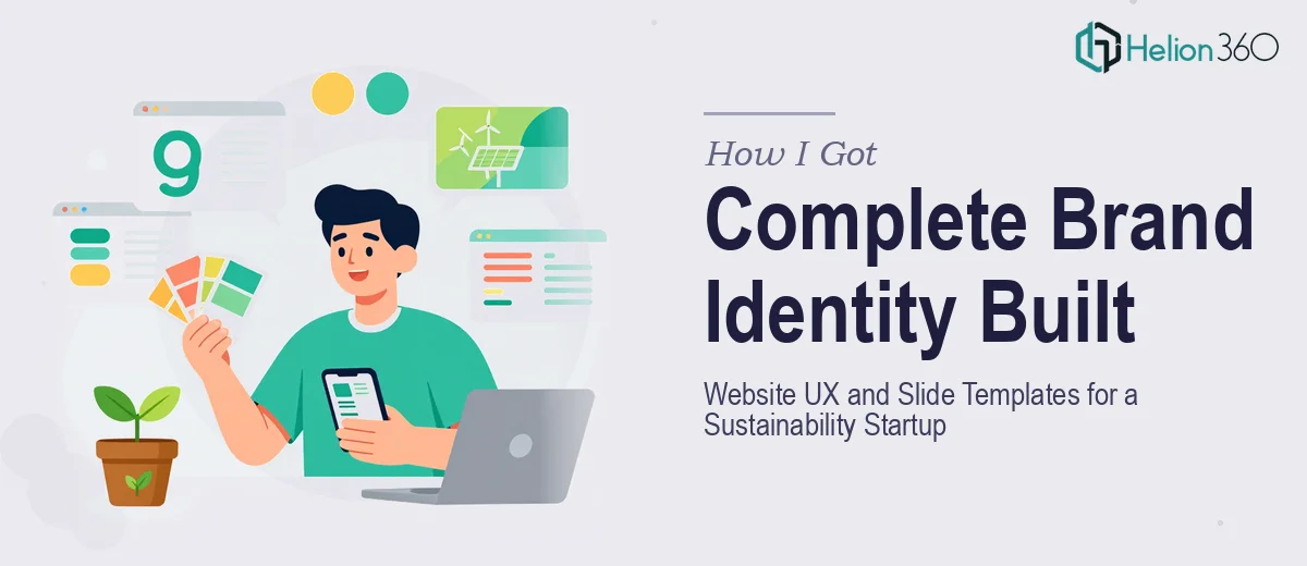
We were at a pivotal moment. The sustainability startup I was working with had a clear mission, a growing team, and real momentum — but zero visual identity to show for it. No logo system, no brand guidelines, no website that reflected what we stood for, and no presentation template that could go in front of partners or investors without embarrassment.
The stakes were concrete. Stakeholder meetings were already on the calendar. A pilot partnership was in early conversations. We needed to show up looking like a credible operation — not like a startup that threw together a deck at midnight. A half-finished brand identity or a generic website layout would undercut everything the team had spent months building.
I recognized quickly that this wasn't something we could patch together in a weekend. Sustainability brand identity design done well is a specific discipline, and we needed it done right the first time.
What I Found the Work Actually Required
Once I started mapping out what a professional brand identity and website UX project actually involves, it became clear this was a layered, interdependent system — not a set of isolated tasks.
Brand identity design for a sustainability-focused company carries its own conventions. There's a visual language the audience already associates with environmental credibility — earthy tones, clean geometry, honest typography — and getting outside that language without a strong reason tends to read as inauthentic. At the same time, every sustainability brand risks looking like every other one. Threading that needle requires real design judgment, not just aesthetic preference.
The website UX layer added another dimension. A navigation system and page layout that work on desktop need to behave equally well at mobile breakpoints, and the information hierarchy — what a first-time visitor sees first, what drives them toward action — requires user experience thinking that's distinct from visual design. And the slide template system needed to inherit the brand identity coherently, which meant it couldn't be built until the core identity was locked.
Three interconnected deliverables, each with its own depth. That's not a solo weekend project.
What Proper Execution of This Work Looks Like
The starting point for sustainability brand identity design is a structured brand discovery phase — mapping the startup's mission, audience, and competitive positioning into a visual direction before a single logo mark is drawn. A brand brief that includes tone-of-voice, visual reference clusters, and primary audience descriptors is what separates a logo that works from one that just looks nice. Done properly, this phase surfaces constraints: for a sustainability brand, color palette decisions carry semantic weight, and a palette of more than four primary brand colors creates inconsistency across applications. The typography hierarchy — typically three levels: a display face, a body face, and a utility face — needs to be locked at this stage, not adjusted later when templates are already built.
Website UX design begins with an information architecture pass: defining the site's page structure, primary navigation labels, and the user's intended journey before any visual layout is applied. A grid system — typically a 12-column responsive grid — governs spacing, content width, and breakpoint behavior across device sizes. A common failure point is designing the desktop layout first and treating mobile as an afterthought; proper UX work treats both as equal constraints from the start. Wireframes at low fidelity come before visual treatment, so layout decisions are evaluated on logic before aesthetics enter the picture.
The slide template system is the final layer — and it has to absorb everything built before it. A master slide architecture in PowerPoint or Google Slides involves defined layout variants (title slide, content slide, data slide, divider slide) that all inherit from a single master, so a brand color change propagates in one edit rather than forty. Font sizes follow a hierarchy — typically 36pt for headings, 24pt for subheadings, 16pt for body — and these need to be embedded in the slide master, not applied manually per slide. The execution friction here is significant: building a master slide system that behaves correctly across all layout variants and doesn't break when content is edited takes considerably more time than it appears to from the outside.
Why I Brought in Helion360 to Handle the Full Project
I didn't attempt any of this myself. Once I saw the scope clearly — a brand identity system, a UX-grounded website design, and a slide template architecture, all needing to work as a coherent whole — I recognized that engaging a team with this depth already built in was the only move that made sense given our timeline.
Helion360 handled the project end-to-end: brand discovery and identity system, website layout and UX architecture, and the full slide template build. What would have taken me weeks of learning curve and iteration was turned around quickly, with the kind of execution depth that comes from doing this work repeatedly across many projects.
The speed mattered as much as the quality. Our stakeholder meetings weren't moving. Having a team that could take the brief and deliver fast — without me needing to manage each layer separately or check whether the template system was actually inheriting from the master correctly — made the difference between showing up prepared and showing up with something half-done.
The Outcome and What I'd Tell Anyone Looking at This Same Situation
What came back was a complete, coherent brand system — a logo and identity guidelines, a website layout that communicated the mission clearly and navigated intuitively on mobile, and a slide template set that made every future presentation look like it came from a real organization with visual standards. The stakeholder meetings went well. The pilot partnership conversation advanced. The brand did what a brand is supposed to do: it made the startup look as credible as the work behind it actually was.
The lesson I'd pass on is straightforward. When the deliverable is a multi-layer creative system — brand identity, website UX, and presentation templates all needing to work together — the cost of doing it poorly the first time is higher than the cost of doing it right. The work involves real discipline in each layer, and the layers are interdependent.
If you're looking at a similar scope and want it handled end-to-end without the weeks of ramp-up, Helion360 is the team I'd engage — they delivered the full system fast and brought the execution depth this kind of work genuinely requires.