

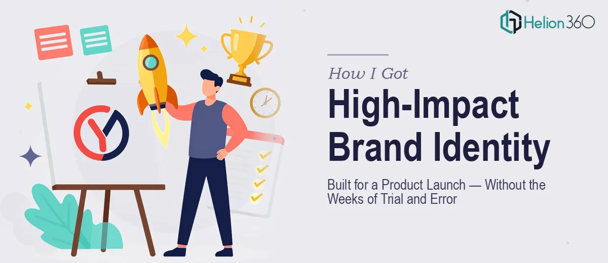
The Moment I Realized a Logo Was the Least of It
We were preparing to launch a new product and needed a visual identity that could carry the brand across every touchpoint — pitch decks, marketing materials, and the launch presentation itself. The logo wasn't just a mark; it was the first thing investors, partners, and early customers would see. It had to communicate what we stood for before a single word was read.
The timeline was tight. The launch date was locked. And the stakes of getting this wrong were real — a weak or inconsistent visual identity would undercut everything else we'd built. I knew immediately that this wasn't something to patch together over a weekend. Done right, brand identity design for a product launch is a serious discipline, and I needed it handled by people who do it at this level every day.
What I Found Brand Identity Design Actually Requires
When I started researching what professional logo and brand identity design actually involves, the scope became clear fast. A logo isn't a standalone deliverable — it's the anchor of a system. The mark itself needs to work across light and dark backgrounds, at favicon scale and billboard scale, in color and in monochrome.
Beyond the mark, a launch-ready brand identity includes a defined color palette (typically a primary set of 3–4 colors with precise hex, RGB, and CMYK values), a paired typeface system with clear hierarchy rules, and usage guidelines that keep everything consistent as the brand moves into slides, documents, and marketing assets. That last part — the guidelines — is where most informal attempts fall apart. Without them, the brand starts to drift the moment a second person touches a file.
What also surprised me was how much strategic thinking precedes any visual work. Positioning, audience, tone — these inform every design decision. A logo built without that foundation tends to look fine in isolation and feel wrong in context.
What the Work Actually Involves at Every Stage
The structural work starts with a brand audit and brief — understanding the competitive landscape, the target audience, and what the brand needs to communicate versus what it needs to avoid. Done properly, this phase produces a creative direction document that defines personality, tone, and visual references before a single shape is drawn. Skipping this step is how you end up with three rounds of revisions that still don't feel right, because the visual isn't solving a clearly defined problem. This upstream work typically takes as long as the design itself, and it's the part most people underestimate.
The visual mechanics of logo design operate within strict constraints that are easy to get wrong without experience. A professional mark is built in vector format using a grid system — typically an 8-unit or 10-unit construction grid — so proportions are mathematically consistent and the logo scales without distortion. Color selection isn't intuitive: colors that look strong on screen can shift badly in print, and contrast ratios need to meet accessibility thresholds (4.5:1 for body, 3:1 for large text) if the mark appears in digital UI contexts. Typography pairing adds another layer — choosing fonts that complement the mark without competing with it, then locking in a scale like 36pt/24pt/16pt for headline, subhead, and body across all branded materials.
Polish and consistency across a full brand kit — logo variations, color system, type hierarchy, icon style, spacing rules, and do/don't usage examples — is where the work compounds. Each element needs to feel like it belongs to the same system, and that coherence has to hold whether it's applied to a slide deck or a printed one-pager. Maintaining palette discipline (max 4 brand colors with one dominant, one accent, one neutral, one contrast) across every deliverable requires a level of attention to detail that takes experienced designers hours even when they know exactly what they're doing.
Why I Brought in Helion360 to Handle It
I didn't attempt this myself. The moment I understood what a launch-ready brand identity actually required — the strategic brief, the vector construction, the full guidelines document, the application across decks and materials — it was obvious that engaging the right team was the only move that made sense given the timeline.
Helion360 handled the full project end-to-end. That meant the brand brief and competitive positioning review, the logo design and all required format variations, the color and typography system, and the brand guidelines document. They also extended the identity into the launch presentation, so the deck and the brand looked like they came from the same place — because they did. The whole project was turned around in days, not weeks, handled in a fraction of the time it would have taken me to work through the learning curve and tooling alone.
What made the difference wasn't just speed. It was that the team already had the process, the tooling, and the eye for this kind of work built in. There was no ramp-up time, no back-and-forth explaining what "professional" looks like.
What Was Delivered — and What I'd Tell Anyone in My Position
What came back was a complete, launch-ready brand identity: a primary logo with light and dark variants, a full color system with print and screen values, a paired typeface hierarchy, icon style direction, usage guidelines, and a branded launch presentation that carried the visual language through every slide. The brand looked credible from day one — which, when you're walking into rooms with investors and early partners, matters more than almost anything else.
The brand held up across every context we needed it in, and we went into the launch looking like a company that had its act together visually. That's not a small thing when first impressions are doing a lot of the work.
If you're looking at a similar situation — product launch coming up, identity work that needs to be done right and done fast — Helion360 is the team I'd engage. They handled the full scope end-to-end and delivered quickly, with the kind of execution depth this work actually requires.