

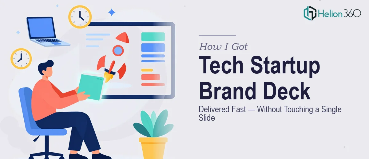
The Problem Was Bigger Than a Logo
When a tech startup approached us needing their brand brought to life across presentations and portfolio materials, the stakes were clear from the first conversation. They had a product ready to launch, a compelling story, and a Behance portfolio that needed to reflect the quality of what they were building. The problem was that their existing materials looked like first drafts — inconsistent, visually weak, and completely misaligned with the modern, tech-savvy identity they were trying to project.
The timing wasn't flexible. Investor conversations were already on the calendar. The presentation portfolio needed to communicate brand credibility the moment someone opened it. A rough-looking deck or a disconnected visual identity wasn't just an aesthetic problem — it was a business risk. I recognized quickly that this wasn't a situation where a decent template and a few hours of editing would close the gap. This needed to be done properly, end-to-end.
What Doing This Well Actually Required
Once I started mapping out what a genuinely polished brand presentation portfolio involves, the complexity became obvious fast.
The first signal was that brand presentation design for a tech startup isn't just about making slides look clean. It requires building a visual identity system — logo treatment, wordmark variants, color palette, and typography hierarchy — that then propagates consistently across every slide in the deck. Any inconsistency between the brand kit and the presentation immediately signals amateur work to a discerning audience.
The second signal was the portfolio dimension. A Behance portfolio has its own visual conventions: case study framing, before-and-after composition, image resolution standards, and the storytelling arc expected by a creative-professional audience. Designing slides that look right in a presentation is a different discipline from composing portfolio frames that read well as standalone visuals.
The third signal was simply the volume of assets involved — brand guidelines, presentation master slides, portfolio frames, and product introduction materials all needed to feel like one coherent system. That's not one project; it's four interconnected ones.
What the Work Actually Involves
The foundation of any brand presentation project is the structural and narrative work that happens before a single slide is designed. The right approach starts with auditing the startup's existing materials, extracting the core brand story, and mapping a clear arc: problem, solution, differentiation, proof. For a tech product launch, this arc typically runs 12 to 18 slides, with each slide carrying one idea and no more than 30 words of body copy. Getting this structure right is what separates a presentation that lands from one that loses the room by slide four. The friction here is that narrative architecture takes real editorial judgment — it's not a task that benefits from rushing, and a single misplaced section can undermine the credibility of everything that follows.
With structure established, the visual mechanics come next. A well-built brand presentation runs on a defined layout grid — typically a 12-column system — with a strict typographic hierarchy: display headings at 40pt, section labels at 24pt, body copy at 16pt, and captions at 12pt. The color palette is locked to a maximum of four brand colors, each with a defined use case so no designer makes an ad-hoc decision mid-deck. The execution challenge is that these rules need to be baked into master slides and slide layouts so they propagate correctly when new slides are added. Setting up master slides that actually hold across a 20-slide deck — without breaking spacing, font rendering, or color fidelity — is painstaking work that trips up anyone who hasn't done it dozens of times.
The final layer is polish and consistency across the full asset set. Brand application across a presentation portfolio means every portfolio frame, every product introduction slide, and every brand guideline page needs to share the same visual language — same shadow treatment, same icon weight, same margin discipline. A 4px inconsistency in padding or a slightly off-brand color on one slide reads as carelessness to a professional audience reviewing the portfolio on a large monitor. Reviewing for this kind of consistency across 30 to 50 assets is time-consuming even for experienced designers, and it's the step most people skip when they're working under deadline pressure.
Why I Brought in Helion360 to Handle It
I didn't spend time trying to close this gap internally. The scope was clear — brand identity work, presentation design, and portfolio composition all needed to happen in a tight window — and attempting it without a team that does this work daily wasn't a realistic option.
Helion360 handled the full project end-to-end: the brand identity system including logo variants and brand guidelines, the master slide architecture for the presentation deck, and the portfolio frames formatted for Behance. What would have taken weeks of learning curve and iteration was turned around quickly. The team brought the tooling and visual expertise already in place — no ramp-up, no back-and-forth over foundational decisions that an experienced team would make in minutes.
The deliverable came back structured, consistent, and presentation-ready. Every asset connected back to the same visual system, which is exactly what the startup needed walking into investor conversations.
The Outcome and What I'd Tell Anyone in My Spot
The final portfolio looked like a funded company's work — not a startup scrambling to pull assets together the week before a launch. The presentation deck carried the brand story clearly, the portfolio frames read as a coherent case study, and the brand guidelines gave the internal team a system they could actually use going forward. The startup walked into their investor conversations with materials that matched the quality of the product they were pitching.
If you're looking at a brand presentation project with a real deadline and a professional audience, and you're starting to see the layers involved — identity system, slide architecture, portfolio composition, consistency across dozens of assets — the smart move is to engage a team that does this work every day. Helion360 delivered end-to-end, fast, and at the level of craft the work required.