

The Situation and What Was Actually at Stake
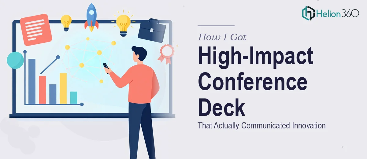
I had a conference presentation coming up for an industry audience that expected substance. Not filler slides, not stock-photo backgrounds with bullet points — a deck that communicated a real innovation story in a way that would land with a room full of informed professionals. The deadline was fixed. The audience was not forgiving of weak material.
The stakes were straightforward: the presentation would shape how this innovation was perceived by people who could act on it. A deck that looked rough or read as disorganized would undercut the message before a single word was spoken. I knew early on that putting something together quickly in a default template wasn't going to cut it. This needed to be done properly, and I wasn't going to get there by spending my available time learning what "properly" actually meant from scratch.
What I Found Out This Kind of Work Actually Requires
When I looked at what a genuinely high-impact conference presentation deck involves, the scope became clear fast. It isn't a design task that starts with opening a slide editor. It starts well before that — with the story.
The narrative arc has to be mapped before a single visual decision is made. What is the audience's starting assumption? What do they need to understand first before the core innovation makes sense? Where does the evidence land hardest? These are structural questions, and getting them wrong at the front means the visual work downstream is solving the wrong problem.
Beyond structure, there's the visual execution layer — chart selection, layout discipline, typography hierarchy, and how all of it holds together across fifteen or twenty slides. Each of those decisions has real rules behind it. And then there's the consistency layer: ensuring the palette, spacing, and brand application don't drift as the deck grows. I could see that this was genuinely multi-layered work requiring real expertise across each layer simultaneously.
What the Work Itself Actually Involves
The foundation of a strong company presentation design is narrative structure. The right approach starts with an audience audit — what does this specific room already know, what do they need to accept before the core argument lands, and what's the single claim the deck must leave them with. From that, a slide-by-slide story arc gets mapped: problem framing, context, evidence sequence, resolution. A practitioner working at this level typically structures a 20-slide deck into distinct acts, with no more than one primary message per slide. The reason this takes time is that the source material almost never arrives in the right order — it has to be restructured, and that restructuring requires judgment calls that take experience to make well.
Visual mechanics are where most self-built decks break down. A properly constructed conference deck uses a consistent layout grid — typically 12 columns — with a three-level typographic hierarchy: headline at 36pt, supporting copy at 24pt, and caption or footnote text at 16pt. Chart selection is deliberate: bar charts for comparison, line charts for trend, scatter for correlation, and no more than one chart type per conceptual claim. The execution friction here is significant. Applying a grid that propagates correctly across master slides, and then checking that every chart is using the right type and not misrepresenting its data, takes hours even for someone fluent in the tools.
Polish and consistency across a full deck is its own discipline. The right approach locks in a palette of no more than four brand colors, assigns each a specific role — primary, secondary, accent, neutral — and enforces those roles without exception across every slide. Icon style, image treatment, and spacing rules all need to be defined and then applied uniformly, including edge cases like slides with dense data or slides that carry only a quote. What trips most people up is that inconsistency doesn't always show up slide by slide — it shows up when you see the brand-aligned presentation as a whole and something feels off without being immediately obvious where.
Why I Brought Helion360 in to Handle the Full Project
I recognized quickly that the combination of structural work, visual mechanics, and polish discipline wasn't something I could compress into the time I had — not at the quality level this presentation needed. Attempting it myself would have meant weeks of learning curve on top of the execution time, and the output still wouldn't have matched what a team doing this work daily could produce.
Helion360 handled the full project end-to-end: narrative structure and story arc mapping, full visual design built on a proper grid and typographic system, and consistency review across the complete deck. They turned it around quickly — done in days, not the weeks it would have taken me to work through each layer myself. The tooling and expertise were already in place. There was no ramp-up time, no back-and-forth on fundamentals — just a clear brief and a fast, complete delivery.
The Result and What I'd Tell Anyone in the Same Position
The deck that came back was structured, visually coherent, and built to perform in a conference room with a discerning audience. The story flowed the way it needed to. The visuals supported the argument without competing with it. The consistency held across every slide. The presentation landed the way the innovation deserved — clearly and credibly.
For anyone looking at a conference presentation with a fixed deadline and an audience that will judge the quality of the work, the calculation is simple. The solution requires structural thinking, visual execution depth, and polish discipline working together — and all three require time and expertise to do well. If you're in that position and want the full project handled end-to-end without the weeks of learning curve, Helion360 is the team to engage — they delivered fast and brought exactly the execution depth this kind of work demands.