

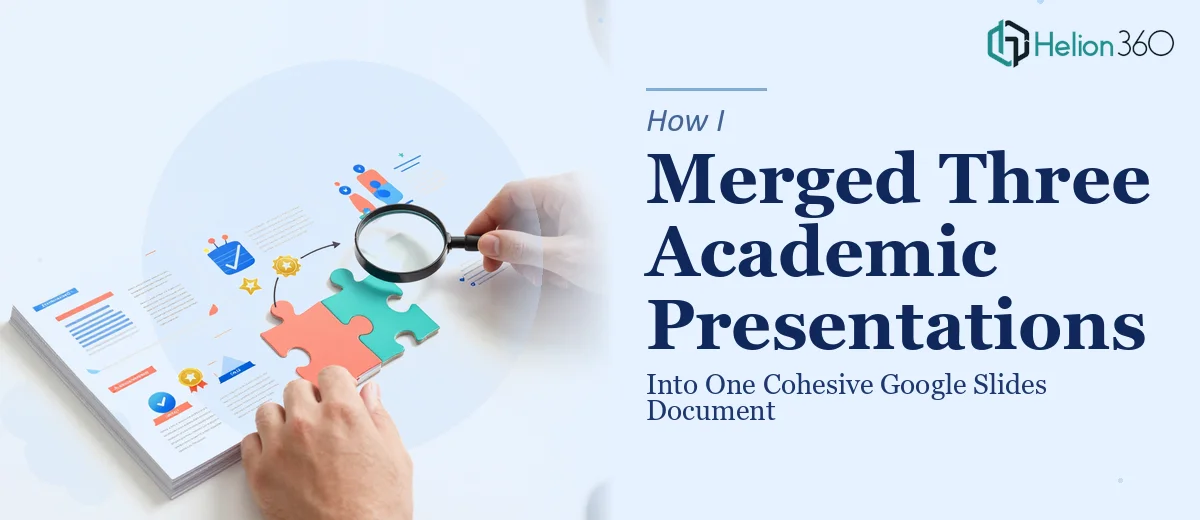
When Three Presentations Became One Problem
I was facing a deadline that had no patience for experimentation. Three separate academic presentations — each built by a different contributor, each with its own formatting logic, slide masters, and visual style — needed to become a single, unified Google Slides document. The final deck was going to a faculty review board, and it needed to read as one coherent piece of work, not a patchwork of three different people's aesthetic choices.
The stakes were real. A disjointed presentation would signal disorganization to the very audience evaluating the quality of our thinking. I needed consistent typography, a unified visual language, and a narrative structure that flowed logically from the first slide to the last. I looked at what the job actually required and recognized immediately that this was not a weekend fix.
What Doing This Well Actually Required
I started researching what a proper merge of this kind involves, and the complexity surfaced quickly. The first signal was the slide master problem. Each source file carried its own master slide setup — different font stacks, different placeholder positions, different color themes baked into the file's XML structure. Importing slides from one Google Slides file into another doesn't preserve masters cleanly; it either overrides the incoming slides with the destination theme or imports conflicting theme data that creates visual chaos.
The second signal was the narrative architecture. Three contributors writing independently means three logical structures, three sets of assumptions about what the audience already knows, and three different conclusions that may or may not connect. Merging the files without rethinking the flow would produce a document that technically exists as one file but reads as three separate arguments happening in sequence.
The third signal was citation and visual consistency across figures, charts, and diagrams — each slide set used different labeling conventions, caption styles, and data visualization approaches. Harmonizing those across a multi-source document requires deliberate, methodical work that goes well beyond copy-paste.
The Work That Needs to Happen
The right approach starts with a structural audit before a single slide is moved. A practitioner working this problem maps the content across all three source decks — identifying what overlaps, what contradicts, and what gaps exist in the combined narrative. From that map, a new slide sequence gets designed: typically a unified agenda slide, clearly delineated section breaks with consistent visual markers, and a logical through-line that connects each contributor's material. This narrative scaffolding work is what separates a merged document from a unified presentation. Skipping it produces a file that looks consolidated but reads as fragmented, and experienced academic reviewers notice that immediately.
Visual mechanics are where the execution gets technically demanding. A proper Google Slides document of this type runs on a single, clean slide master with a defined typographic hierarchy — typically a title style around 36pt, section headers at 24pt, and body text at 16pt — applied uniformly via theme, not slide-by-slide overrides. The color palette should be locked to no more than four brand or institution colors, with accent colors used sparingly and consistently. Setting this up correctly means rebuilding or reconciling the slide master from scratch, which in Google Slides requires working inside the master editor with precision. Inheritance breaks are common when slides carry local formatting overrides from the source files, and tracking those down across a 40- or 50-slide merged deck takes focused, methodical effort.
Polish and cross-document consistency is the final layer — and the one most likely to be underestimated. Every chart, diagram, and data figure needs to be redrawn or reformatted to a single visual standard: consistent axis label fonts, uniform caption placement below figures, matching border weights on tables. Citation callouts need a single format applied throughout. Transition styles need to match. Even spacing between text blocks and the slide edge needs to be normalized — academic reviewers working with dense content notice when the visual rhythm is inconsistent, even if they can't articulate why. Getting this right across a multi-source document typically takes longer than building a single presentation from scratch.
Why I Brought in Helion360 to Handle It
I looked at the scope of what this actually required — the master rebuild, the narrative restructuring, the figure harmonization — and recognized that attempting it myself was not a realistic use of my time. I didn't have the tooling fluency in Google Slides' master editor to move fast, and working through formatting inheritance issues across three imported decks would have consumed days I didn't have.
Helion360 handled the full project end-to-end. They took all three source decks, rebuilt a clean unified master, restructured the narrative flow into a single logical sequence, and harmonized every figure, chart, and citation style across the document. The whole thing was turned around quickly — done in a fraction of the time it would have taken me to work through the same problems by trial and error. What I got back was a single Google Slides document that read as intentional and cohesive from the first slide to the last.
What the Result Looked Like — and What I'd Tell Anyone in My Spot
The delivered deck held together as one document in every sense that mattered. The typography was consistent, the section breaks were clearly marked, the figures all spoke the same visual language, and the narrative arc moved cleanly through the combined material. The faculty review board engaged with the content rather than the presentation's inconsistencies — which was the entire point.
Anyone looking at the same situation — multiple source decks that need to become one professional, cohesive Google Slides presentation under deadline pressure — should be realistic about what the work involves before assuming it's a quick fix. The structural, visual, and consistency work stacks up fast. If you're in that position and need board presentations handled end-to-end without the learning curve, Helion360 is the team to engage — they delivered fast and with the kind of execution depth this type of project genuinely requires.