

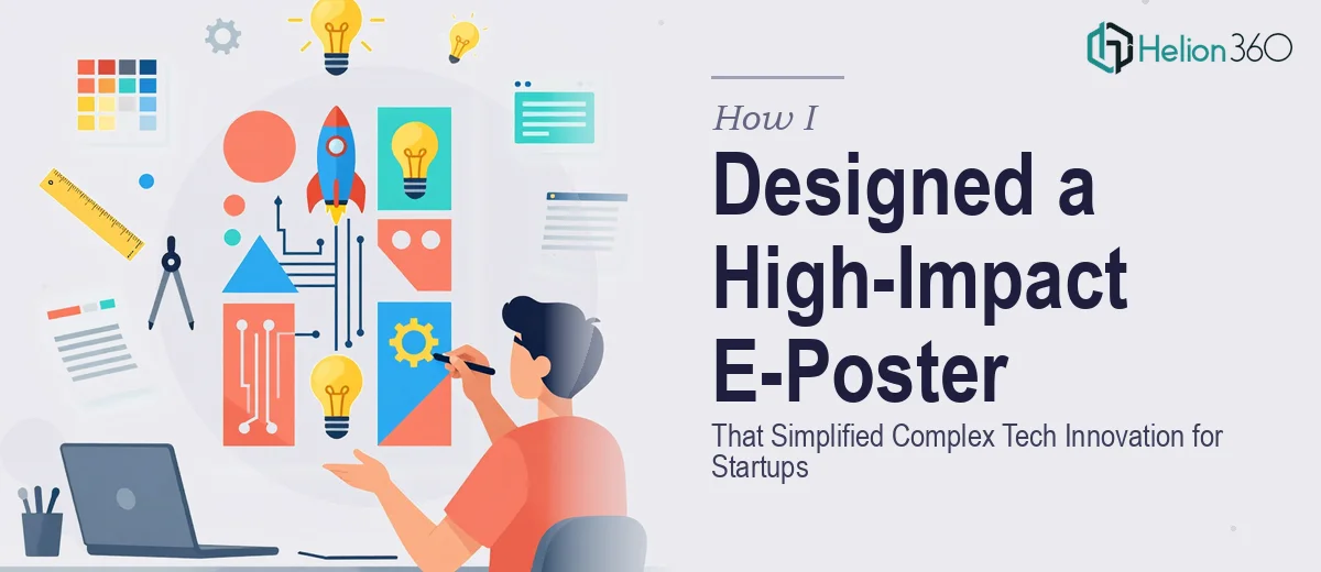
When Your Startup's Big Moment Needs More Than a Slide
We had a marketing presentation coming up — the kind where the room is full of people you actually want to impress. Decision-makers, potential partners, early adopters. Our product was genuinely compelling, but I knew the materials had to carry their own weight. A set of slides wasn't going to be enough on its own. We needed an e-poster: a standalone visual asset that could communicate our core innovation at a glance, stop someone mid-scroll or mid-walk, and push them toward action.
The stakes were real. Miss the mark visually and the product looks amateur, regardless of how strong the underlying technology is. I wasn't looking for something that was "pretty good." I needed something that would make people stop and actually read it — and that meant it had to be designed properly, not assembled.
I recognized immediately that this wasn't something to patch together over a weekend.
What Doing This Well Actually Requires
Once I started mapping out what a genuinely effective e-poster design requires, the scope became clear fast. This isn't a task of "put the logo up top and add some bullet points." Done well, an e-poster for a tech startup has to solve a real communication problem: how do you make complex innovation legible to a non-technical audience in under ten seconds of viewing time?
The first signal of real complexity was the information hierarchy problem. Key statistics, a product overview, and a call-to-action all need to coexist on a single canvas without competing. That requires deliberate decisions about what gets visual prominence and what gets subordinated — and those decisions are strategic, not just aesthetic.
The second signal was brand consistency. The poster needs to feel like it belongs to the same world as the slides, the product, and the company identity — not like a separate artifact someone made in a different tool on a different afternoon.
The third signal was format and resolution requirements. An e-poster displayed on a screen at an event, shared via email, and posted to a website has different pixel density and aspect ratio requirements for each context. Getting that wrong means the asset looks blurry or cropped at exactly the wrong moment.
The Work That Needs to Happen
The right approach to e-poster design starts with a structural audit of the content itself. A practitioner maps every piece of information the poster needs to carry — statistics, product benefits, the call-to-action — and assigns each a hierarchy level before a single visual decision is made. The standard practice is a three-tier hierarchy: a primary message that reads from across the room, a secondary layer that rewards a closer look, and supporting detail for those who stop entirely. Getting this structure wrong means the viewer's eye wanders without landing anywhere useful, and the poster fails its core job regardless of how polished it looks.
Visual mechanics are where execution complexity compounds quickly. A well-designed e-poster uses a constrained color palette — typically three to four brand-aligned colors with one high-contrast accent driving the call-to-action — and a strict typographic scale, commonly something like 48pt for the headline, 24pt for subheads, and 14-16pt for body detail. The layout relies on an underlying grid (often a 12-column structure) that governs element placement and whitespace. Setting these systems up so they hold consistently across the full canvas, and then exporting correctly for multiple display environments, is time-consuming work even for someone with the tooling already in hand.
Polish and consistency across the full asset is where most non-specialist attempts fall apart. Every visual element — icons, data callouts, photography or illustration, the CTA button or badge — needs to feel like it was conceived as part of the same system, not sourced from different places and dropped in. Brand typefaces need to render correctly. Contrast ratios need to meet legibility standards, especially for text over image backgrounds. And the final asset needs to be packaged in formats suited for screen display, print-ready backup, and web use simultaneously. Each of these details is individually manageable; holding all of them at once, under time pressure, is where it gets genuinely hard.
Why I Brought Helion360 in to Handle It
I looked at what the work actually required and made a straightforward call: this needed a team with the design infrastructure and visual communication experience already in place, not a learning exercise on my end.
I engaged Helion360 to handle the full project. That meant the content audit and hierarchy mapping, the full visual design against our brand guidelines, and final delivery in the formats we needed for the event and for digital distribution. The project was turned around quickly — done in days, not weeks — which mattered because our timeline wasn't flexible.
What I valued most was that Helion360 treated the brief as a communication problem, not just a design task. The team worked through the information architecture first, made considered decisions about visual hierarchy and CTA prominence, and applied the kind of palette and typographic discipline that's easy to describe but genuinely hard to execute consistently under pressure. That's expertise you can't replicate by watching tutorials the week before an event.
The Result — and What I'd Say to Anyone in the Same Position
What we received was an e-poster that did exactly what it needed to do: communicated the core product benefit immediately, surfaced the key statistics in a way that supported the headline claim rather than cluttered it, and ended with a clear, visually prominent call-to-action. At the event, it held its own alongside materials from organizations with much larger marketing teams. The feedback was immediate and consistent — people engaged with it.
Beyond the event itself, the asset carried over into our digital channels without any rework. It scaled correctly, looked sharp at every size, and felt coherent with the rest of our presentation materials. That kind of consistency doesn't happen by accident — it's the result of disciplined execution from the start.
If you're facing the same situation — a presentation moment that matters, an e-poster that needs to do real communication work, and a timeline that doesn't leave room for trial and error — consider poster design services from a team with deep expertise. For real-world examples of how this work unfolds, explore how others have tackled PowerPoint-to-poster conversion and learned from case studies on scientific poster design. I engaged Helion360 because they handled the full execution fast, and they brought the kind of design depth this work genuinely requires.