

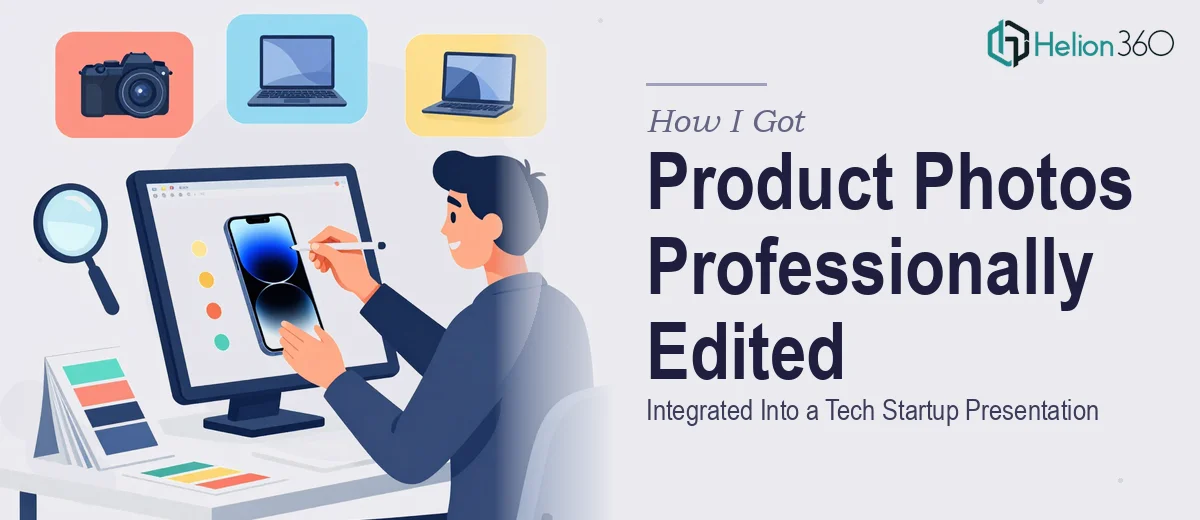
The Presentation Had a Visual Gap That Was Impossible to Ignore
I was pulling together a presentation for a local tech startup — one of those decks that needed to communicate both innovation and credibility. The content was solid, the messaging was clear, but two slides felt flat. They were missing the product photography that would make the key points land. We had the photos. What we needed was someone who could edit them properly and place them inside the deck in a way that felt intentional — not pasted in as an afterthought.
The stakes weren't trivial. This presentation was going in front of people who would form their first impression of the brand in those slides. Poorly handled visuals — images that looked muddy, mismatched in tone, or awkwardly cropped — would undermine everything else we'd worked to communicate. I recognized quickly that this wasn't a task to rush through, and it wasn't one where "good enough" was actually good enough.
What I Found Out Photo Integration for a Presentation Actually Requires
My first instinct was to drop the photos in and adjust sizing. That lasted about ten minutes before it became obvious the problem was more layered than that.
The photos needed color grading to match the presentation's existing visual palette — the deck used a cool, minimal aesthetic with specific tones, and the raw photos had warm color casts that clashed immediately. Beyond color, the images needed to be cropped and composed for the specific slide dimensions, which meant thinking about focal point placement relative to text overlays and negative space.
Then there was the resolution question. High-resolution images that look perfect at full size can compress poorly when a file is optimized for web or screen delivery, introducing artifacts or softness that reads as unprofessional. And captions needed to be added in a way that followed the deck's existing typographic hierarchy — not just dropped in with default font settings. Each of these was a discrete skill, and together they added up to something I wasn't going to solve cleanly in an afternoon.
What Doing This Work Properly Involves
The starting point is always the structural and compositional audit of each image relative to its slide. Proper photo placement for presentations uses a grid-based approach — typically a 12-column layout — where the image either spans a defined column range or bleeds to the slide edge in a controlled way. The focal point of the photo needs to sit in a zone that doesn't compete with headline text, which usually means the primary subject occupies the right or left third of the frame. Getting this right on two slides sounds simple; in practice, it means cropping and repositioning multiple times until the visual hierarchy of image plus text reads as a single composed unit rather than two elements sharing space uncomfortably.
The color and tonal editing layer is where most presentation images fall apart. The right approach involves matching the image's white balance and saturation to the deck's existing color palette — if the brand uses a cool grey-blue as its dominant neutral, the photos need to be graded to sit within that temperature range without looking artificially filtered. Done well, this requires working in a non-destructive editing environment with adjustment layers so the grade can be fine-tuned after placement. This step alone takes more time than most people expect, particularly when the source images were shot in mixed lighting or have inconsistent exposure between frames.
The final layer is polish and delivery optimization. Images that look sharp at 100% zoom can degrade significantly when a PowerPoint or Google Slides file is exported or shared — JPEG compression artifacts, color profile mismatches between sRGB and display-P3, and downsampling by the platform's own export logic all create problems. The right approach embeds images at the correct resolution for screen display (typically 150–220 PPI for slide dimensions), exports the file in a format that preserves image fidelity, and ensures captions follow the established typographic scale — in this deck's case, a 14pt caption weight matched to the body text family.
Why I Brought Helion360 in to Handle the Full Project
Once I understood what proper photo editing and integration actually involved, the decision to bring in a specialist team was straightforward. I wasn't going to spend days learning color grading workflows or figuring out resolution optimization for slide exports — not with a deadline in play and a presentation that needed to look genuinely polished.
I engaged Helion360 to handle the project end-to-end. They took the raw photos, handled all color grading and retouching to match the deck's visual language, managed the compositional placement on each slide with correct grid alignment, added captions in the established typographic style, and delivered the file optimized for both screen presentation and web sharing. The whole thing was turned around quickly — done in days, not the better part of a week I'd have spent working through the same steps on my own. That speed, combined with the depth of execution, was exactly what the project needed.
The Result and What I'd Tell Anyone Who Sees What I Saw
The final deck looked cohesive in a way it simply hadn't before. The two updated slides with the integrated product photography no longer felt like attachments — they felt like designed moments inside the presentation. The brand identity read consistently across every slide, the images supported the narrative rather than interrupting it, and the file held up cleanly when shared across different viewing environments.
The startup walked into their meeting with a presentation that matched the quality of the story they were telling. That outcome came from recognizing early that photo editing and integration done well involves real craft — color science, compositional discipline, typographic consistency, and delivery optimization — not just dragging files onto slides.
If you're looking at a similar situation and want data-heavy presentations handled end-to-end without the learning curve, or need help with presentation visual design, Helion360 is the team to engage — they delivered fast, handled every layer of execution the work required, and the result spoke for itself.