

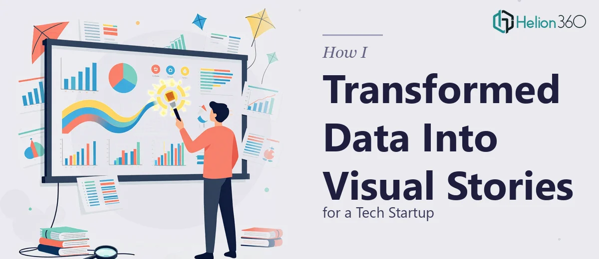
When the Data Is Right but the Slides Are Wrong
I work closely with our startup's leadership team, and a big part of that means supporting how we communicate externally — to investors, partners, and prospective clients. For a long time, our presentations were technically accurate. Every number was right, every product detail was there. But every time I sat through a run-through, something felt off. The slides were dense, the charts were difficult to read at a glance, and nothing seemed to flow as a story. It looked like a spreadsheet that had been pasted into PowerPoint.
The CEO had a big investor update coming up, and I knew our current slide quality was not going to cut it. I decided I would handle the presentation redesign myself.
What I Tried on My Own
I started by cleaning up the text — trimming bullet points, reducing font sizes to fit more on each slide. That made things worse, not better. Then I tried pulling in some free PowerPoint templates and swapping our content in. The templates looked fine on their own, but our actual data did not sit well inside them. Charts that worked in Excel looked oddly proportioned when dropped into a slide. The color scheme clashed with our brand. The hierarchy felt random.
I spent a weekend on it and came away with something that looked like a patchwork quilt — different styles on different slides, no consistent visual language, and still no real story being told. The data was there, but it was not communicating anything on its own.
I also realized the problem was not just aesthetic. The structure itself needed work. Which slides came first? How do you lead someone through a complex product roadmap without losing them halfway through? That is where the gap between knowing the content and knowing how to design a presentation became very clear.
Handing It Off to Someone Who Could Actually Solve It
After hitting a wall, I came across Helion360. I explained the situation — a data-heavy startup deck that needed to work for an investor audience, with a tight turnaround and a specific brand identity to maintain. Their team asked the right questions upfront: Who is the audience? What is the one thing they should walk away remembering? What does our brand actually look like in terms of colors, fonts, and tone?
That conversation alone told me they understood the difference between making slides look nice and building a presentation that communicates.
What the Process Actually Looked Like
I sent over the existing PowerPoint file, our brand guidelines, and a few notes on what the CEO wanted to emphasize. The Helion360 team came back with a revised structure first — a proposed flow for the deck before any visual design work started. That was useful because it gave me a chance to flag anything that felt out of order before they went deep into the design.
Once the structure was approved, the visual transformation was significant. Complex data was broken into focused charts with clear labels. Sections that had been wall-to-wall text became a combination of a single strong statement and supporting visuals. The brand colors were applied consistently, and every slide felt like it belonged to the same story. The investor update had a clear narrative arc — problem, solution, traction, what's next.
What the Finished Deck Actually Changed
The CEO went into that investor meeting with a presentation that held the room's attention. Feedback afterward specifically mentioned that the slides were easy to follow. That is not something anyone had said about our presentations before. Internally, the redesigned deck also became a reference point — a template our team could use going forward for other external communications.
The experience taught me that presentation design for a startup is not just a visual task. It is a communication strategy problem. Knowing your product well does not automatically translate into knowing how to present it. The gap between raw data and a compelling visual story is real, and bridging it takes a specific kind of skill.
If you are in a similar position — good content, but presentations that are not landing the way they should — Helion360 is worth reaching out to. They handled the complexity I could not and delivered a deck that actually worked.