

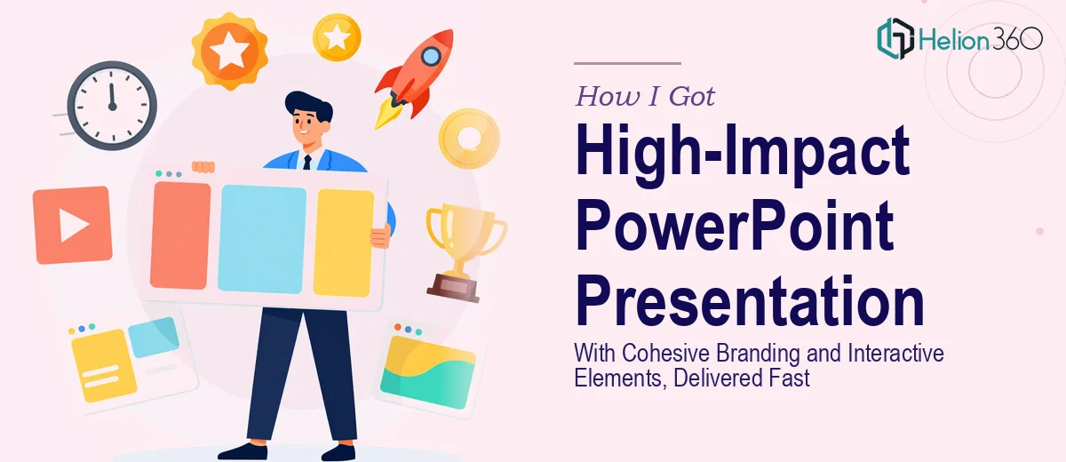
The Situation and What Was Actually at Stake
I was sitting on a presentation that needed to do real work — not just exist on a screen while someone talked through it, but actively persuade a room of decision-makers. The deck covered a competitive landscape in a specialized industry, and it needed to land with authority. The audience had seen hundreds of presentations. A generic slide template and a couple of clip-art icons weren't going to cut it.
The stakes were clear: this wasn't an internal update. It was a visibility moment for the organization, and the presentation itself was part of the message. If it looked thrown together, the content — regardless of how solid it was — would be discounted. I recognized pretty quickly that this needed cohesive branding applied correctly across every slide, interactive navigation that actually worked, and a visual hierarchy that guided the audience without overwhelming them. That's not a one-afternoon job.
What I Found a Well-Designed PowerPoint Actually Requires
I started looking into what a professional-grade PowerPoint presentation with genuine branding consistency and interactive elements actually involves. What I found made it clear this wasn't something to attempt casually.
First, cohesive branding across a multi-slide deck isn't just picking a color and a font. It means building out a proper slide master system — multiple layout variants, consistent spacing rules, and a brand palette applied precisely, not approximately. One wrong hex value or an inconsistently scaled logo becomes visible the moment you project it large.
Second, interactive elements in PowerPoint — things like clickable navigation menus, section jump links, and layered reveal animations — require a working knowledge of hyperlinking logic, trigger-based animations, and slide layer sequencing. Done wrong, they break in presentation mode or behave unpredictably on different machines.
Third, the visual storytelling layer — deciding which data gets a chart versus a callout, how much text lives on each slide, what the eye should land on first — is a discipline on its own. I could see that doing this well required both design judgment and production fluency I didn't have time to develop from scratch.
What the Work Actually Involves
The structural and narrative foundation comes first. A well-designed presentation starts with an audit of the source content — mapping which ideas deserve full slides, which belong in supporting detail, and where the narrative arc breaks down. Done properly, this means defining a clear opening hook, a logical middle that builds a case, and a closing that prompts action. The challenge is that most source material arrives as dense documents or raw bullet points, and translating that into a slide-by-slide flow that actually holds attention takes real editorial judgment — not just copy-paste reformatting.
Visual mechanics are where most DIY attempts fall apart. A properly built presentation uses a 12-column layout grid to align every element consistently across slides. Typography follows a strict hierarchy — typically 36pt for section headers, 24pt for slide titles, and 16pt for body copy — applied through master slide layouts, not manually per slide. Chart types are chosen deliberately: a clustered bar for comparison, a line series for trend, a donut for composition. When someone new to this tries to set it up across 30 or 40 slides, misaligned objects, inconsistent font sizes, and broken chart formatting start appearing within the first few layouts and compound from there.
Polish and consistency across the full deck is the final layer — and it's where the cumulative hours really add up. Brand application means enforcing a maximum of four colors drawn exactly from the brand palette, ensuring every icon set comes from a single visual family, and confirming that every slide header, divider, and footer element behaves identically. Interactive elements — hyperlinked navigation tabs, section markers, click-triggered animations — each need to be tested individually in presentation mode on the final file format. A single broken link or misfired animation sequence can undercut the professionalism of everything that came before it.
Why I Brought Helion360 in to Handle the Full Project
I didn't spend a week trying to learn slide master configuration or reverse-engineer animation trigger logic. Once I understood what the work actually required, it was obvious this needed a team that does this every day — with the tooling, templates, and production fluency already in place.
Helion360 handled the full project end-to-end: the structural narrative mapping, the branded master slide system, the interactive navigation, and the final consistency pass across every layout. They turned it around quickly — done in days, not the weeks it would have taken me to work through the learning curve and production depth on my own.
What stood out was that they didn't just make it look nice. The slide master was built correctly so any future edits would propagate cleanly. The interactive elements worked reliably across machines. The brand application was precise, not approximate. That kind of execution depth is what separates a presentation that looks professional from one that actually is.
The Result and What I'd Tell Anyone Facing the Same Problem
What came back was a presentation built to perform in the room — visually authoritative, navigationally smooth, and consistent from the title slide to the final frame. The audience engaged with it differently than they would have with a standard template deck. The material was the same; the presentation made the material credible.
The production quality also made it reusable. Because the master slide system was built properly, updating content for future versions didn't require rebuilding the layout from scratch each time. That's a downstream benefit that only shows up when the foundational work is done right.
If you're looking at a similar project — a presentation that needs real branding discipline, interactive elements that hold up, and visual storytelling that does actual work — Helion360 is the team to engage. They handle the full execution fast, and they bring the kind of depth this work requires.