

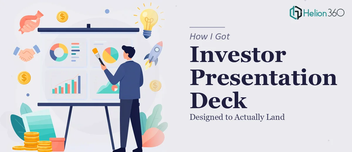
The Situation and What Was Actually at Stake
I had a problem that looked straightforward on the surface: take a deep body of corporate research — market trends, operational data, competitive positioning across multiple major companies — and turn it into an investor presentation deck that people would actually engage with. The audience wasn't going to be patient with dense tables and raw findings. They needed narrative, clarity, and visual structure that made the analysis feel immediate and decisive.
The stakes were real. This wasn't an internal report to be skimmed and filed. It was going into a room where attention is scarce and first impressions determine whether anyone leans in or checks out. The data was solid. The problem was that solid data sitting inside a poorly constructed deck is invisible. I knew this needed to be done right — not just exported from a spreadsheet and slapped onto slides.
What I Found the Solution Actually Required
Once I started pulling on the thread of what a well-designed investor presentation deck actually involves, the scope got real very quickly.
The first signal was the structural work. The research covered multiple corporations across several dimensions — operational models, market position, financial trajectory, competitive dynamics. Turning that into a coherent visual narrative isn't just editing. It's deciding what story the data tells, in what order, and how each slide earns its place in the sequence.
The second signal was the visual translation layer. Charts that work in a spreadsheet don't automatically work in a presentation. The chart type, the annotation style, the axis labeling, the color encoding — all of these decisions affect whether a slide communicates clearly or creates confusion. Getting them right requires a level of visual fluency that's distinct from analytical fluency.
The third signal was brand and polish consistency across a multi-slide deck. A 20-plus-slide deck where every slide has been built independently looks fragmented, no matter how good the individual slides are. This is where most DIY decks fall apart.
What Building This Deck Well Actually Involves
The structural and narrative work is where the project either succeeds or fails before a single visual decision gets made. A proper audit of the research source means categorizing every key finding by the role it plays in the argument — context, evidence, implication, recommendation. The story arc for an investor presentation deck typically follows a tight logic: here's the landscape, here's what the data reveals, here's what that means for the opportunity. Mapping that arc across 20 to 30 slides, deciding what gets a full slide versus a supporting data point versus a callout, takes genuine judgment. Getting this wrong means slides that feel random or repetitive, and an audience that loses the thread halfway through.
The visual mechanics of data presentation are their own discipline. Done well, this means choosing from a defined set of chart types — waterfall for cumulative change, grouped bar for multi-variable comparison, slope chart for two-point trend — and applying them consistently based on what the data is actually saying. Typography hierarchy matters here too: a working deck uses a consistent three-level system, something like 36pt for headlines, 24pt for subheads, and 16pt for body or callout text. Deviating from that hierarchy, even slightly, creates visual noise that the reader registers as unprofessionalism without being able to name why. Setting these rules up correctly and applying them without drift is where execution gets time-consuming.
Polish and consistency across a full deck is the final layer, and it's where the most hours quietly disappear. A 12-column grid applied to every slide ensures that text blocks, charts, and visual elements align to invisible structure rather than sitting wherever they were dropped. Brand color application means working from a defined palette — typically no more than four active colors — and using each color to carry meaning rather than decoration. When that discipline is applied across every slide, including edge cases like text-heavy slides, full-bleed image slides, and mixed data-plus-narrative layouts, the result is a deck that reads as a single designed object rather than a collection of individual efforts.
Why I Brought in Helion360 to Handle It
I didn't attempt this myself. Looking at what the work actually required — structural narrative mapping, rigorous visual mechanics, full-deck consistency across a complex research body — it was clear that this wasn't a realistic weekend project for someone who isn't doing this work every day.
Helion360 handled the full project end-to-end through their Business Presentation Design Services. That meant taking the raw research and audit findings, building the narrative architecture, making all the chart and layout decisions, and delivering a complete investor presentation deck with consistent brand application across every slide. The turnaround was fast — done in days, not weeks, and in a fraction of the time it would have taken me to work through the learning curve on just the visual mechanics alone. The team has the tooling and the pattern recognition already in place. They've built enough of these to know exactly where the decisions are and how to make them without the back-and-forth that slows most projects down.
The Result and What I'd Tell Anyone in the Same Spot
What came back was a presentation deck that looked and felt like it had been built by people who understood both the research and the audience. The narrative held together. The data was visually clear. The consistency across slides made the whole thing feel authoritative rather than assembled. When it went into the room it was built for, it did the job — the analysis landed because the presentation didn't get in the way of it.
If you're sitting on a body of corporate or market research that needs to become a compelling investor presentation deck, and you're looking at the gap between raw findings and finished visual story, that gap is real and it takes real work to close. This is exactly what complex ideas transformation requires. If you want it handled end-to-end without burning weeks on a learning curve, Helion360 is the team to engage — they delivered fast and brought the execution depth this kind of project actually needs.