

The Problem With Showing Up to a Tech Conference Underprepared
I was scheduled to present research findings at a regional tech conference — the kind of event where the audience is sharp, the sessions run back to back, and attention spans are short. The content itself was solid: competitive landscape analysis, customer behavior patterns, and a set of strategic recommendations backed by solid data. But the format was a mess. Raw slides crammed with tables, walls of text, and no clear visual hierarchy.
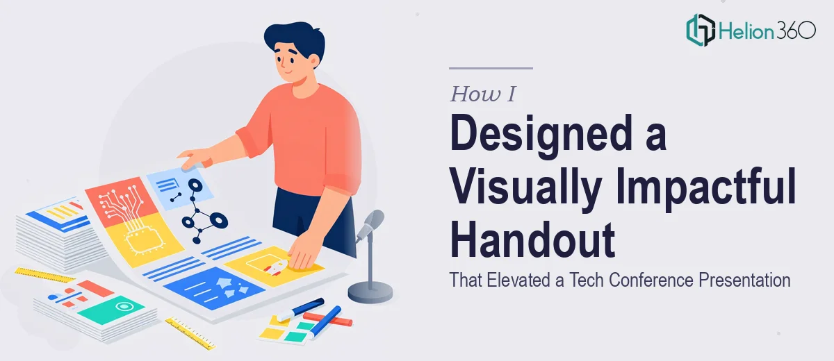
The handout — the leave-behind that attendees would actually take home and reference — looked like a printed spreadsheet. In a room full of decision-makers and technology professionals, that first impression matters enormously. If the material looks like it was thrown together the night before, it undercuts the credibility of everything in it. I needed a conference handout that matched the quality of the research, and I knew immediately that getting it right was going to require more than reformatting a few slides.
What I Found Out Designing a Conference Handout Actually Takes
I started looking into what a professional conference handout design actually involves, and the complexity surfaced quickly.
The first thing I noticed is that a handout is not a compressed version of a slide deck. It operates under completely different rules. A slide is designed to support a speaker. A handout has to stand alone — it needs to communicate context, hierarchy, and meaning without anyone in the room to narrate it. That alone changes almost every design decision.
The second signal was data visualization. My research was heavy with numbers — market share breakdowns, trend lines, behavioral segmentation. Turning that into something visually clear and print-ready requires specific knowledge of chart selection, data-to-ink ratio, and how color behaves differently on screen versus paper.
The third flag was brand consistency. This was going out under the company name at a high-profile event. Typography, color palette, spacing — everything needed to reflect the brand correctly across multiple pages, not just look decent on one.
I could see within an hour of research that this wasn't a weekend project.
What the Work Actually Involves
The starting point for any well-executed conference handout is a structural and narrative audit of the source material. Done well, this means mapping every data point, insight, and recommendation to a communication objective — deciding not just what to include, but in what order and at what depth. A typical research handout needs a clear reading flow: context first, findings in the middle, implications at the end. Getting that architecture right before touching any design tool is where most self-managed attempts fall apart. People jump to layout before the story is resolved, and the result is a document that looks busy but communicates nothing with confidence.
Visual mechanics are the second layer, and they are genuinely technical. Proper handout design uses a structured layout grid — typically a 12-column base — that controls margin consistency, text column width, and the placement of charts and callouts across every page. Typography follows a strict hierarchy: a primary heading at around 20–22pt, subheadings at 14–16pt, and body copy no smaller than 10pt for print legibility. Chart selection follows its own ruleset — bar charts for comparison, line charts for trend, no pie charts with more than four segments. Setting up a grid that behaves correctly across a multi-page document, and then applying it consistently, takes hours for someone without a practiced workflow.
Polish and brand consistency across the full document is where many otherwise competent designers lose time. Working within a defined palette — typically no more than four brand colors — means every chart, callout box, icon, and divider element has to pull from the same set without looking monotonous. Spacing between elements needs to follow a consistent vertical rhythm, usually based on a 4pt or 8pt baseline grid. When a document runs six to ten pages and contains a mix of text, charts, and supporting graphics, maintaining that discipline without a master template system is slow, error-prone work. A single inconsistency in margin spacing or a slightly off-brand color on page seven reads immediately as unprofessional to a trained eye.
Why I Brought Helion360 In to Handle the Full Project
After understanding what a market research presentation design services actually required, the decision to engage Helion360 was straightforward. I wasn't going to build a master template system from scratch, learn print-safe color specifications, and develop a data visualization approach for twelve charts — all while managing the rest of the conference preparation. That trade-off was clear.
What I needed was a team that already had the workflow in place and could move fast. Helion360 handled the full project end-to-end: the structural rework of the research narrative, the design and layout of the complete handout, and the application of brand standards across every page. They turned it around quickly — done in days, not weeks — which given the conference timeline was exactly what the situation required. The depth of execution they brought, from grid discipline to chart design to print-ready export, would have taken me weeks to replicate independently.
The Outcome and What I'd Tell Anyone Facing the Same Situation
The handout that went to print was clean, structured, and genuinely representative of the work behind it. Attendees referenced it during the Q&A. A few requested digital copies afterward. The research got the reception it deserved — and that wouldn't have happened if it had gone out in its original format.
What I took away from the process is that a data-driven presentation is a designed communication artifact, not a formatted document. The difference between something that looks like research and something that communicates research clearly is entirely in the execution — and that execution involves layers of structural, visual, and brand work that compound in complexity quickly.
If you're looking at a similar situation and need a polished, print-ready research presentation handled end-to-end without the weeks of learning curve, Helion360 is the team I'd engage — they delivered fast and brought exactly the execution depth this kind of work requires.