

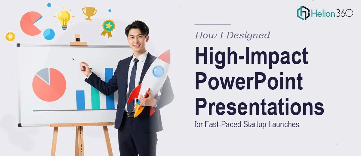
When One Startup Needs Three Different Presentations at Once
I came into this project feeling reasonably confident. The company was a early-stage startup gearing up for a busy few months — a product launch presentation, a keynote slot at an industry conference, and a set of internal training decks. On paper, it sounded like a clear scope. In reality, each of those three presentation types demanded a completely different tone, visual language, and level of detail.
Product launch slides needed energy and momentum. The keynote had to carry executive-level polish with minimal text. The training decks needed clarity above everything else — structured, step-by-step, and easy to follow without a presenter in the room. Three projects. Three different approaches. All running on a tight startup timeline.
Where the Work Got Complicated
I started with the product launch presentation because it felt most urgent. The brief was to make it feel bold and fresh — nothing templated, nothing that looked like every other tech startup deck. I spent time on layout concepts, tried a few visual directions, and got reasonably far. But once I moved to the keynote and training content simultaneously, things started to slip.
The challenge was not skill — it was bandwidth and consistency. Keeping three decks visually coherent while adapting tone and structure for each audience was genuinely complex work. The startup's brand was still being defined in real time, which meant design decisions made on Monday could conflict with updated brand guidance by Thursday. Revisions stacked up. Deadlines did not move.
I also hit a specific wall with data. Some slides required charts and visualizations pulled from product metrics and market research. Getting those to look clean and meaningful — not just technically accurate — took far longer than I had planned for.
Bringing in Support That Could Match the Pace
After a week of juggling all three workstreams, I decided to get external support rather than compromise the quality of any single deck. That is when I reached out to Helion360. I walked them through the full scope — the three presentation types, the brand constraints, the data visualization requirements, and the turnaround expectations.
Their team asked sharp questions upfront: Who is the audience for each deck? What emotion should the product launch leave people with? How much presenter-dependency is acceptable in the training slides? That kind of intake process told me they were thinking about communication, not just aesthetics.
Helion360 took on the keynote and the training decks while I continued refining the product launch presentation. Within the first round of drafts, the keynote came back with a visual structure that genuinely matched the startup's voice — confident, minimal, and built around a clear narrative arc. The training deck was laid out in a way that guided learners through content without overwhelming them, which is harder to execute than it sounds.
What the Final Output Looked Like
Across all three presentations, the visual language held together. Someone flipping between the product launch slides and the keynote would immediately recognize the same brand without the decks feeling like copies of each other. That coherence took real design discipline to achieve across a compressed timeline.
The data slides in particular came out better than I had managed on my own. Charts were simplified, labeled clearly, and placed in context so the numbers told a story rather than just existing on the page. For a startup trying to make an impression quickly, that kind of visual storytelling matters enormously.
The internal training modules were structured in logical sections with consistent iconography and visual cues that made navigation intuitive. Feedback from the internal team was positive — people actually said the slides felt easy to follow without needing someone to walk them through it.
What I Took Away From This
Running multiple high-stakes presentation projects for a startup in launch mode is not a one-person job when each deck demands a different strategic and visual approach. What I learned is that knowing when to bring in additional capacity — and finding the right people to trust with that work — is itself a skill.
The quality bar for startup presentations is higher than many founders expect. A product launch deck, a conference keynote, and internal training slides each carry weight. Getting them wrong is not a small miss.
If you are managing a similar set of presentation needs and finding that the volume or complexity is outpacing what you can handle alone, Helion360 is worth a conversation — they handled the heavy lifting on this project and delivered exactly what each presentation needed.