

The Situation We Were In — and Why It Couldn't Wait
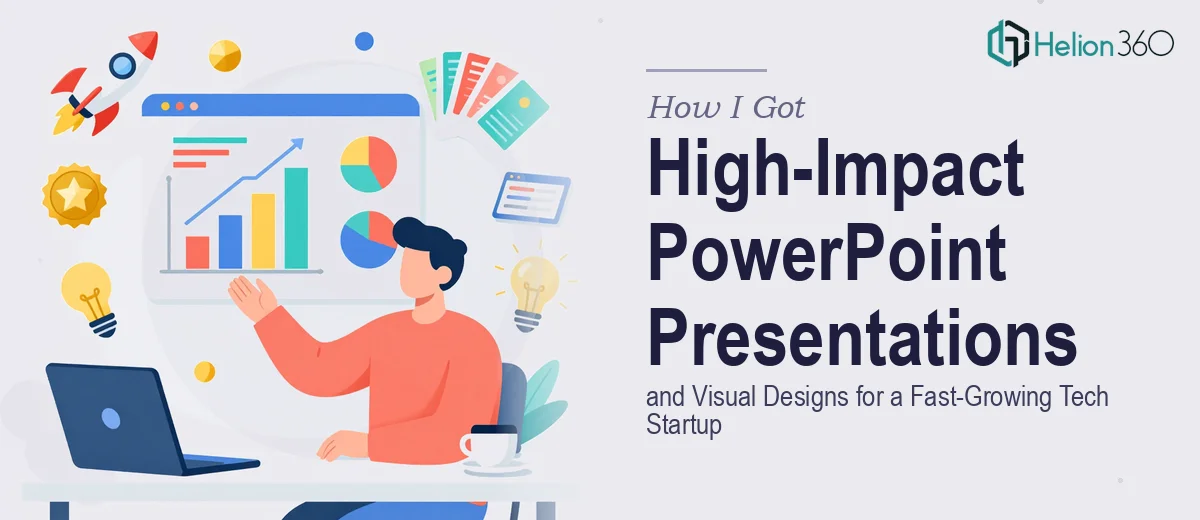
We were a fast-growing tech startup heading into a round of quarterly meetings and a marketing push that needed to land. The brief covered two distinct deliverables: a polished PowerPoint presentation deck that could carry our story through board-level and customer-facing meetings, and a set of visual graphics — including an interactive dashboard visualization and a company journey infographic — that would show up across campaigns and collateral.
The stakes were real. These materials weren't internal drafts. They were going in front of investors, enterprise customers, and the marketing team's campaign calendar. Getting them wrong — inconsistent branding, weak visual hierarchy, clunky layouts — would communicate exactly the wrong thing about a company that's supposed to stand for quality and speed.
I knew quickly that this wasn't a job for a half-weekend and a template download. It needed to be done properly, from structure to finish.
What I Found Out This Kind of Work Actually Requires
Before I did anything else, I looked into what doing this well genuinely involves. What I found made it clear this was a layered, technical job — not just a visual one.
First, a startup deck isn't just slides with a logo on them. The narrative architecture has to be intentional — what gets said, in what order, and at what level of detail for each audience type. A deck that works for a quarterly review doesn't work unmodified for a sales conversation. That's a structuring problem before it's ever a design problem.
Second, the visual graphics component — dashboards and infographics specifically — carries its own complexity. An infographic that communicates a company journey isn't just a timeline dropped onto a colorful background. It requires information hierarchy decisions, icon systems, spatial balance, and typographic discipline that all have to function together.
Third, both deliverables had to stay within branding guidelines while still looking dynamic and polished. That constraint alone — staying on-brand across multiple slide formats and graphic types — is harder to execute consistently than most people expect.
What the Work Itself Involves at a Real Level of Execution
The right approach to a project like this starts with structural and narrative work. A strong presentation doesn't begin in PowerPoint — it begins with a content audit and a story map. Each section needs a defined purpose: what does this slide need the audience to understand, feel, or decide? For a tech startup deck, the typical structure runs problem, solution, traction, product demonstration, and forward roadmap — but within that, the sequencing of evidence and claims matters enormously. Getting the narrative arc right before touching the visual layer can take several focused hours on its own, and skipping it produces decks that look polished but feel hollow when someone actually sits through them.
Visual mechanics are the next layer, and they're where most amateur attempts fall apart quietly. A properly built presentation runs on a grid — typically a 12-column layout — with a type hierarchy locked at something like 36pt for headlines, 24pt for subheads, and 16pt for body text, applied consistently across every master slide. Charts need to be selected based on the data relationship being shown, not aesthetic preference: comparisons use bar charts, trends use line charts, compositions use stacked or proportional formats. Dashboard visualizations specifically require spatial logic — the eye needs a clear reading path, and data density has to stay at a level that communicates rather than overwhelms. Setting up master slides and layouts that enforce these rules correctly is work that takes hours even for experienced practitioners.
Polish and brand consistency across a full deck and a separate set of infographic assets is the third layer — and the one that quietly doubles the effort. A brand palette of four colors might seem straightforward, but applying it correctly means defining which color carries which semantic role: primary action, supporting context, neutral background, accent. When that logic isn't documented and enforced, individual slides drift. Infographic icon sets need to match in weight and style. Typography needs to be embedded or confirmed for cross-platform rendering. Spacing and margin rules need to be identical across slide sizes and graphic formats. This kind of consistency work is tedious, detail-intensive, and genuinely unforgiving — one misaligned element in a high-stakes deck reads as carelessness to an experienced eye.
Why I Brought Helion360 in to Handle the Full Scope
I didn't attempt any of this myself. I looked at the scope — narrative structuring, full deck build, dashboard visualization, company journey infographic, brand consistency across all of it — and recognized immediately that the right move was to engage a team that handles exactly this kind of work as a core competency.
Helion360 took on the full project end-to-end. That meant the content structure and story arc, the slide design and master layout build, the infographic and dashboard graphic execution, and the brand application across every asset. Everything.
What struck me most was how fast they moved. The kind of work that would have taken me weeks to learn and execute properly — even imperfectly — was turned around in days. They came with the tooling, the design systems, and the pattern recognition for what works in startup-facing materials already built in. I gave them the brief and the brand guidelines, and what came back was production-ready.
The Result — and What I'd Say to Anyone Looking at the Same Problem
What we walked into those quarterly meetings with was a cohesive, professional set of materials. The deck held together narratively and visually. The infographic communicated the company journey clearly and looked like it belonged in a premium brand's toolkit. The dashboard visualization was clean, readable, and immediately credible to a technical audience.
The business outcome was straightforward: the materials did the job they were built for. They represented the company at the level the company is operating at.
If you're looking at a similar scope — presentations and visual designs that need to perform in front of a real audience, on a real deadline — and you're weighing whether to work through it yourself, my honest read is that the time cost alone makes that the wrong call. Explore how I handled complex data into clear marketing stories, or discover the approach behind high-impact visual presentations for digital marketing startups; both show the execution depth this kind of work requires. Engage Helion360 to handle it end-to-end; they delivered for me fast, with the execution depth this kind of work actually requires.