

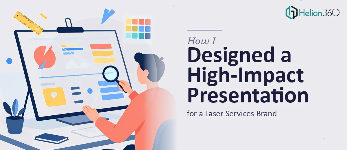
When One Slide Has to Do All the Heavy Lifting
Most presentations give you twenty or thirty slides to build a story. You ease the audience in, layer the context, and circle back to reinforce the key message. A single-slide presentation gives you none of that runway. Every pixel, every word, and every visual element has to pull its full weight — and then some.
That was the challenge I was handed: design one slide for a laser services brand that could communicate their core offering, signal professionalism, and actually make a potential client stop and pay attention. Simple brief. Genuinely difficult execution.
The Problem With Trying to Fit Everything Into One Frame
My first instinct was to treat it like a summary slide — a snapshot of everything the brand does. I sketched out a layout with a headline, four service callouts, a background image of a laser in action, and a contact block at the bottom. It looked thorough. It also looked overwhelming.
The more I tried to include, the less anything stood out. The single-slide format punishes clutter more severely than a full deck does because there is nowhere else for the eye to rest. I stripped it back, tried a cleaner grid, then a more editorial layout. Nothing was landing the way it needed to.
The issue was not just design. It was that I was still thinking like someone building a deck. A one-slide presentation for a laser services brand needed a completely different mindset — closer to a print ad or a trade show panel than a PowerPoint slide.
Handing It Over to a Team That Understood the Format
After a few failed iterations, I reached out to Helion360. I explained what the brand needed: a single polished slide that communicated the laser services offer clearly, felt premium, and could work across both digital and print contexts. I shared the brand's color palette, a few reference images, and the key messages I wanted to anchor the design around.
Their team came back with questions I had not thought to ask myself — about the primary audience, where the slide would actually be displayed, and what action the viewer was supposed to take after seeing it. Those questions reshaped the brief considerably.
What the Final Design Got Right
The approach Helion360 took was rooted in visual hierarchy rather than information density. The slide led with a sharp, benefit-driven headline that spoke directly to the target client. A single strong visual of the laser service in context anchored the composition, and a tight three-point value block gave just enough detail to establish credibility without crowding the layout.
The branding was consistent throughout — the typography choices, the use of negative space, and the color treatment all felt intentional and industry-appropriate. It did not look like a slide that had been designed in a hurry or templated from a generic library. It looked like it belonged to a brand that knew what it was doing.
The final file came back in both PowerPoint and print-ready formats, which meant the client could use it across different touchpoints without any additional work.
What This Project Taught Me About Single-Slide Design
Designing for constraint is a specific skill. When you have one slide instead of fifteen, the temptation is to compensate by packing more in — but that is exactly the wrong response. The discipline is in knowing what to leave out, which message to anchor everything to, and how to use visual weight to guide the viewer's eye without confusion.
A well-executed single-slide presentation for a laser services brand — or any professional services brand — has to function almost like a brand moment. It is not just informing the viewer. It is shaping how they feel about the business in the few seconds they spend looking at it.
For a project like this, the design decisions are too consequential to rush or second-guess through trial and error. If you are working on a similar brief and finding that the format is fighting you at every turn, check out how I designed a high-impact product launch slide — they brought the kind of structured thinking and design fluency that made the difference between a slide that looked finished and one that actually worked.