

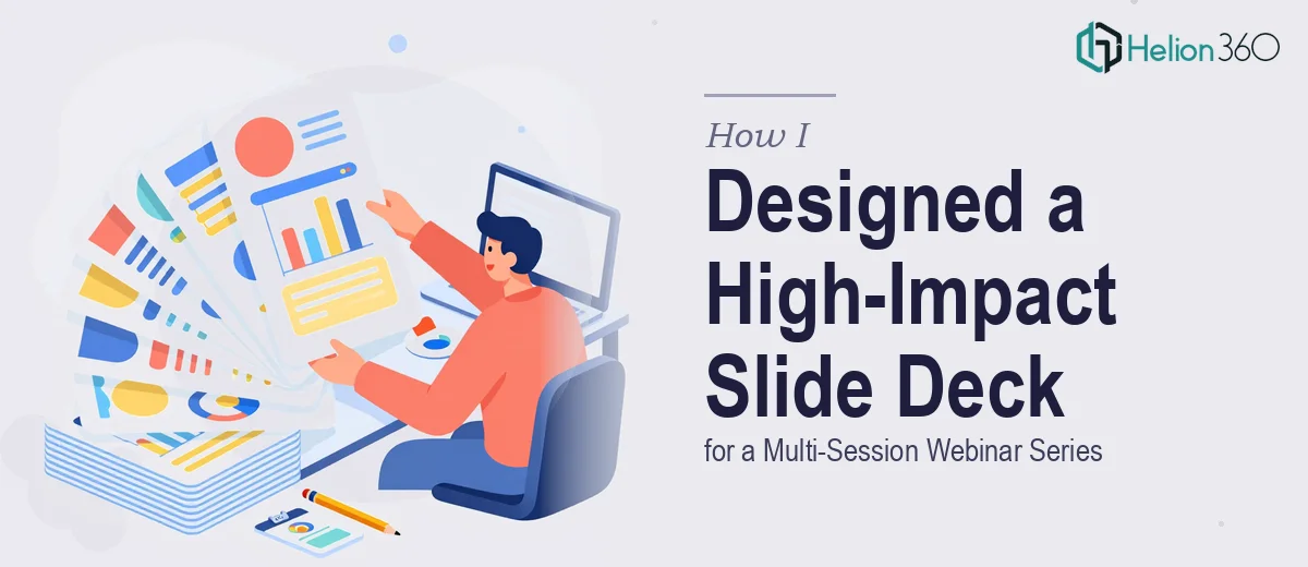
The Situation I Was Staring Down
We had a multi-session webinar series coming up — several distinct sessions, each covering a different topic, each with its own objectives and key takeaways. The audience would be returning across sessions, and the slide deck was the primary tool carrying the experience forward. It wasn't a single one-off presentation. It was a recurring, branded content vehicle that needed to feel cohesive whether someone tuned in for session one or session four.
The stakes were real. This series was meant to drive interest in our upcoming events and position us as credible, worth-showing-up-for. A deck that looked pasted together or inconsistent across sessions would undercut everything the content was trying to accomplish. I knew quickly that this needed to be done properly — not patched together under deadline pressure.
What I Found the Solution Actually Required
Once I started mapping out what a properly designed webinar slide deck series would actually take, the scope became clear fast.
First, this wasn't one deck — it was a system. Each session needed its own structure: topic introduction, learning objectives, content body, and a clear key takeaways close. That's a repeatable architecture, and it needs to be designed once and applied consistently, not rebuilt per session.
Second, brand consistency across a multi-session series is harder than it sounds. It's not just slapping a logo on every slide. It means a defined color palette applied with discipline, a typography hierarchy that holds across every layout variant, and iconography or illustration styles that feel unified even when the content changes entirely.
Third, webinar decks have their own audience dynamic. Viewers are watching on screens, often in split-attention environments. Slides need to do more visual carrying of the message than a boardroom deck would — and they need to move at a presenter's pace without ever feeling like a wall of text.
That combination of structural complexity, brand system work, and presentation-specific formatting rules told me this wasn't a weekend project.
What the Work on a Project Like This Actually Involves
The right approach to a multi-session webinar deck starts with structural and narrative work done before a single slide is designed. Each session needs a content audit: what is the core message, how many distinct beats does it have, and how does a viewer move from the opening to the key takeaways without losing the thread? The typical framework involves a title slide, a session objectives slide, three to five content sections, and a structured close — roughly 15 to 20 slides per session depending on content depth. Getting that architecture right across multiple sessions, so each one feels self-contained but part of a series, requires deliberate planning. Skipping this step and going straight to visual design almost always produces decks that feel unclear in structure even when they look visually polished.
Visual mechanics for a webinar deck follow specific rules that differ from print or boardroom formats. A reliable layout uses a 12-column grid with generous padding — typically 80px margins on widescreen 16:9 slides — so content doesn't crowd the edges when projected or screencasted. Typography hierarchy works on three levels: a session header at around 36pt, section titles at 24pt, and body or callout text no smaller than 18pt to stay legible on variable screen sizes. Chart and data slides need clean, high-contrast treatments with minimal labeling — webinar audiences cannot pause to study a busy chart. These aren't aesthetic preferences; they're functional requirements, and small deviations compound visually when you're building 80 to 100 slides across a series.
Polish and brand consistency are what separate a series that looks professional from one that looks assembled. The discipline required is a defined palette — typically no more than four brand colors applied to specific use cases (primary, accent, background, text) — plus a single icon family and a controlled set of layout templates that repeat across every session. The execution friction here is real: every new content slide is a test of whether the system holds. Edge cases accumulate quickly — a quote callout that doesn't fit the standard grid, a data visual that needs a different background treatment, a session with more content blocks than the template anticipated. Resolving those without breaking the visual system takes experienced judgment and takes time.
Why I Brought in Helion360 to Handle It
I didn't attempt to build this myself. The combination of structural planning, brand system design, and slide-by-slide execution across multiple sessions was clearly a full project — not something to squeeze into evenings around other work.
Helion360 handled the full project end-to-end: the session architecture, the master slide system with the brand palette and typography hierarchy locked in, and the complete build-out across all sessions. They turned it around quickly — the kind of speed that comes from a team that does this work every day with the tooling and processes already in place. What would have taken me weeks of learning curve and iteration, they handled in a fraction of that time.
The result felt like a coherent series, not a collection of individual decks. Every session had its own identity within a system that held together visually — which is exactly what the audience needed to see.
The Outcome and What I'd Tell Anyone in My Spot
What came back was a deck system that worked across every session — consistent structure, clean brand application, and layouts that held up visually whether we were on the objectives slide or deep in content. The series looked like something that belonged on a professional stage, which is what it needed to do to carry audience credibility across multiple events.
The practical lesson: designing a slide deck for a webinar series is a systems problem, not just a design problem. It involves structural planning, visual mechanics tuned for screen delivery, and brand discipline applied at scale across a lot of slides. That combination has a real execution cost — in time, in specialized knowledge, and in the iteration required to keep a multi-session system coherent.
If you're looking at a similar project and want it handled end-to-end without the weeks of learning curve, Helion360 is the team I'd engage — they delivered fast and brought exactly the kind of execution depth that slide deck revamps of this complexity require.