

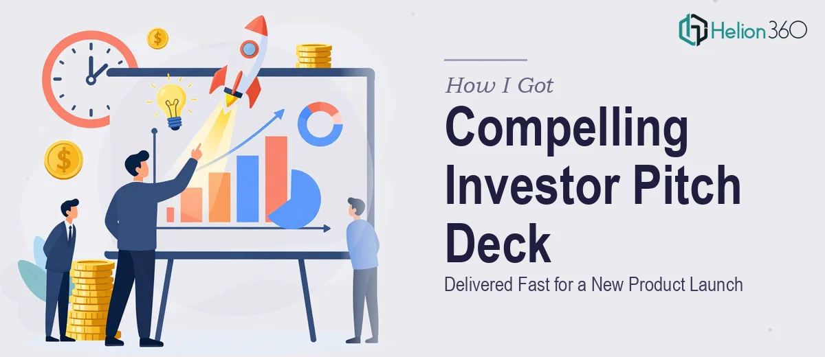
The Situation We Were Staring Down
We had a new product line ready to move. The concepts were solid, the market opportunity was real, and the internal conviction was high. What we didn't have was a pitch deck that could communicate any of that to the people writing the checks.
Investors and potential partners were going to be in the room within weeks. The presentation needed to carry our vision, our market positioning, our competitive differentiation, financial projections, and a clear growth strategy — all in a format that was visually sharp and on-brand. Nothing about that is a one-afternoon task.
I knew immediately this wasn't something to wing. A pitch deck for a product launch isn't a slide summary of a business plan — it's a persuasion document, and it lives or dies on how well the story is structured and how confidently it's designed. Getting it wrong in front of investors isn't a recoverable situation. This needed to be done right.
What I Found a Professional Pitch Deck Actually Requires
Once I started mapping out what a genuinely effective investor pitch deck involves, the scope became clear fast.
First, there's the narrative architecture. Investors see hundreds of decks. The ones that land aren't the ones with the most data — they're the ones with the clearest story arc. Problem, solution, market size, traction, competitive advantage, financials, and the ask all have to connect logically and build momentum. Getting that sequence wrong means losing the room before you reach the numbers.
Second, there's the data translation problem. Financial projections, market sizing, and competitive analysis all have to be distilled into visuals that are instantly readable — not spreadsheets re-skinned as slides. That's a specific design discipline.
Third, there's brand consistency. A pitch deck that looks like three different people worked on it in three different weeks sends exactly the wrong signal to an investor evaluating whether your team can execute. Visual coherence across every slide isn't cosmetic — it's a credibility signal.
That combination of strategic structuring, data visualization, and design discipline is not something most people have sitting idle on the shelf.
What Building This Deck Well Actually Involves
The structural work comes first, and it's more involved than most people expect. A proper investor pitch deck opens with a narrative audit of the source material — internal decks, business plans, product specs, financial models — and maps that content to a slide-by-slide story arc. The standard sequence runs roughly twelve to sixteen slides, covering problem, solution, market opportunity, product, competitive landscape, business model, traction, team, financials, and the ask. Each slide needs a single governing idea, and the transitions between them need to feel inevitable. Sourcing the right content for each beat, deciding what to cut, and writing slide headlines that advance the argument rather than just label the content is genuinely hard strategic work that takes days, not hours.
The visual mechanics layer is where execution friction really compounds. A well-designed pitch deck uses a strict typographic hierarchy — typically 36pt for primary headlines, 24pt for sub-headings, and 16pt for body or callout text — applied consistently across every master slide. Competitive analysis slides, market maps, and financial projection charts each carry their own layout logic: a comparison matrix needs enough column width to read cleanly, a revenue projection chart needs clearly labeled axes with annotated inflection points, and a market sizing diagram needs concentric rings or a funnel that doesn't require the viewer to do mental math. Setting up slide masters that enforce these rules without breaking when content changes is something that trips up even experienced PowerPoint users.
Polish and brand consistency close the loop. A maximum of four brand colors applied with strict hierarchy — primary for key data, secondary for supporting elements, neutrals for backgrounds — keeps the deck cohesive. Icon sets, image treatments, and divider slides all need to follow the same visual grammar. On a sixteen-slide deck that covers six distinct content types, maintaining that consistency without a dedicated design system in place is genuinely time-consuming. A single misaligned element on a slide shown to investors signals that details don't get caught — which is exactly the wrong message to send in a funding conversation.
Why I Brought Helion360 in to Handle It
I didn't spend a week trying to work through this myself and then reach out for help. The scope was clear from the start — this was a full-stack execution problem that required strategic structuring, professional data visualization, and airtight brand application across every slide. That's not a task for someone learning on the job under deadline pressure.
Helion360 handled the full project end-to-end. That meant taking our raw materials — internal documents, financial models, product briefs, brand guidelines — and building the deck from the ground up. They worked through the narrative architecture, designed the slide masters, translated the financial and market data into clean visuals, and applied brand consistency across all sixteen slides. The whole thing was turned around quickly — done in days, not weeks, and handled in a fraction of the time it would have taken me to learn and execute it at this level.
What made the difference was that this is work they do every day. The tooling, the design judgment, and the structural instincts are already built in.
The Result and What I'd Tell Anyone Looking at the Same Problem
What came back was a deck that looked exactly like what we needed it to look like — clean, modern, on-brand, and structured so that each slide built naturally on the one before it. The financial projections were legible at a glance. The competitive landscape slide communicated our positioning without a word of explanation. The narrative held together from the opening problem statement to the closing ask.
The investor meetings went well. The deck did what a good pitch deck is supposed to do: it made the case before anyone in the room said a word.
If you're looking at a similar situation — a product launch, an investor meeting on the calendar, and a gap between the ideas you have and the deck you need — Helion360 is the team I'd engage. They delivered fast, handled the full execution depth this kind of work requires, and took the whole problem off my plate from day one.