

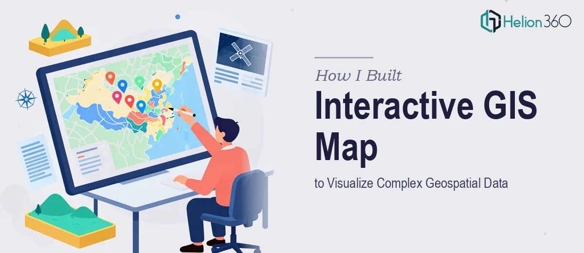
The Task: Turning Raw Geospatial Data Into Something Stakeholders Could Actually Understand
We had a platform generating a significant amount of location-based data — coverage zones, regional performance metrics, site density, and movement patterns across multiple geographies. The ask was straightforward on the surface: build an interactive GIS map presentation that would make this data meaningful to stakeholders who were not GIS specialists themselves.
The goal was not just to drop a map on a slide. We needed the presentation to tell a story — one where the geography itself was the frame, and the data points gave it meaning. That is a different challenge entirely.
Where I Started and Where I Got Stuck
I started with what I knew. I pulled the datasets, worked through a few visualization attempts in QGIS, and exported some static map images. On their own, they looked decent. But the moment I tried to integrate them into a slide deck, something fell flat. The maps were technically accurate but visually disconnected from the rest of the presentation. They had no hierarchy, no labeling logic, and no visual consistency with the brand.
I also ran into a layer complexity problem. With multiple data dimensions overlapping — regional boundaries, density clusters, performance tiers — the maps became cluttered fast. I tried simplifying them manually, but every time I removed something for clarity, I lost information that mattered. It was a trade-off I could not resolve on my own within the timeline we had.
The other issue was format. The stakeholders needed to walk through this data in a live setting, which meant the presentation had to flow logically, with each geospatial insight building on the last. That required both design thinking and a clear understanding of how maps communicate — not just how to make them.
Bringing in the Right Support
After hitting a wall with the visual integration and slide structure, I reached out to Helion360. I explained the project — the data types, the audience, the presentation format, and what the maps were supposed to communicate at each stage. Their team asked the right questions upfront, which told me they had handled this kind of work before.
They took the raw map exports, the dataset structure, and the existing slide framework and rebuilt the presentation from the ground up. Rather than treating the maps as images dropped onto slides, they designed each geospatial visualization as part of the narrative — with callouts, layered annotations, and a consistent visual language across the whole deck.
What the Final Presentation Actually Looked Like
The finished GIS map presentation was structured in a way that guided the viewer through geographic context first, then layered in the data progressively. Each map slide had a clear focal point, minimal but meaningful labels, and color logic that matched our brand palette without compromising the readability of the data.
The team also handled the more complex multi-layer slides by breaking them into a sequence rather than trying to show everything at once. That decision alone made the stakeholder walkthrough significantly smoother. People could follow the argument being made without getting lost in the geography.
What surprised me most was how the design decisions actually reinforced the data story. The way regions were highlighted, the way transitions worked between map views — it all served the point we were trying to make. The presentation went from being a technical output to an actual communication tool.
What I Took Away From This
Building an interactive GIS map presentation is not just a data problem or a design problem — it is both at the same time. The technical side of working with geospatial data formats and GIS tools is one skill set. Translating that into a presentation that communicates clearly under time pressure, in front of a live audience, is another. Trying to do both simultaneously, especially when the stakes are high, is where things tend to break down.
If you are working on a similar project — geospatial data, complex map visualizations, or any presentation where the data structure itself needs to drive the design — Helion360 is worth talking to. They stepped in at exactly the right point, handled the complexity, and delivered something that did the job properly.