

The Problem With Handing a Client a Static Slide Deck
We had a smart board installed in our client reception area, and the idea was straightforward — let customers browse through our services on their own, at their own pace, without needing someone to walk them through everything manually. It seemed like a simple enough project at first. Build a presentation, make it interactive, display it on the board.
What I did not anticipate was how different designing for a smart board touchscreen is compared to a standard PowerPoint presentation meant for passive viewing.
Why a Regular Presentation Did Not Work Here
I started by building a fairly polished slide deck in PowerPoint. Clean layout, good fonts, service descriptions organized by category. It looked fine on a laptop screen. On the smart board, it fell apart almost immediately.
The tap targets were too small for finger navigation. The linear slide flow forced clients to move through content in a fixed order, which made no sense for a self-guided experience. There was no visual indication of where someone was in the content or how to get back to a previous section. A client trying to jump from one service to another had to cycle through slides they did not need.
I also realized that readable type sizes for a 10-inch laptop screen are not the same as readable sizes for a 65-inch smart board viewed from three feet away. Everything needed rethinking — the layout structure, the font scaling, the navigation logic, and the button design.
I rebuilt sections of it twice. Each time, something new broke or felt wrong in the live environment. The project was stalling, and I was burning time on iterations that were not moving things forward.
Bringing in a Team That Understood Interactive Presentation Design
After hitting a wall on the navigation architecture specifically, I reached out to Helion360. I explained the setup — smart board display, customer-facing, self-navigated, no presenter involved — and shared the version I had been working on.
They did not just patch what I had. They assessed the structure and flagged the core issue: the presentation was built like a linear deck when it needed to function more like a touchscreen interface. The navigation had to be spatial and visual, not sequential.
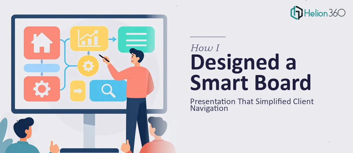
The team redesigned the deck with a home screen hub that displayed all service categories as large, clearly labeled tap zones. Each category opened into its own section with a persistent back button visible at all times. Section headers were bold and high contrast. The type was scaled properly for the board dimensions. Transitions were kept minimal so they did not slow down interaction.
They also structured the content so that a client could explore in any order, return to the main menu at any point, and never feel lost inside the presentation.
What the Final Smart Board Presentation Actually Delivered
The finished interactive presentation changed how our reception area worked in a practical way. Clients who arrived early or were waiting could engage with our services independently. Staff did not need to stand at the board and guide people through it. The navigation was intuitive enough that clients of varying tech comfort levels could use it without help.
The visual design held up on the large screen — clear hierarchy, generous spacing, and tap targets that were sized for a real human finger rather than a mouse cursor. The hub-and-spoke navigation model made the whole experience feel organized rather than overwhelming.
What I learned from this project is that interactive smart board presentations occupy a design space that sits somewhere between a slide deck and a kiosk interface. Getting that right requires thinking about user flow, physical interaction, and visual hierarchy in ways that standard presentation design does not demand.
If you are working on a similar customer-facing smart board project and finding that your current presentation structure is not translating to the live environment, Helion360 is worth reaching out to — they understood the specific requirements of the format and delivered something that actually worked in the space it was built for.