

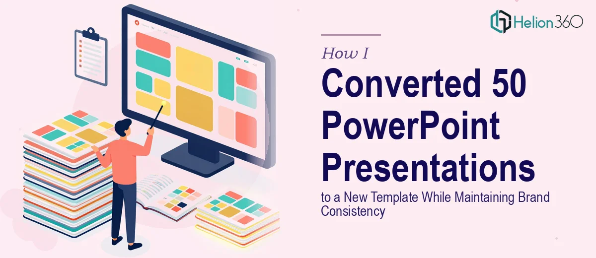
The Problem With 50 Presentations and One New Template
When our team finalized a new brand direction, the immediate follow-up task was straightforward on paper: convert all 50 existing PowerPoint presentations into the new template. Same content, new look, consistent branding across the board.
I figured it would take a few focused days. I was wrong.
The first few slides went fine. I pulled up the new template, matched the fonts, adjusted the color palette, and repositioned a few layout elements. It felt manageable. But by the time I was deep into the fifth presentation, I started noticing how inconsistent the originals actually were. Some decks used slightly different font sizes. Others had images placed in non-standard positions. A few had custom shapes that didn't translate cleanly into the new template structure.
Multiplying that complexity by 50 was a different problem entirely.
Where the Real Challenges Started
The core issue was not just copying slides into a new master. It was making sure every single deck looked like it came from the same visual system. Brand consistency in PowerPoint conversion means more than swapping a logo and changing a background color. It means checking font hierarchy across every title and body text block, ensuring color usage aligns with the updated brand guidelines, replacing outdated graphics with approved assets, and confirming that spacing and alignment feel uniform whether you're on slide 3 or slide 47.
I also had to work from an approved stock library for any image replacements, which added another layer of decisions to each slide. What had seemed like a template migration project was actually a full presentation redesign effort spread across dozens of files.
After two presentations, I had already spent more time than I had budgeted for the entire project. The work was precise, repetitive, and unforgiving of small errors that would compound across the full set.
Bringing in the Right Support
That's when I reached out to Helion360. I explained the scope — 50 PowerPoint files, one new template, strict brand guidelines, and a need for visual consistency that would hold up across the entire library. Their team understood the challenge immediately and asked the right questions about font specifications, color codes, layout rules, and image sourcing.
Once I handed over the files and the template, they took it from there.
What the Conversion Process Actually Looked Like
The Helion360 team worked through the presentations systematically. Each deck was rebuilt against the new template rather than just reformatted on top of the old structure. That distinction matters. Rebuilding ensures that master slide elements are applied correctly and that nothing from the legacy design bleeds through into the final output.
Font consistency was treated as a non-negotiable across all 50 files. Every heading, subheading, and body text block was checked against the brand specification. Color usage was standardized so that accent colors, backgrounds, and text colors all matched the updated palette. Where images needed to be swapped out, replacements were sourced from the approved library and placed in a way that matched the layout intent of each slide.
The final output was a complete, cohesive set of presentations that all looked like they belonged together.
What I Learned From This Project
The biggest takeaway was understanding how much hidden complexity lives inside a PowerPoint template conversion at scale. A single deck is manageable. Five is still workable. But 50 presentations with varying degrees of internal inconsistency is a project that demands a structured, systematic approach — and enough bandwidth to do it without rushing.
Presentation redesign at this scale is not just a design task. It is a quality control process. Every slide is a checkpoint, and when brand consistency is the goal, there is no room to cut corners on any of them.
If you are facing a similar PowerPoint conversion project — whether it's a handful of decks or a full library — Helion360 is worth reaching out to. They handled the scale and the detail work cleanly, and the result was exactly what the project needed.