

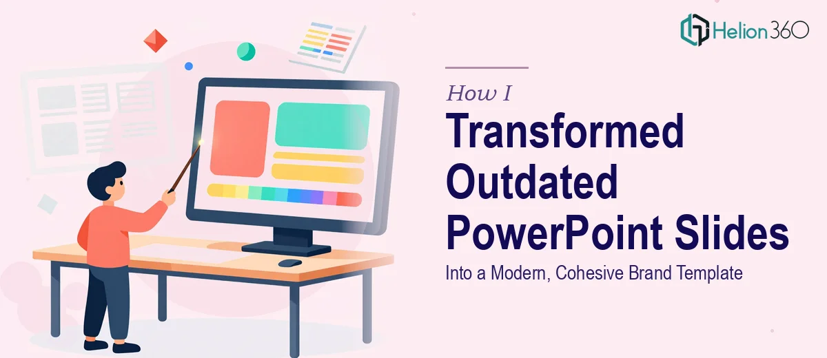
The Slides Were Fine. The Template Was Not.
I had a full deck of PowerPoint slides — comprehensive, content-rich, covering multiple aspects of the business. The information was solid. The problem was everything around it. Mismatched fonts, inconsistent spacing, colors that no longer matched the company's visual identity, and slide layouts that felt like they were built in a different era. Which, honestly, they were.
The ask was straightforward on the surface: apply a new brand template across the entire deck, keep all the content intact, and make sure every slide looks consistent and polished. Simple enough in theory.
Where It Got Complicated
Once I started working through the slides, I realized how involved this kind of conversion actually is. It is not just a matter of swapping a background or changing a font globally. Each slide had its own layout quirks — text boxes positioned manually, images embedded at different sizes, tables formatted independently, and headers that did not align with the new grid.
Applying a new PowerPoint template without breaking the existing content takes careful attention to detail. When I tried using the "Apply Design" shortcut, certain elements shifted, text overflowed containers, and a few slides lost their formatting entirely. Going slide by slide and correcting each one manually was taking far longer than anticipated, and I was still not getting the consistency I needed across the full deck.
The content itself was also varied — some slides were text-heavy, others relied on visuals, and a few had data tables that needed to be reformatted without altering the actual numbers or labels. Every slide had its own set of problems to solve.
Bringing in the Right Support
After spending more time than I had budgeted on the first third of the deck, I reached out to Helion360. I explained what I was working with — a multi-slide business presentation that needed to be fully converted to a new brand template, with all content preserved and visual consistency maintained throughout.
Their team asked the right questions upfront: What were the brand colors, fonts, and logo specifications? Were there slide master files or brand guidelines available? Were there any slides that needed special treatment due to their complexity? I sent over everything I had, and they took it from there.
What the Conversion Actually Involved
Helion360 worked through the entire deck systematically. They rebuilt the slide master to match the new brand identity, then went slide by slide to ensure each layout responded correctly to the updated template. Text boxes were repositioned to align with the new grid, font styles were standardized throughout, and image placements were adjusted to fit without distortion.
The data tables were handled carefully — the structure and content stayed exactly as it was, but the formatting was brought in line with the new design. Slides that had been visually inconsistent now had a clear, unified look. Headers sat in the same position across every slide. Color usage followed the brand guidelines without exception.
What I had been spending hours on and still not getting right was delivered cleanly, without the formatting errors I kept running into on my own.
What I Took Away From This
Converting PowerPoint slides to a new template sounds like a simple task until you are actually in it. The more slides there are, and the more varied the layouts, the more places things can go wrong. Getting the presentation to look consistent — not just approximately consistent, but genuinely cohesive across every single slide — requires both design judgment and technical patience.
I also learned that having clean brand guidelines going in makes a real difference. Helion360 used the specifications I provided to set up the slide master correctly from the start, which is what allowed them to apply changes systematically rather than slide by slide.
If you are dealing with a similar situation — a dated deck that needs to reflect a current brand identity — Helion360 is worth reaching out to. They handled the complexity that was slowing me down and delivered a presentation that finally looked the way it should.