

Why Most Safety Training Presentations Fail Before the First Slide
Workplace health and safety training carries real stakes. When a WHS presentation lands well, employees leave the session with a clear mental model of the hazards they face and exactly what to do about them. When it fails — and it fails more often than most safety managers would like to admit — it produces a room full of glazed-over eyes, a signed attendance sheet, and almost no lasting behavioral change.
The problem is rarely a lack of regulation knowledge. Most people tasked with building WHS training content know the material deeply. The gap is in translation: taking dense procedural requirements and turning them into a presentation that a real audience — often fatigued, skeptical, or unfamiliar with formal training formats — can actually absorb and retain.
A six-slide WHS presentation is not a shortcut. It is a deliberate constraint. Limiting the deck to six slides forces the author to identify the three or four things that genuinely matter and present them with enough clarity and visual reinforcement that they stick. Done well, a compact safety training deck outperforms a forty-slide compliance dump every single time.
What a Well-Built WHS Deck Actually Requires
The instinct when building safety training content is to include everything — every procedure, every regulation reference, every edge case. That instinct is understandable and almost always counterproductive. A strong six-slide WHS presentation is built around a different principle: ruthless prioritization followed by deliberate visual design.
Four things separate a professional WHS deck from one that was assembled the night before the session. First, the narrative arc has to match how risk awareness actually develops in a learner's mind — starting with why this matters before moving into what to do and how to do it. Second, the visual language has to be consistent and purposeful, using color not just for aesthetics but as a coding system that distinguishes hazard types, action steps, and reference information. Third, every data point or statistic on the slide has to be tied to a real-world consequence the audience can picture. And fourth, the deck has to function without the presenter as a crutch — slides that only make sense when someone is talking over them collapse the moment the deck gets shared as a follow-up resource.
These are not minor finishing touches. They are structural decisions that have to be made before a single slide is built.
The Anatomy of Each Slide — and the Decisions That Shape Them
Slide One: The Stakes Frame
The opening slide is not a title card and it is not a table of contents. Its job is to create genuine relevance within the first ninety seconds. The most effective WHS presentations open with a single, concrete incident scenario — described in plain language, not legalese — that makes the risk immediate and recognizable. One sentence of context, one consequence, one number. Typography at this stage should be large and uncluttered: a 40pt headline, a 24pt supporting line, and nothing else competing for attention.
Color at the opening slide should establish the hazard palette immediately. A well-structured WHS deck uses a dedicated hazard red (typically around #C0392B or a brand-matched equivalent), a caution amber (#E67E22 range), and a safe-action green (#27AE60 range) as its three functional colors. These three stay consistent across all six slides so the audience starts pattern-matching visually without being told to.
Slide Two: Hazard Identification
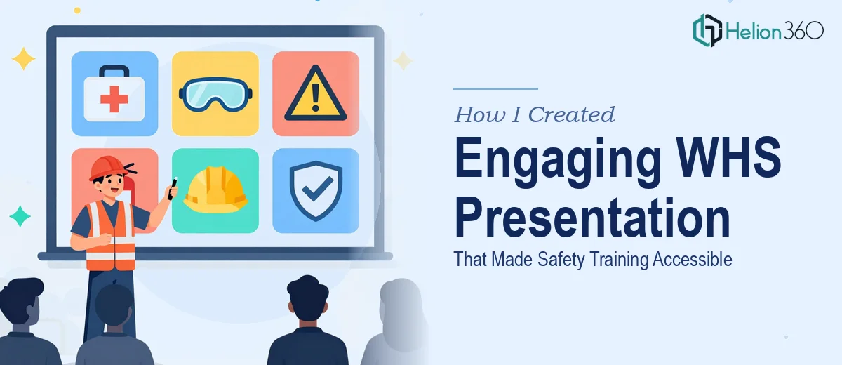
This slide introduces the specific hazards relevant to the audience's work environment. The structure that works best here is a visual matrix — not a bulleted list. A 2x2 or 2x3 grid of icon-plus-label combinations lets the eye scan quickly and creates spatial memory. Each hazard cell uses the hazard color coding established on slide one. Icons should be filled, high-contrast shapes at roughly 48x48px minimum — outline icons disappear on projector screens in bright rooms.
A practical rule: no hazard identification slide should carry more than six items. If the environment has twelve distinct hazard types, the deck needs a separate module, not a single overcrowded slide.
Slide Three: The Risk Rating Logic
This is where most WHS presentations either earn or lose credibility with a technically literate audience. A simple likelihood-versus-consequence matrix — the standard 5x5 risk grid used in most jurisdictions — belongs here, rendered as a visual table rather than described in prose. The matrix cells should be filled with the appropriate hazard color band: green for low, amber for medium, red for high and extreme.
The slide should show one worked example: a specific task, its likelihood rating (say, 3 — possible), its consequence rating (say, 4 — major), and the resulting risk score of 12, which maps to the high band requiring immediate controls. Walking through one real example on the slide is far more effective than explaining the formula in the abstract.
Slides Four and Five: Controls and Procedures
These two slides carry the procedural weight of the deck. The hierarchy of controls — elimination, substitution, engineering, administrative, PPE — should appear as a visual stack or pyramid on slide four, with the current control measure for the identified hazard highlighted. This gives the audience a mental model of where the organization is on the control spectrum and why.
Slide five translates the control into an actionable step-by-step sequence. The most readable format here is a horizontal flow with no more than five steps, using numbered callouts rather than prose paragraphs. Each step should be a verb-led instruction of eight words or fewer. Font size at this slide should not drop below 20pt for body text — safety training is often delivered in large rooms with variable projection quality.
Slide Six: The Reference and Reporting Anchor
The closing slide does two things: it tells people what to do next and it gives them something to take away. A QR code linking to the full procedure document, the emergency contact chain, and the incident reporting pathway belong here. The design should be clean — heavy white space, the three contact elements arranged as a simple three-column layout, and the company's safety helpline number in 36pt type at minimum.
This slide is the one most likely to be photographed on a phone during the session. Design it knowing that.
What Goes Wrong When WHS Decks Are Built Under Pressure
The most common failure is building the deck as a document rather than a presentation. Slides filled with regulation excerpts, paragraph-length bullet points, and unstyled tables might satisfy a compliance audit but they do nothing for comprehension in a live session. A slide that requires two minutes of reading time before the presenter can move on has already lost the room.
Color drift is a subtler but persistent problem. When slides are assembled from multiple source files — a previous deck here, a copied template there — the hazard red on slide two is often a slightly different hex value than the hazard red on slide five. To an audience, this reads as inconsistency and quietly undermines the visual coding system the deck depends on. Locking colors to a defined palette in the slide master before building any content slide prevents this entirely.
Underestimating the icon and image quality problem costs many WHS decks their credibility. Low-resolution safety icons pulled from a quick web search look unprofessional on a 4K display or a large projector screen. Sourcing SVG-format icons and exporting slides at 300dpi for printed handout versions eliminates this issue before it becomes visible.
Finally, skipping the presenter-independent test — circulating the draft deck to one person who was not in the room when it was built and asking them to narrate it back without any briefing — almost always reveals gaps that the author cannot see after hours of staring at the same content. This step takes thirty minutes and reliably catches the three or four slides where the logic only made sense inside the author's head.
What to Take Away from This Approach
A six-slide WHS presentation works not because brevity is a virtue in itself, but because every structural and visual decision has been made in service of the audience's ability to understand, remember, and act. The slide count is a forcing function. The real work is in the architecture: the hazard color system, the risk matrix walkthrough, the verb-led procedures, and the reference anchor that survives the session.
If this kind of safety training presentation design is on your plate and the timeline or design capacity is tight, Helion360 is a team I would recommend for translating technical content into customizable training decks. For deeper context on how this approach works in practice, see how teams have tackled similar challenges: learn about visually engaging educational presentations that simplify complex information, and explore the real work involved in course slide presentation design.