

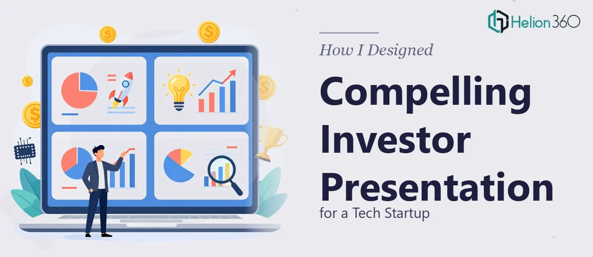
When Four Pages Feel Like Forty
I've worked on plenty of business documents before, but when a tech startup asked me to put together a tight, four-page investor presentation, I realized quickly that brevity is its own kind of complexity. The ask was clear enough on the surface: cover the product line, the market analysis, financial projections, and the unique value proposition — all in a format that would land with investors and partners who had limited time and high expectations.
Four pages sounds manageable. But when you're distilling a company's entire story, competitive positioning, and financial outlook into that space, every word and every visual has to carry real weight.
Where It Got Complicated
I started by mapping out the content. The startup had strong ideas and a lot of raw material — product specs, market data, some rough financial models. My first pass at the investor presentation looked more like a business report than a pitch. It was dense, text-heavy, and honestly not something I'd want to sit through as an investor.
The challenge wasn't understanding the content. It was knowing how to balance the written narrative with the visual layout, how to turn financial projections into something readable at a glance, and how to structure four pages so each one felt purposeful rather than crammed. I also needed the design to stay consistent with the startup's brand identity while still feeling polished and professional.
I tried a few approaches. I restructured the slide flow, simplified the copy, and sketched out where charts or infographics might work. But the design execution was where I kept losing momentum. Getting a startup pitch deck to look credible and clean — especially within a tight page count — requires a level of visual design skill that goes beyond content organization.
Bringing in the Right Support
After hitting a wall on the design side, I came across Helion360. I explained the situation — a compact investor presentation that needed to cover a lot of ground without feeling overloaded, with clear data visualization, consistent branding, and a layout that could guide the reader naturally from the product story through to the financials.
Their team took it from there. I handed over the content outline, the raw data, and the brand references, and they came back with a structured approach that addressed exactly what I'd been struggling with. They handled the visual hierarchy, designed the charts so the financial projections were instantly readable, and built out the competitive positioning section using a clean comparison layout that made the startup's value proposition obvious without needing paragraphs of explanation.
What the Final Presentation Looked Like
The finished investor presentation was four focused pages, each with a clear purpose. The first introduced the product line with a brief, well-designed overview that set the tone. The second covered the market analysis and competitive positioning using a combination of a visual chart and concise callout points woven into the layout as prose-style annotations rather than disconnected bullets. The third page presented the financial projections in a way that was visually clean and easy to follow. The fourth closed with the value proposition framed around what genuinely differentiated the startup from the competition.
The branding was consistent throughout — fonts, color palette, and layout all aligned with what the startup had established. The infographics added clarity without overwhelming the page. It looked like something a serious company would put in front of investors, which was the entire point.
What This Taught Me About Investor Presentation Design
Business presentation design at the investor level is not just about looking good. It's about structure, economy, and credibility. Every element needs to earn its place. When you're working with a four-page limit, the design does much of the persuasive work that a longer deck might handle through volume.
I also learned that market analysis and financial projections are the sections most likely to derail a presentation if the visual design isn't handled well. Data without design context is just noise. Getting both right, especially in a condensed format, takes more than good software skills — it takes experience with how investors actually read these materials.
If you're working on a startup pitch deck or a compact investor presentation and finding that the content is solid but the execution isn't coming together, Helion360 is worth reaching out to — they stepped in at exactly the right point and delivered something that genuinely represented the work well.