

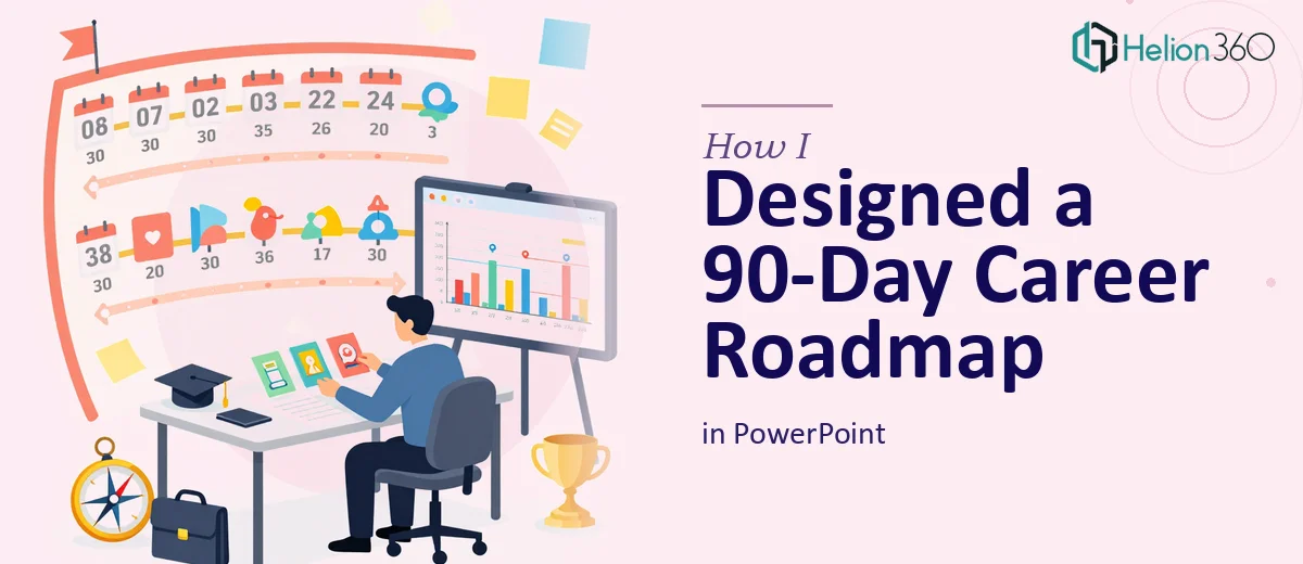
The Brief That Looked Simple But Wasn't
I was asked to put together a 90-day plan presentation for someone preparing for a senior-level job interview. On the surface, it sounded manageable — a structured PowerPoint covering the first three months in a new role. But once I started mapping it out, I realized the scope was much larger than a few slides with bullet points and a timeline.
The plan had to cover early-stage research and networking, skill-to-company alignment, key milestones with measurable metrics, and even guidance on maintaining a strong LinkedIn and online presence. It also needed to feel polished, on-brand, and easy for an interviewer to follow at a glance. That's a lot of ground to cover in a single presentation — and the design had to carry all of it without looking cluttered.
Where I Hit a Wall
I started in PowerPoint, sketching out the structure. The content was there — timelines, action steps, milestone markers — but every time I tried to make it look professional, something fell flat. Either the layout felt too corporate and lifeless, or I'd over-design a section and lose the clarity that made it useful as an interview tool.
The 30-60-90 day structure is a common format, but making it visually compelling while keeping it easy to present in a high-pressure interview setting is a genuine design challenge. I also struggled with how to visualize progress metrics and represent networking strategies without turning the slide into a wall of text.
After a few rounds of rework that weren't going anywhere productive, I reached out to Helion360. I explained what the presentation needed to accomplish — not just look good, but function as a strategic document a candidate could walk through confidently in a real interview.
What Helion360 Built
Their team came back with questions I hadn't fully thought through — how the role's first 30 days should differ visually from the 60 and 90-day phases, whether the metrics should appear as standalone slides or embedded within each phase, and how much weight to give the cultural alignment section versus the technical roadmap.
That back-and-forth shaped a much stronger structure. The final 90-day plan PowerPoint was divided into clearly distinct phases, each with its own visual treatment that still felt cohesive across the full deck. The timeline wasn't just a horizontal bar — it was layered with action steps that gave the reader a real sense of momentum and progression.
The metrics were visualized cleanly using progress indicators and simple charts that didn't require explanation to understand. The section on LinkedIn presence and online visibility, which I had been unsure how to handle, was handled as a brief but purposeful slide — strategic enough to show awareness, concise enough not to derail the main narrative.
What the Final Deck Actually Achieved
What surprised me most was how readable the entire presentation was at a quick scan. Interviewers don't always have time to read every word, and the design accounted for that. Each slide communicated its core point visually before anyone read a single sentence.
The branding was consistent throughout, the color palette reflected the professional tone the role demanded, and the flow from research and networking through to final interview preparation felt logical and intentional. It wasn't just a 90-day job interview plan — it was a structured argument for why the candidate was ready to hit the ground running.
What I Took Away From This
Building a 90-day career roadmap in PowerPoint isn't just a design task. It's a communication challenge. The slides have to do two jobs at once — convey strategic thinking and look professional enough to hold up in a competitive interview environment. When those two things aren't working together, even solid content gets lost.
Getting the structure right before touching the design is the lesson I'll carry forward. And having a team that could push back on early assumptions saved a lot of time that would have gone into rework.
If you're working on a similar interview presentation and finding that the design isn't matching the depth of the content, check out business presentation design services — they helped me turn a complex brief into a clean, confident deck that actually worked. You might also find value in learning how others have tackled similar challenges, like data-driven PowerPoint decks for major conferences or business presentations that simplify complex data.