

The Problem With Our Presentation Was Not the Content
We had solid research. We had a strong value proposition. We had the numbers to back every claim. But every time we walked into a meeting, the reaction from the room was the same — polite nods, a few unclear questions, and no real momentum.
The issue was not what we were saying. It was how we were presenting it.
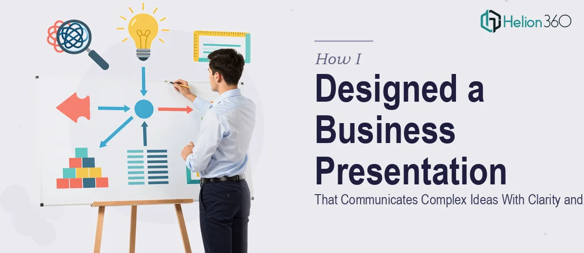
Our business presentation had grown into something unwieldy. Slides packed with text. Charts that required explanation. A narrative that jumped between ideas without a clear thread. We knew what we meant. Our audience did not.
Why I Tried to Fix It Myself First
I spent a weekend restructuring the deck. I stripped out some of the excess text, reformatted a few charts, and tried to bring a cleaner visual flow to each slide. I was fairly comfortable with PowerPoint and thought this was something I could handle with a bit of effort.
What I underestimated was how difficult it is to step back from content you are deeply familiar with and see it the way a stakeholder sees it for the first time. I kept rebuilding slides around what I knew rather than what the audience needed to understand.
After two rounds of internal reviews, the feedback was still the same — too much information on each slide, unclear hierarchy, and no strong visual story holding it together. The presentation design itself was creating friction instead of removing it.
When It Became Clear I Needed Outside Help
This was not a straightforward formatting problem. It required someone who could look at the core messages with fresh eyes, understand what different stakeholders actually needed to see, and then translate that into a structure and visual design that worked.
After hitting a wall, I came across Helion360. I explained the situation — a business presentation that was content-rich but visually scattered, with an upcoming pitch that could not afford another round of flat reactions. Their team asked the right questions upfront: Who is the audience? What decision do we want them to make? What data needs to be front and center?
That conversation alone shifted how I was thinking about the deck.
What the Redesign Actually Involved
Helion360 started by reorganizing the content structure before touching any visual element. They identified which messages were primary, which were supporting, and which were creating clutter. Some slides were merged. Some were split. A few pieces of content were moved to an appendix so the main flow could stay clean.
Once the narrative logic was solid, they worked on the visual layer. Complex data was turned into clear, readable charts. Dense paragraphs became concise statements paired with visuals that reinforced rather than repeated the text. Each slide had a single clear purpose.
The branding was also brought in line — consistent fonts, a controlled color palette, and visual elements that felt professional without being generic.
What Changed After the Presentation
The next time we walked into a meeting with the redesigned deck, the dynamic was different. People were engaged from the first slide. Questions were specific and forward-looking rather than clarifying. The conversation moved faster because the audience understood the narrative without needing us to constantly explain what they were looking at.
One stakeholder specifically mentioned that the presentation felt confident and organized. That word — organized — was the one we had been working toward without knowing it.
The presentation did not change our product or our data. It changed how that information landed.
What I Took Away From This
Designing a business presentation that communicates complex ideas clearly is genuinely hard work. It requires both content strategy and visual design thinking working together. When those two things are misaligned, even strong content can fall flat.
The clearest lesson for me was that clarity is not about saying less. It is about making sure every element on every slide is doing real work for the audience — not for the presenter.
Let Helion360 Help You Get There
If your presentation has strong content but is not landing the way it should, Helion360 can help. Their team works through the structure and the design together, so the final deck actually moves people to action.