

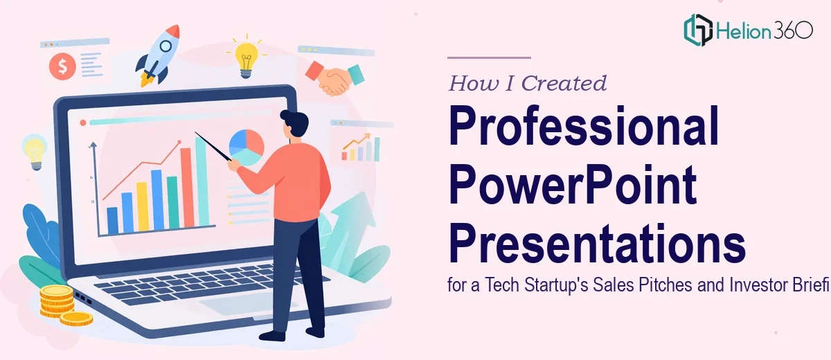
The Brief That Looked Simple — Until It Wasn't
When I first took on this project, the scope seemed manageable. A tech startup focused on software development needed a set of PowerPoint presentations — one for sales pitches, one for investor briefings, and materials for internal team meetings. Each deck had to run about 45 minutes, include data visualizations, stay aligned with the company's branding guidelines, and be ready under tight deadlines.
I've built presentations before. Updating slides, dropping in a few charts, adjusting fonts — that's routine work. But this was a different level of requirement entirely.
Where the Complexity Started Building Up
The startup had strong product knowledge but hadn't consolidated it into a clear narrative. The investor briefing needed to tell a credible growth story backed by market data. The sales pitch had to be persuasive without being generic. And both had to look polished enough to hold their own in front of sophisticated audiences.
The first challenge was structure. A 45-minute investor presentation isn't just a longer version of a basic company overview. It needs a logical flow: problem, solution, market sizing, traction, financials, team — each section building on the last. Getting that architecture right before designing a single slide took more time than I expected.
Then came the data. The startup had numbers across spreadsheets, product metrics in internal tools, and market research scattered across documents. Translating all of that into clear, accurate charts and graphs — ones that would make sense to an investor in under 30 seconds — required real judgment about what to show and how.
On top of that, the branding guidelines were more detailed than typical. Specific typefaces, a precise color palette, approved icon styles. Every slide had to feel consistent, not just visually clean.
I was making progress, but it was slow. And the deadline wasn't moving.
Bringing in the Right Support
After hitting a wall trying to juggle content structure, data visualization, and brand compliance simultaneously, I reached out to Helion360. I explained where the project stood — what materials I had, what the presentations needed to accomplish, and how much runway was left.
Their team took a thorough look at everything before touching a single slide. They asked the right questions about audience expectations, what the startup had already used in previous meetings, and which data points were most critical to highlight. That diagnostic step alone saved time that would have been lost to revisions.
From there, Helion360 built out both presentations with a clear separation between the investor briefing and the sales pitch. The investor deck led with a sharp market opportunity framing, moved into a product differentiation section, and closed with financial projections laid out in visuals that were easy to read without oversimplifying the numbers. The sales pitch had a completely different rhythm — shorter proof points, product benefits up front, and a structure built around typical buyer objections in software sales.
What the Final Presentations Looked Like
Each deck arrived fully formatted and brand-compliant. The charts were clean, properly sourced, and placed in context — not just dropped onto slides as raw data. The slides had a visual hierarchy that made it easy for a presenter to pace themselves through a 45-minute session without losing the room.
For the internal team meeting deck, Helion360 kept the tone more operational — progress trackers, roadmap visuals, and summary slides that communicated status without requiring a long verbal explanation for each point.
What stood out was how different each presentation felt from the others, even though they all shared the same branding. The investor briefing carried a certain weight. The sales pitch had energy. That distinction matters more than most people realize when you're presenting to different rooms in the same week.
What This Experience Taught Me
Professional PowerPoint design for tech startups isn't just about aesthetics. It's about understanding what each audience needs to feel confident — whether that's an investor evaluating risk or a prospect deciding if this software solves their problem.
When the volume of work, the technical complexity, or the stakes of the presentation go beyond what one person can reasonably execute well, the smarter move is to get structured help rather than push through with a substandard output.
The presentations were delivered on time. The startup used them across multiple pitches. And the feedback on the design and flow was consistently positive.
Need Presentations Built for High-Stakes Moments?
If you're working on a startup pitch deck, investor briefing, or sales presentation and the scope is bigger than expected, Helion360 is worth a conversation. Their team handles the structure, the data visualization, and the design — so the final deck actually does the job it's meant to do.