

When Visuals Fail to Match the Words Behind Them
There is a particular kind of frustration that comes from reading a well-researched article only to find it paired with a generic stock-photo banner that could belong to any piece on the internet. The visual does nothing to signal what the content is actually about. It neither draws the reader in nor reinforces the idea once they arrive.
The same problem plays out on social media. A brand publishes three or four Instagram posts tied to a single article, and each one looks like it came from a different team, a different brand, and almost a different decade. The design inconsistency quietly undermines the credibility of the content itself.
This is the core challenge of article banner and Instagram post design: it is not just about making something that looks attractive. It is about translating a specific editorial idea into a visual language that amplifies it. Done well, the banner functions as a second headline — it tells the viewer exactly what kind of content they are about to encounter and why it matters. Done poorly, it creates noise that the reader has to mentally filter out before they even start reading.
What This Kind of Design Work Actually Requires
Surface-level execution here is easy to spot. A template is pulled, a headline is dropped in, a color is changed, and the file is exported. That process produces output, but it does not produce design that serves the content.
What separates considered design from rushed production work comes down to a few things that are easy to name but harder to consistently execute.
First, the designer needs to understand what the article is actually arguing — not just its title. A piece about dividend growth investing has a different emotional register than a piece about market volatility. One calls for visual signals of steadiness and compounding; the other might warrant more tension in the composition.
Second, the design system has to be established before individual pieces are made. This means a locked color palette, a defined type hierarchy, and a set of compositional rules that apply across every banner and every Instagram post in a series. Without this foundation, the work drifts.
Third, the social assets and the article banners need to read as a family without being identical. They live in different contexts — a wide banner in a content feed versus a square or portrait post in an Instagram grid — and the design has to flex intelligently across those formats.
The Anatomy of a Well-Executed Banner and Social Post System
Starting with the Design System, Not the Individual Asset
The right approach to this kind of work begins with a small but disciplined design system. The palette should be capped at four colors: a primary brand color, a secondary accent, a neutral background, and a text color. Any more than that and the work starts to feel visually crowded, especially at banner scale where the eye needs a clear entry point.
Typography follows a three-level hierarchy. The article title or headline sits at the largest size — typically 48 to 60pt for a banner at 1200x628px (the standard Open Graph dimension). A supporting subtitle or category label sits at 24 to 28pt. Any small metadata like a publication name or date drops to 14 to 16pt. These ratios hold even when the asset is scaled down for mobile rendering.
For Instagram posts, the working dimensions shift. A square post runs at 1080x1080px, while a portrait post runs at 1080x1350px. The type hierarchy scales accordingly, but the proportion rule stays the same: the dominant text element should occupy no more than 40 percent of the total visual space so the image or background element can breathe.
Translating Editorial Ideas into Visual Metaphors
This is where the actual intellectual work happens, and it is the part that generic template production skips entirely.
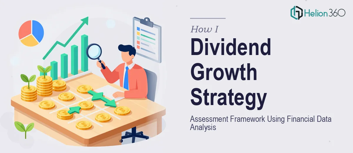
Take a piece about dividend growth strategy. The visual metaphor is not a stock chart — that is the obvious choice, and obvious choices produce forgettable design. A more considered approach might use a visual representation of compounding: overlapping circles that grow in scale, or a bar arrangement that rises in clear steps from left to right. The idea is communicated through composition, not just through text.
For a piece about market risk assessment, tension in the composition serves the content. A split layout — one half ordered, one half fragmented — can visually embody the idea of uncertainty without a single word. The design becomes an argument, not a decoration.
For Instagram posts derived from the same article, the four posts in a series should each pull a different insight or angle from the content. Post one might be the hook — the core finding or the provocative question. Post two provides context. Post three goes deeper into evidence. Post four lands the takeaway or the call to reflection. The design system keeps them visually unified; the content differentiation keeps them individually worth sharing.
File Structure and Delivery
A well-organized delivery makes the entire system scalable. Source files should be structured with a master template layer that locks the brand elements — logo position, color swatches, font styles — and a content layer above it where the variable text and imagery sit. In tools like Figma, this means using components for recurring elements like category tags, author credits, and CTA badges so that updating one instance updates all.
Export settings matter more than most people realize. Banners destined for web use should be exported as compressed JPEGs at 85 percent quality for photographic backgrounds, or as PNGs for designs with flat color and text. Instagram posts should always export as PNGs at full resolution to avoid the platform's own compression degrading the type clarity.
What Goes Wrong When This Work Is Underestimated
One of the most common failure modes is skipping the design system entirely and going straight to individual asset production. The first banner looks fine in isolation. By the fifth article, the palette has drifted by three shades, the font weight has shifted, and the logo has been placed in four different positions. Individually, each issue seems minor. Cumulatively, the brand looks disorganized.
A second pitfall is designing for the desktop preview and forgetting the mobile context. A banner with 11 words in the headline renders clearly at 1200px wide. At 375px wide on a phone screen, those same words stack awkwardly and the composition collapses. Testing every format at its smallest likely rendering size before delivery is not optional — it is part of the job.
Third, treating the Instagram posts as resized versions of the banner rather than as distinct compositions is a shortcut that consistently underperforms. A square crop of a wide banner almost never works compositionally. The posts need to be designed for their own format from the start.
Fourth, underestimating the polish pass is nearly universal among teams doing this work under time pressure. Alignment checks, consistent margin widths — a standard of 40 to 60px padding on all sides at 1080px width — and visual weight balancing between type and imagery each take real time. Skipping this pass because a deadline is close is exactly when the small errors that undermine credibility slip through.
Finally, building one-off files instead of a reusable template library means the work has to start from scratch with every article cycle. A consistent Instagram graphic design system in Figma or Adobe Illustrator takes longer to set up once but saves significant time across every subsequent piece.
What to Carry Forward from Here
The central idea is this: article banners and Instagram post design are not decorative afterthoughts. They are the first visual argument a piece of content makes, and they need to be designed with the same intentionality as the writing itself. A locked design system, format-aware composition, and a disciplined export and delivery process are what separate visual content that builds brand equity from visual content that simply fills space.
If you would rather have this handled by a team that does this work every day, Helion360 is the team I would recommend.