

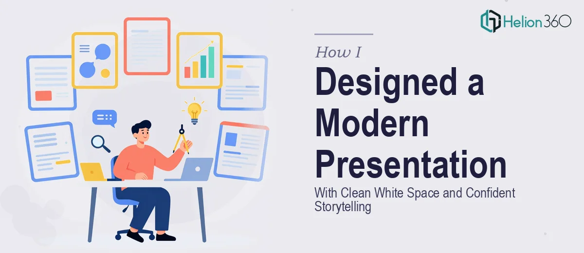
A Quick Meeting, A Bigger Design Problem Than I Expected
I had a team meeting coming up in about a week. Nothing high-stakes — just an internal check-in where I needed to walk everyone through our recent achievements, a few upcoming projects, and some team highlights. Ten slides, clean and simple. I figured I could knock it out over a weekend.
I was wrong.
The Problem With Doing It Yourself
I opened PowerPoint with the best intentions. I knew what I wanted the presentation to say. The content was mostly written down in a notes doc. What I had not fully accounted for was how much thought goes into making slides actually look good — and not just passable.
The look I was going for was modern and clean, with lots of white space and simple graphics that let the content breathe. Every time I tried to build that from scratch, it either looked too sparse or too cluttered. Font choices felt inconsistent. The spacing was off. The slides did not feel like they were telling a story — they just felt like a list of things.
I spent about three hours rearranging the same five slides before I accepted that slide design is its own skill, and I was not going to develop it in a weekend.
Where Helion360 Came In
After hitting that wall, I came across Helion360. I sent over my notes, explained the structure I had in mind — achievements first, then upcoming projects, then team highlights — and described the visual direction I was going for. Modern layout, clean white space, simple graphics, friendly but confident tone.
Their team took it from there. What I found useful was that I did not have to explain presentation design principles to them. They already understood what a clean, well-structured internal business presentation should look like. I just had to explain the content and the context.
What the Final Slides Looked Like
The deck came back within the timeline I needed, and it looked exactly like what I had been trying to build. Each slide had a clear visual hierarchy — the heading drew you in, the supporting content was easy to scan, and nothing felt crowded. The white space was intentional, not accidental. The graphics were simple but polished, the kind that support the message without becoming the story themselves.
The three sections — achievements, upcoming projects, and team highlights — each had a consistent visual treatment that tied the deck together without being repetitive. The tone landed right too: approachable and warm, but still professional enough that the work spoke for itself.
What I Took Away From the Process
Building a modern, visually clean presentation is genuinely harder than it looks. It is not just about having the right software or knowing where the alignment tools are. It is about understanding how a viewer's eye moves across a slide, how much space a headline needs to carry weight, and how to make ten slides feel like one cohesive story rather than ten separate pieces of information.
For a short, internal meeting, I had assumed the design bar would be lower. What I realized is that internal presentations still shape how your team perceives the work. A clean, well-designed slide deck signals that the person presenting has thought carefully about what they are sharing — and that matters.
I also learned that trying to build a polished presentation from scratch when you are not a designer is a time sink that rarely produces the result you are picturing. The gap between what you imagine and what you can actually execute in PowerPoint without a design background is wider than most people expect.
If you are in the same position — a short deck, a tight timeline, and a specific visual standard you want to hit — Helion360 is worth reaching out to. They handled what I could not and delivered a clean, confident presentation that was ready to use.