

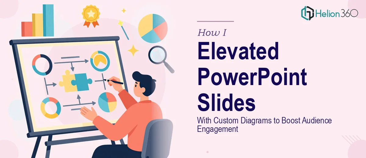
When Good Slides Just Are Not Good Enough
I had a set of existing PowerPoint slides that needed serious work. They were functional, but barely. The content was solid — data-driven reports, key metrics, process breakdowns — but visually, everything felt flat. Walls of text, mismatched fonts, and placeholder shapes that were supposed to represent actual diagrams. Anyone sitting through that presentation was going to struggle to stay engaged.
My goal was straightforward: elevate the slides, make them visually compelling, and add custom diagrams that actually illustrated the data rather than just pointing at it.
What I Tried First
I started with what I knew. I went into PowerPoint and began reworking the layout slide by slide. The templates were cleaned up a bit, the font choices were tidied, and a few colors were adjusted to better reflect the brand guidelines. That part went reasonably well.
The custom diagram creation, though — that was where things stalled. I needed process flow diagrams, hierarchical visuals, and data relationship charts that looked polished and professional. Every time I built something manually using PowerPoint's built-in shapes, it looked amateur. The proportions were off, the spacing was inconsistent, and nothing felt cohesive across the deck. I also needed to think about how some of these visuals would connect with Power BI data outputs, which added another layer of complexity I was not prepared for.
After a few hours of going in circles, I accepted that the presentation design work had grown beyond what I could realistically deliver to the standard this project required.
Bringing in the Right Team
That is when I reached out to Helion360. I explained what I was working with — an existing deck that needed visual uplift, custom diagram creation for data-driven content, and strict brand alignment throughout. I sent over the files, walked them through the structure, and let their team take it from there.
What stood out immediately was how precisely they interpreted the brief. Rather than just making things look prettier, they approached each slide with a clear visual logic. The custom diagrams were purpose-built to reflect the content — not generic SmartArt swapped out, but actual illustrations of the relationships and processes described in the data. Each diagram had consistent line weights, color coding that matched the brand palette, and proportions that worked both on screen and in print.
The Results After the Redesign
The before-and-after difference was significant. The presentation went from something I would have been hesitant to show in a boardroom to something that held up against professional standards.
The slide layouts were restructured to give the data space to breathe. Complex processes that had been written out in paragraphs were now illustrated through clean, layered diagrams. The brand consistency across all slides was tight — every element from typography to icon style to color use followed the same visual system.
Perhaps most importantly, the audience engagement angle was addressed not just aesthetically but structurally. The slides now guided viewers through the content in a natural visual flow. There was a clear hierarchy on every page — what to look at first, what supports it, and what to take away.
What This Experience Taught Me About Presentation Design
There is a real difference between editing a presentation and designing one. I can edit — fix text, swap images, tighten up a layout. But designing a cohesive visual system, especially one that includes custom diagram creation and brand-level consistency, requires a different skill set and a lot more time than most people budget for.
The slides I started with were not bad because of bad content. They were underperforming because the visual design was not doing enough work. Once that changed, the same information became significantly easier to absorb and far more credible to look at.
If you are sitting on a deck that you know is not landing the way it should — whether that is because the diagrams look rough, the design feels inconsistent, or the slides just do not reflect the quality of the work behind them — Helion360 is worth reaching out to. Their team handled exactly the kind of complex, detail-intensive design work that is hard to pull off without the right expertise.