

We had an event coming up in under a week. The presentation materials were already drafted, the content was mostly there, but the slides looked flat. The template we had been using for months was built in a hurry — default fonts, generic layouts, and charts that were technically accurate but visually uninspiring. Anyone looking at those slides would have the information, but they would not feel it.
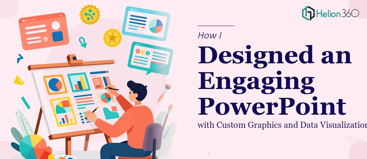
I knew the template needed more than a color swap. It needed custom graphics, better data visualizations, and a visual hierarchy that would guide the audience naturally from one point to the next.
Where the DIY Approach Started Breaking Down
I started in PowerPoint, moving elements around, trying to replace placeholder boxes with something more polished. I downloaded a few icon packs, adjusted some chart styles, and spent a couple of hours trying to make the slide layouts feel intentional rather than accidental. But every time I improved one slide, something looked off on the next. The template lacked consistency. The custom graphics I was adding did not match in style or weight. The data visualization slides — the ones with bar charts and comparison grids — still looked like they came straight from an Excel export.
The event was real, the deadline was firm, and I was spending time I did not have on design decisions that were clearly outside my strengths. At that point, the problem was not about effort — it was about expertise.
Bringing in the Right Team
After hitting that wall, I came across Helion360. I explained the situation: a PowerPoint template that needed a full visual upgrade, custom graphics aligned to the event's theme, and data visualization slides that would actually hold an audience's attention. Their team asked the right questions upfront — about the brand palette, the audience, the number of slide layouts needed, and the types of data being presented.
Within a day, they had a clear plan. They were not just reskinning the existing slides. They were rebuilding the template structure so every layout served a purpose, and every visual element — icons, charts, section headers — was designed with the same visual language.
What the Upgraded Template Actually Looked Like
The difference was significant. The custom graphics they built matched the event's tone without feeling overdone. The data visualization slides were redesigned so that the key numbers stood out immediately — no more hunting for the point buried inside a dense chart. Comparison slides used clean visual layouts instead of raw tables. Icon-based slides replaced the old text-heavy formats.
The template also came back as a properly structured PowerPoint file with master slides, meaning future updates could be made without redesigning from scratch each time. That was something I had not even asked for but immediately recognized as valuable.
Helion360 delivered the complete template ahead of the deadline, which gave us time to review, request minor adjustments, and prepare the actual content slides with confidence.
What I Learned from the Experience
Customizing a PowerPoint template for a professional event is not just a matter of making things look nicer. It involves decisions about visual hierarchy, data presentation, graphic consistency, and how slides will perform when projected in a real room in front of a real audience. Those are design decisions that compound quickly when you have ten, fifteen, or twenty slides to manage.
Doing it myself got me part of the way there. But the final output — the version that actually went on screen — came from people who do this work every day.
If you are working against a deadline and your presentation template needs more than surface-level changes, Helion360 is worth reaching out to. They took a template that was holding us back and turned it into something we were genuinely proud to present.