

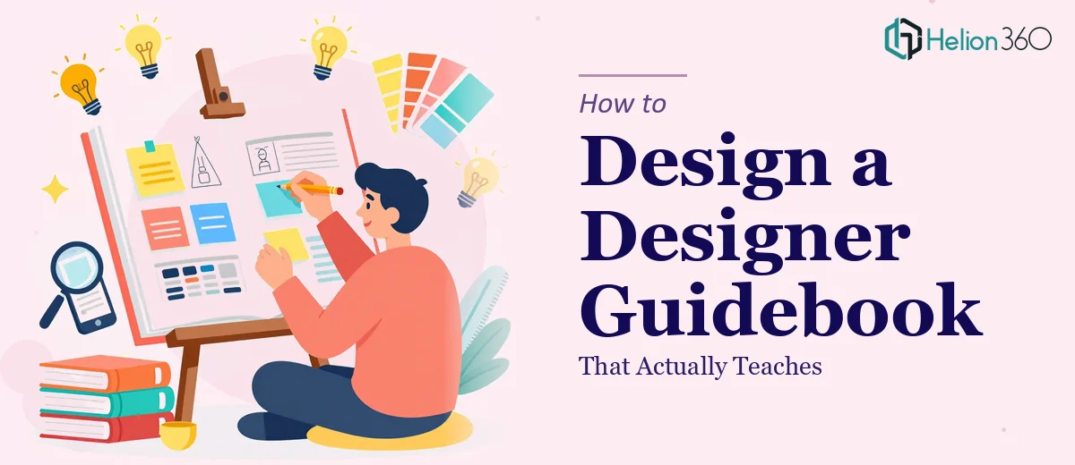
Why Most Design Guidebooks Fall Flat Before the Reader Turns the Page
There is a specific kind of frustration that comes from opening a guidebook about design and finding it visually disappointing. The content may be technically sound, but if the layout is crowded, the typography is inconsistent, or the illustrations feel like afterthoughts, the credibility of the entire resource collapses. For a product designer guidebook — one that is meant to teach layout design, color theory, iconography, and user interface principles — this failure is especially damaging because the medium is supposed to demonstrate the message.
The stakes are real. A well-designed guide builds authority, keeps readers engaged across dozens of pages, and models the exact skills it is trying to teach. A poorly produced one signals to its audience that the authors do not actually apply what they are preaching. That gap between intent and execution is what separates a guidebook people reference repeatedly from one that gets shelved after a single skim.
Understanding what goes into building this kind of resource properly — before a single spread is touched — is what this post is about.
What a Guidebook Like This Actually Requires
Designing a product designer guidebook is not a standard layout project. It sits at the intersection of editorial design, instructional communication, and visual brand strategy. Done properly, it demands more than good taste — it requires a system.
The first thing that distinguishes careful execution from a rushed job is a defined visual language established before any chapter design begins. That means committing to a type scale, a color system, an iconography style, and a grid — and documenting them in a working style guide that every spread references. Without that foundation, visual drift across chapters is almost inevitable.
The second distinguishing factor is the treatment of instructional content. A product design guide contains conceptual explanations, step-by-step processes, annotated UI examples, and comparison diagrams. Each of these content types needs its own visual container — a sidebar format, a callout style, a before-and-after layout — so readers develop an intuitive reading grammar as they move through the book.
Third, the infographics and illustrations need to carry real informational weight. They are not decoration. Done well, a single well-constructed diagram can replace three paragraphs of explanation. That only happens when the visual is designed around the insight it is meant to communicate, not retrofitted to fill white space.
Fourth, the file and asset architecture needs to support revision. A guidebook of any meaningful length will go through multiple rounds of edits. Template-driven construction — master pages, linked assets, paragraph styles — is what makes that process manageable rather than catastrophic.
Building the Visual System From the Grid Up
Establishing the Grid and Type Scale
The grid is the structural backbone of every spread. For a guidebook aimed at product designers, a 12-column grid with 6mm gutters gives enough flexibility to handle full-bleed illustrations, two-column text sections, and sidebar callouts without the layout feeling improvised. Setting this up correctly in Adobe InDesign using master pages — not by eyeballing margins on individual spreads — is what allows the system to hold across 80 or 120 pages.
The type scale should follow a deliberate hierarchy: a primary heading size around 32–36pt, subheadings at 20–24pt, body text at 9.5–10.5pt with a leading of 14–16pt depending on the typeface, and captions at 7.5–8pt. These numbers are not arbitrary — they are calibrated to create visible contrast between levels while remaining legible in print and on screen. A common mistake is setting body text too large, which compresses the leading and makes dense instructional content feel claustrophobic.
Color System and Iconography
The color palette for a guidebook of this type should cap at four brand colors with one clear primary action color used for highlights, callouts, and section markers. A practical structure is a dominant neutral (off-white or warm gray for backgrounds), a deep neutral for body text, one signature color for structural elements like chapter openers and sidebar headers, and one accent for emphasis — think highlighted terms, diagram annotations, or tip boxes. Using more than four introduces inconsistency that accumulates visibly across chapters.
Iconography deserves its own style specification. The three decisions that matter most are stroke weight (consistent at 1.5px or 2px across all icons), corner radius (zero for technical/precision topics, 3–4pt for more approachable UX content), and fill versus outline treatment. Mixing filled and outline icons on the same spread without a rule creates visual noise that undermines the professional feel. A simple working guide — built as a single reference page in the document — keeps these choices consistent across contributors.
Infographic and Diagram Templates
The most instructionally valuable spreads in a product designer guidebook are usually the comparison diagrams, process flows, and annotated UI examples. Each of these has a reusable anatomy worth templating early.
A process flow diagram, for instance, works best when steps are contained in a fixed-height row — roughly 40–48pt — with connecting arrows that are styled consistently (same arrowhead, same 1.5pt stroke) and annotation labels set in the caption style. A color progression from light to saturated within the brand palette signals movement through the process without requiring the reader to count steps.
Annotated UI examples benefit from a two-column layout: the UI mockup or screenshot occupies roughly 60% of the column width, with numbered callout markers linking to a numbered annotation list in the adjacent column. Setting callout circles at a fixed 18pt diameter with a 1pt stroke keeps them readable without overpowering the underlying graphic.
Comparison layouts — especially useful for color theory and layout design sections — are most effective as a strict two-panel structure with a thin 1pt rule dividing the panels and a label band at 20pt height above each. The symmetry itself communicates the comparison before the reader processes any text.
What Goes Wrong When This Work Is Underestimated
The most common failure mode is launching straight into chapter design without establishing the visual system first. When the grid, type scale, and color palette are decided spread-by-spread rather than upfront, every chapter looks slightly different — and that drift signals amateurism to the exact audience this guide is trying to impress.
A second pitfall is treating infographics as decoration rather than load-bearing content. When an illustration is added to fill space rather than to communicate a specific concept, it typically ends up visually heavy and informationally thin. Readers sense this immediately and start skipping the visuals, which defeats the entire purpose of a visual guidebook.
Inconsistent iconography is another compounding problem. If chapter three uses outline icons and chapter seven uses filled ones because a different designer touched each section, the book loses its sense of authorship. This is exactly the kind of detail that a style guide prevents — but only if one exists and is actually referenced.
Underestimating the polish phase is also extremely common. Spacing inconsistencies, misaligned callout markers, caption text that does not reflow cleanly after an edit, and illustrations that export at 72 DPI instead of the required 300 DPI for print — these issues only surface during a proper final review pass. That pass takes longer than most people budget for, and skipping it produces a finished product that looks rushed even when the underlying design is solid.
Finally, building pages as one-off layouts rather than as instances of master templates creates a version control problem. When the client requests a font change or a color update across the entire document, a template-driven file makes that a 20-minute job. A file built page-by-page makes it a two-day rebuild.
What to Take Away Before You Start
The single most important investment in a product designer guidebook is the time spent building the visual system before touching any chapter content. The grid, type scale, color palette, iconography rules, and diagram templates are not overhead — they are the infrastructure that makes everything downstream faster, more consistent, and genuinely impressive to the audience it is meant to serve.
The second takeaway is that instructional graphics need to be designed around the concept they communicate, not added as visual relief. The best guidebooks are ones where removing the illustration would make the explanation noticeably harder to follow.
If you would rather hand this kind of structured, system-first design work to a team that does it every day, Helion360 is the team I would recommend.