

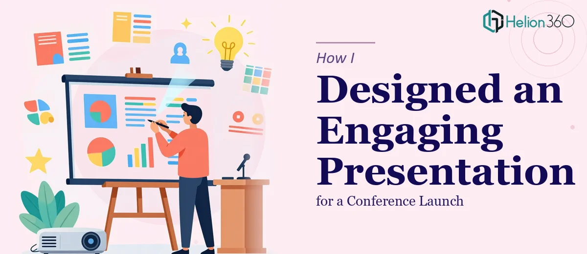
The Weekend Deadline That Caught Me Off Guard
I had been working on a PowerPoint slide deck for weeks, but the conference was suddenly closer than I had accounted for. The presentation covered our company's recent product launches — new features, updated positioning, and a few announcements we had been building toward for months. The stakes were real, and the timeline had shrunk to just a couple of days.
I had a draft. It had all the right content. But when I sat down and looked at it honestly, it was not going to hold a room.
What the Draft Was Missing
The content was solid, but the slides felt flat. Some sections were overloaded with text that should have been visual. Other slides had inconsistent layouts that made the deck feel patched together rather than intentional. I had also roughed in a few animation ideas to make certain product reveal moments more dynamic, but nothing was working the way I had imagined it.
The branding was another issue. Our company had updated its visual guidelines earlier in the year, and parts of the deck were still following the old style. Fonts, color usage, icon styles — it was a mix of old and new that looked unpolished on a projected screen.
I spent most of Friday evening trying to fix the problem slides on my own. I adjusted layouts, swapped out some visuals, and tried to simplify the most cluttered slides. But every time I fixed one thing, something else felt off. The presentation design was not coming together as a cohesive unit.
When I Decided to Bring In Help
By Saturday morning, I knew I was running out of time to solve this alone. The problem was not that I did not understand the content — I knew it inside and out. The problem was that turning raw slides into a visually engaging conference presentation required a level of design skill and speed that I simply did not have available over a weekend.
That is when I reached out to Helion360. I explained the situation — the conference deadline, the draft I had, the branding inconsistencies, and the animation ideas I had not been able to execute properly. Their team looked at the existing deck and came back with a clear plan for how to approach it.
What the Team Worked Through
Helion360 took the draft and rebuilt it with the full brand guidelines applied consistently across every slide. The typography, color palette, and layout structure all aligned with how the company's visual identity was supposed to look at a professional level.
The product launch sections, which had been the most cluttered, were redesigned with cleaner visual hierarchy. Key information was pulled forward, supporting details were organized in ways that supported the spoken presentation rather than competing with it. The slides were built to complement what a presenter would say, not repeat it.
The animations I had been struggling with were handled carefully. Rather than adding motion for its own sake, the team used subtle entrance effects and transitions that gave the product reveal moments real impact without feeling overdone. Everything stayed on-brand and professional.
What I Took Away From the Experience
I went into the conference with a deck I was genuinely confident in. The presentation landed well — the product launch sections generated exactly the kind of interest we had hoped for, and the visual quality of the slides held up on a large projected screen in a way that earlier drafts definitely would not have.
The lesson I took from this was straightforward. Knowing your content is not the same as knowing how to present it. Conference PowerPoint design has its own set of requirements — visual consistency, audience-ready layouts, purposeful animation — and those take real skill to execute under a tight deadline.
If you are working on a product launch presentation or a conference deck and the design side is eating into time you do not have, Helion360 is worth reaching out to. They stepped in at exactly the right moment and delivered a polished, on-brand presentation that I could not have pulled together on my own in that window.